Future-Proof CSS
A presentation at An Event Apart: Front-End Focus by Ire Aderinokun
Future-Proof CSS Ire Aderinokun @ An Event Apart “Front-End Focus” 2020
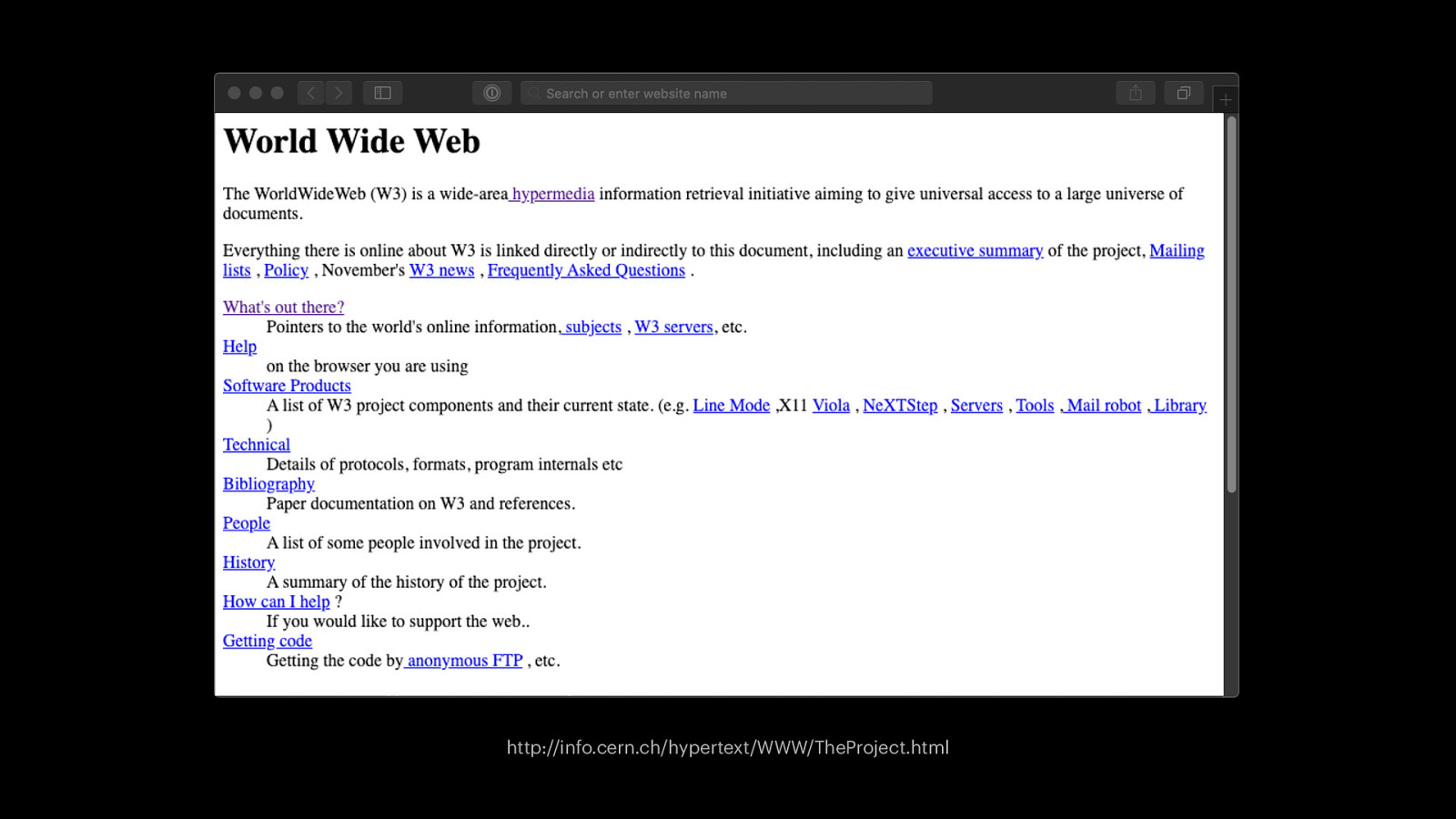
http://info.cern.ch/hypertext/WWW/TheProject.html
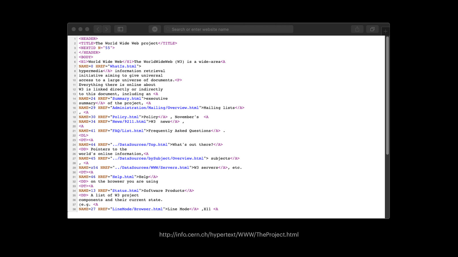
http://info.cern.ch/hypertext/WWW/TheProject.html
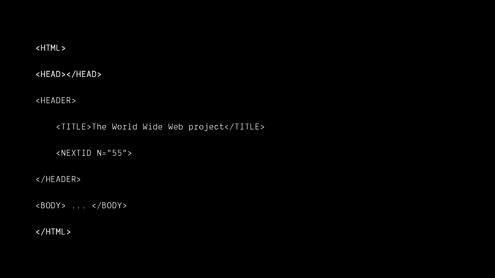
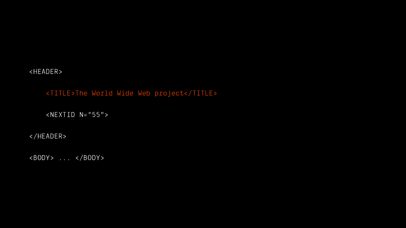
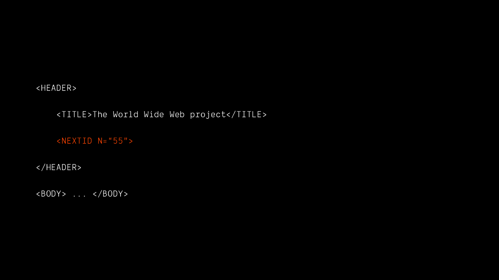
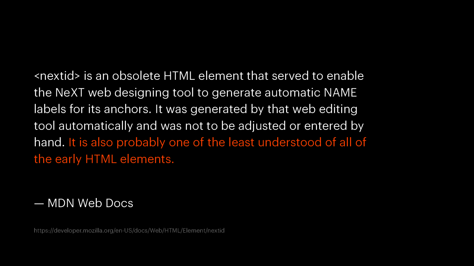
<nextid> is an obsolete HTML element that served to enable the NeXT web designing tool to generate automatic NAME labels for its anchors. It was generated by that web editing tool automatically and was not to be adjusted or entered by hand. It is also probably one of the least understood of all of the early HTML elements. — MDN Web Docs https://developer.mozilla.org/en-US/docs/Web/HTML/Element/nextid
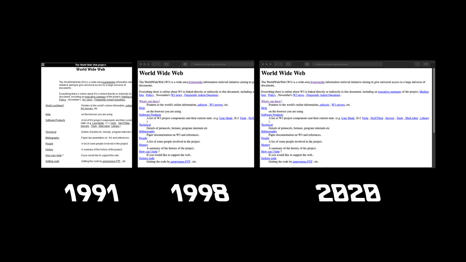
1991 1998 2020

Don’t break the web

Web technologies won’t change in a way that breaks previously compliant websites

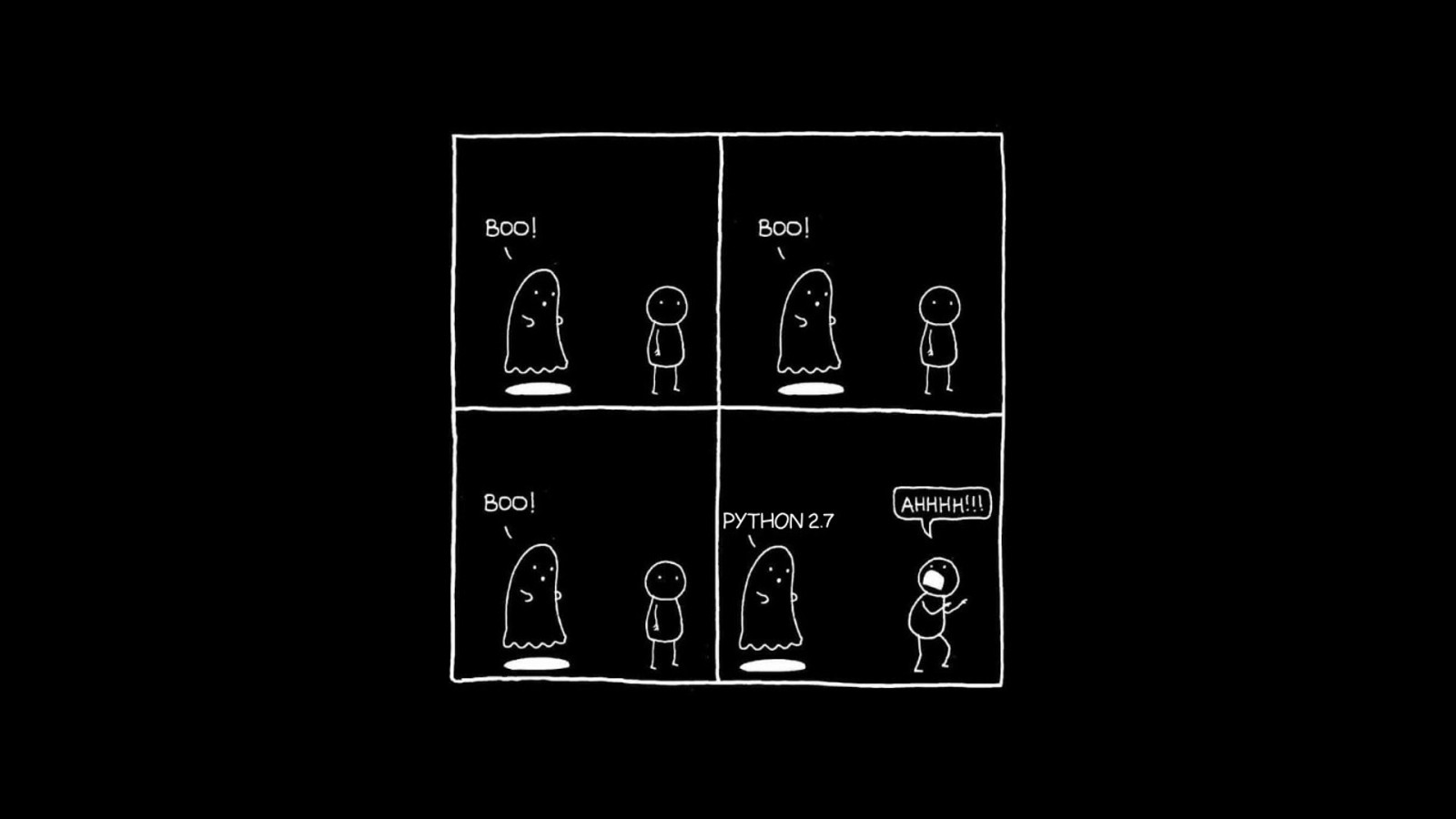
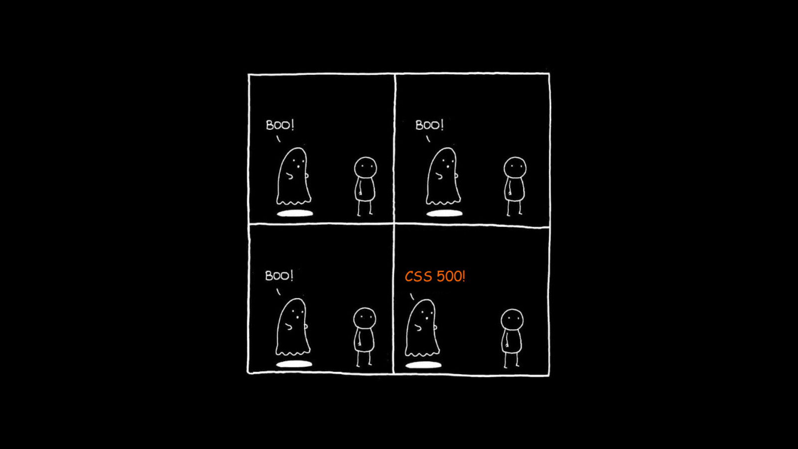
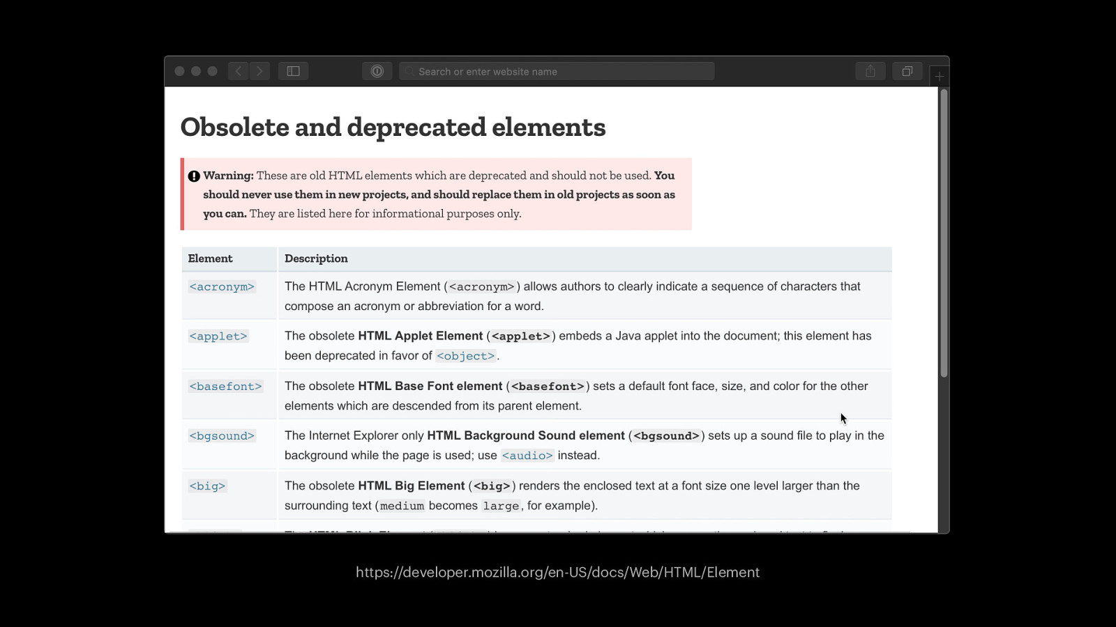
https://developer.mozilla.org/en-US/docs/Web/HTML/Element
But websites still break 💔
Web technologies won’t change in a way that breaks previously compliant websites
Future-proof css !
What will CSS look like in the future ?

l i t a o r r V e B t p & n e l s o e s r k r e i r r P t ie o e r e D W S p n o S o r i C s t P e a l n i i t a m r i c S i e n J g p A o o S s r L S e l C lP S b d n S a i i o r r C y g a n e b V o B u y t S e n I B e S P S m A n C I t o P e u r i i A t o v r y S n e a S E p L C o r a s ) P ( e m i s i t a : r m b e o O t p s s o r u e I i P r t C P r G A e m t p S n o S i r a e C P l P l u a d I c o i d P i g r M A o G t L s u e S w o u * o l y r a CS a s B r V L n e f e & x r e r o r s e B p e i D t r e l n e b s i p w x e o o i r e r t l r P C F e n p enB o o y r e S P t B S l e l C a k c r i n i o g I o S W P L J n A o t i r t t d e s a i u r e p l o m g o y b r b a a P i u L r S a m V S o t S t s n ) C ( More features ! u e s i C : m n g S o S ro L C e a l u d m i s d r a e i o g b t r b M O e u t p S u I o r S o P t P y S A a u C l t L o a n y c x a i o L g S B o S L ) C ( e l s a i b : i m x a e * l b s F s s O e r i u t e r f C e S p t o S e l r e C k P l r l u n o i a d c W o i S n J g M o o i t t L o s a u e o l M * im y b t a s a u i r L r o e f a y x e a V o r L B t p n x e e o l B n b m i w x n e l e o o l b r r i i F B S x n e S nv l e C F r r t a e e l m S D k a r S b o C s O W e n i i n t r o S i S e J t L S p a o C s r m e n l i ni b A * S a J i s r r a e s f V S e e t l S r n b p C e a n i r o m b i a n x V ey o e t l n ir
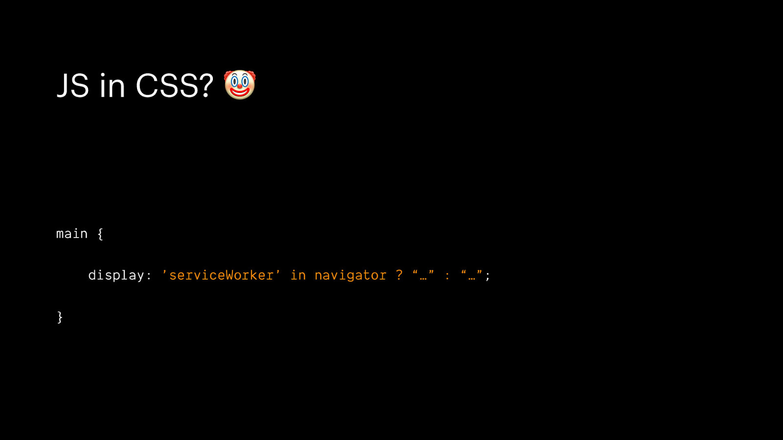
JS in CSS? 🤡 main { display: ’serviceWorker’ in navigator ? “…” : “…”; }
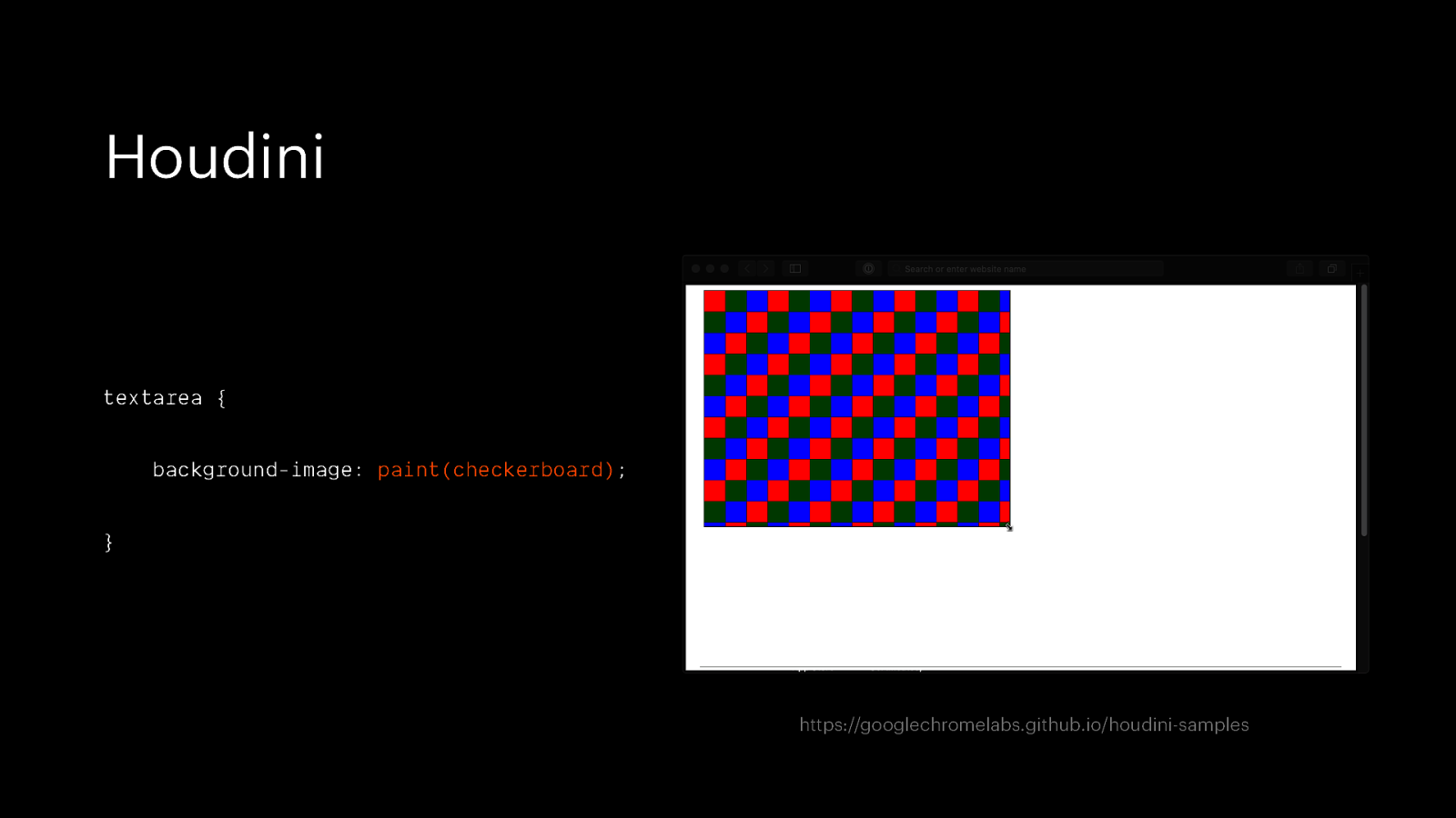
Houdini textarea { background-image: paint(checkerboard); } https://googlechromelabs.github.io/houdini-samples
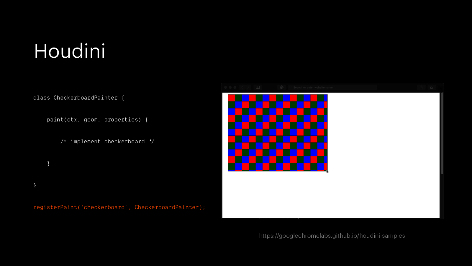
Houdini class CheckerboardPainter { paint(ctx, geom, properties) { /*” implement checkerboard */$ } } registerPaint(‘checkerboard’, CheckerboardPainter); https://googlechromelabs.github.io/houdini-samples
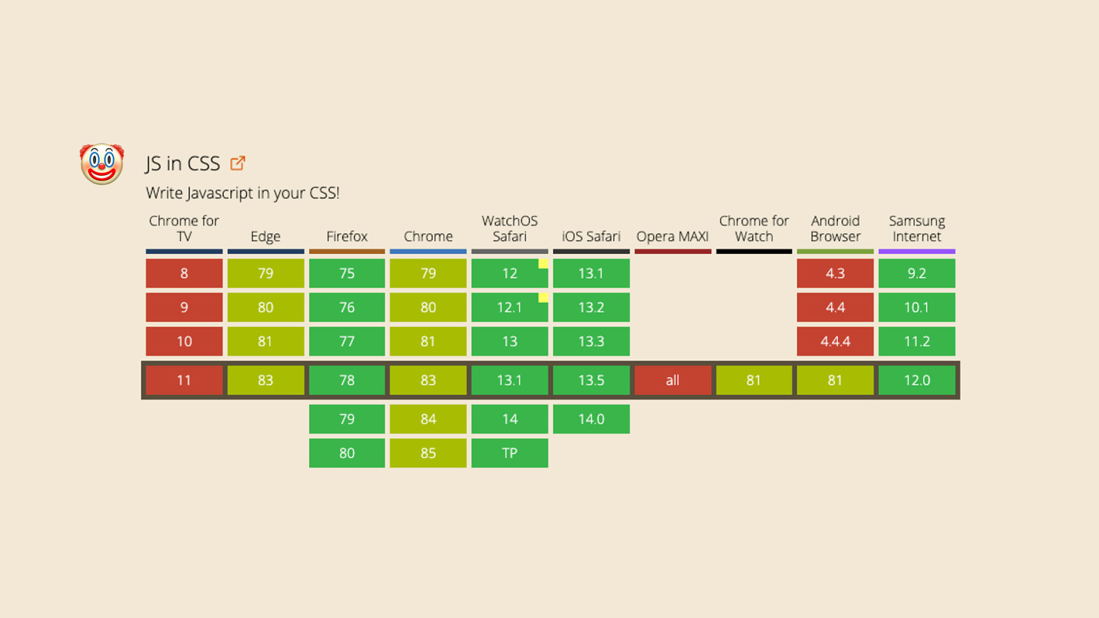
🤡
Progressive enhancement
Progressive enhancement builds documents for the least capable or differently capable devices first, then moves on to enhance those documents with separate logic for presentation, in ways that don’t place an undue burden on baseline devices but which allow a richer experience for those users with modern graphical browser software — Stephen Champeon (2003) http://hesketh.com/publications/inclusive_web_design_for_the_future/
Graceful degradation is the practice of building your web functionality so that it provides a certain level of user experience in more modern browsers, but it will also degrade gracefully to a lower level of user experience in older browsers.
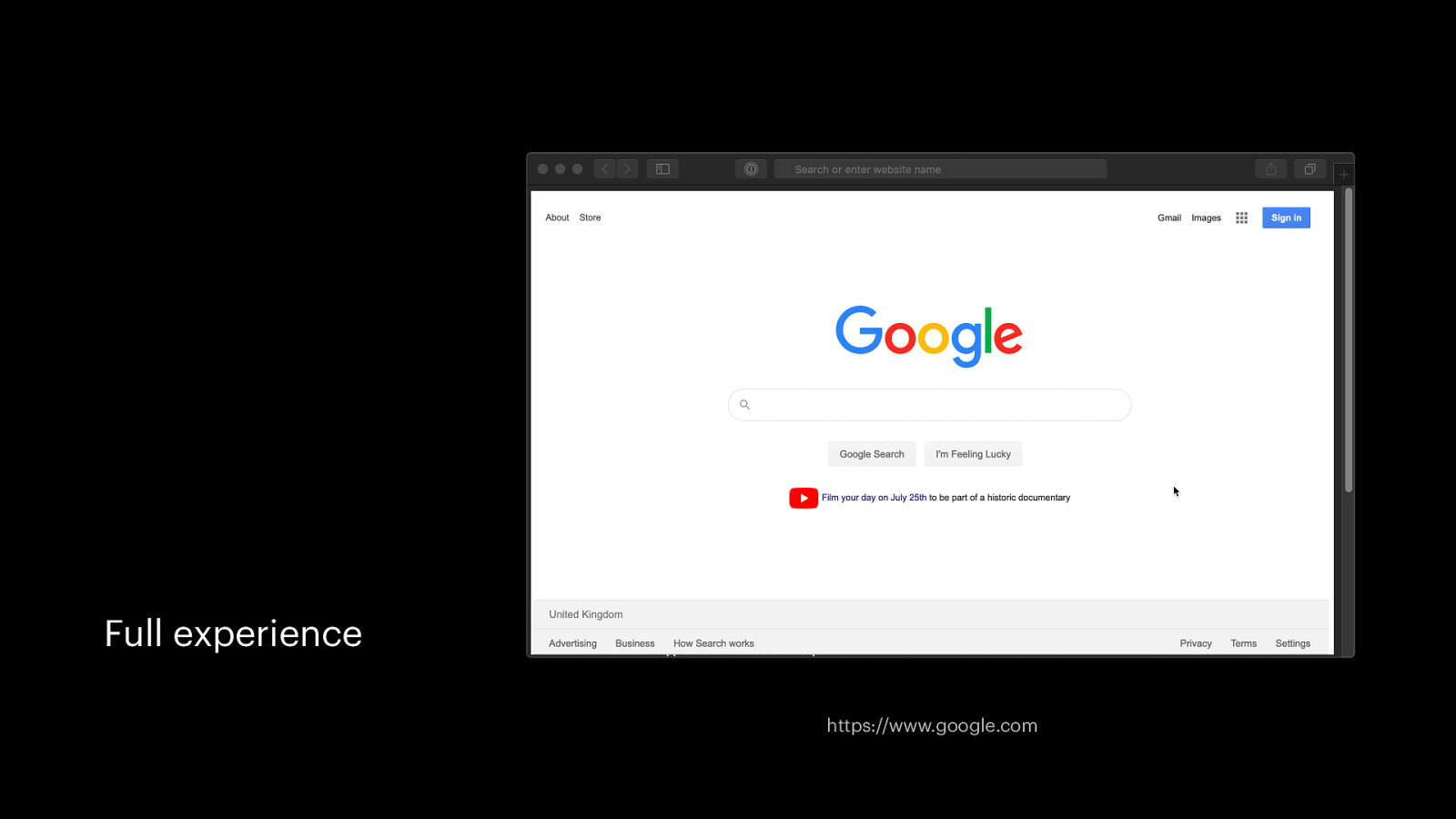
Full experience https://www.google.com
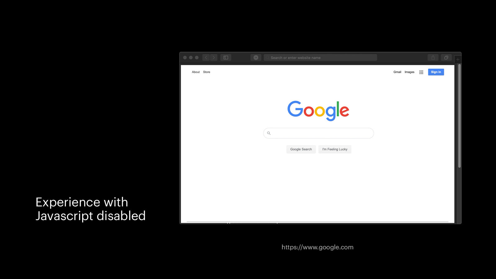
Experience with Javascript disabled https://www.google.com
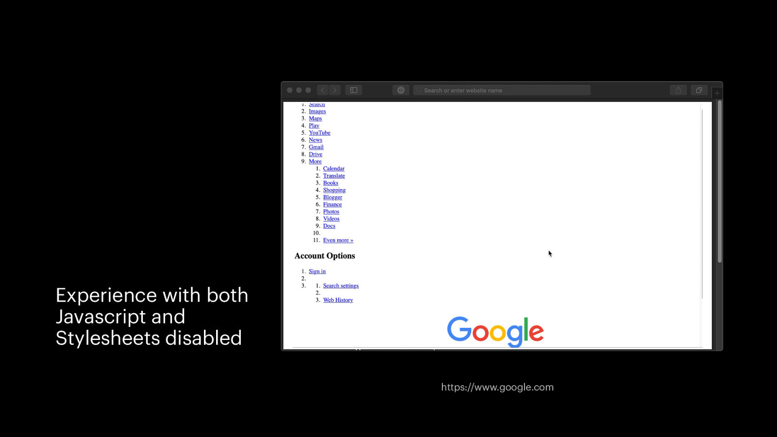
Experience with both Javascript and Stylesheets disabled https://www.google.com
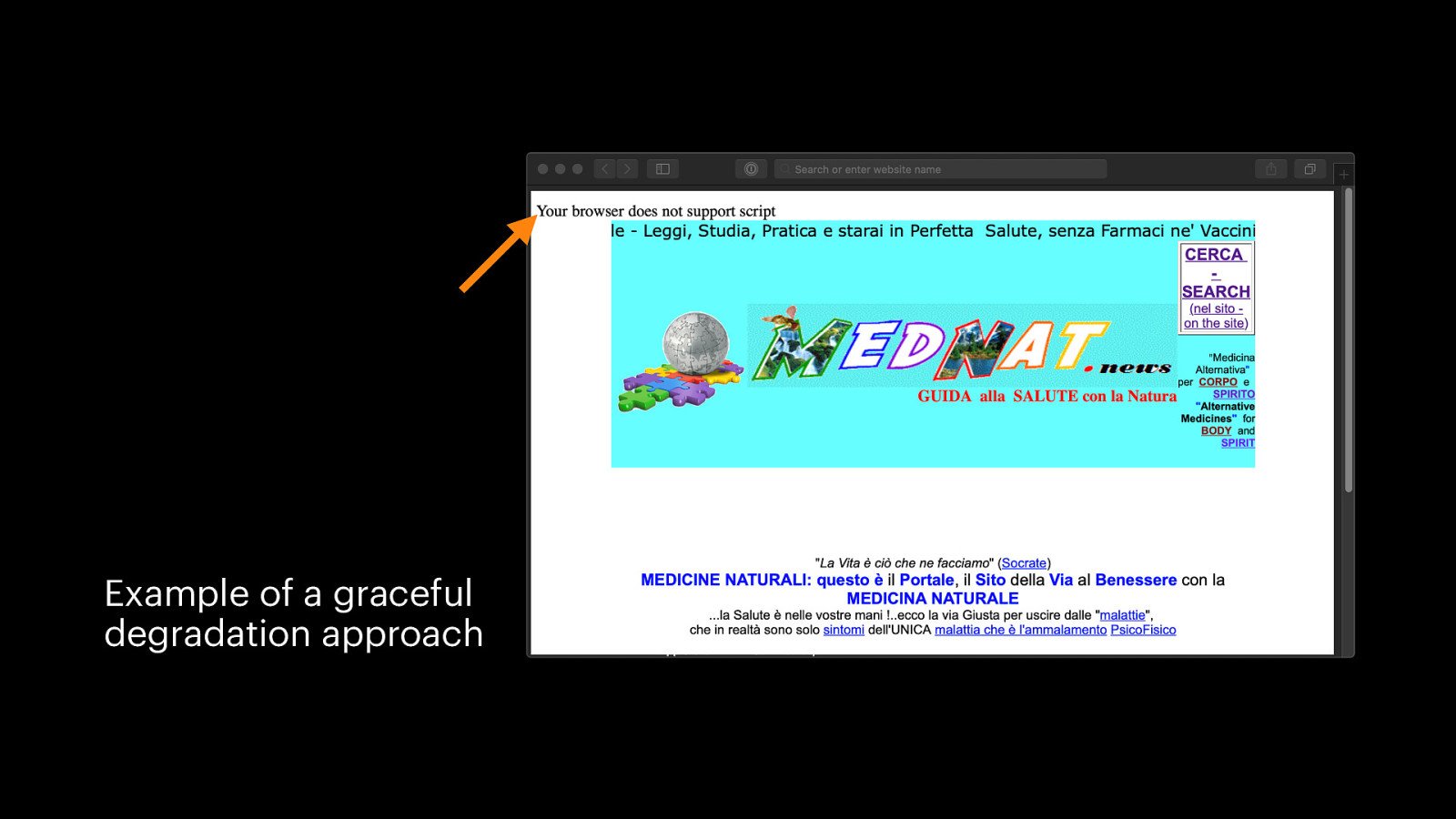
Example of a graceful degradation approach
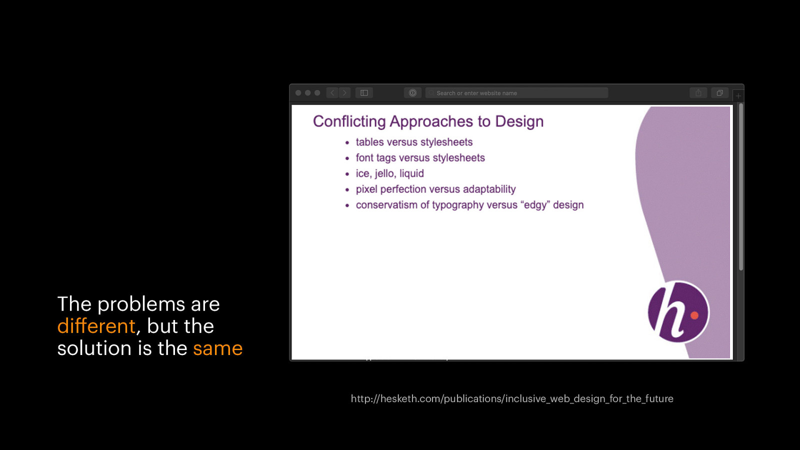
The problems are different, but the solution is the same http://hesketh.com/publications/inclusive_web_design_for_the_future
- Start by providing a core experience to all browsers 2. Add styling and functionality to enhance the experience for more capable browsers
But, progressive enhancement with CSS is kinda hard
JS already has the right tools ✅ Feature detection ✅ Error handling

if (‘serviceWorker’ in navigator) { navigator.serviceWorker.register() .then(() =>& { … }) .catch(() =>& { … }) } else { // do something else }

if (‘serviceWorker’ in navigator) { navigator.serviceWorker.register() .then(() =>& { … }) .catch(() =>& { … }) } else { // do something else }
CSS is lacking the right tools ❌ Feature detection (sort of) ❌ Error handling
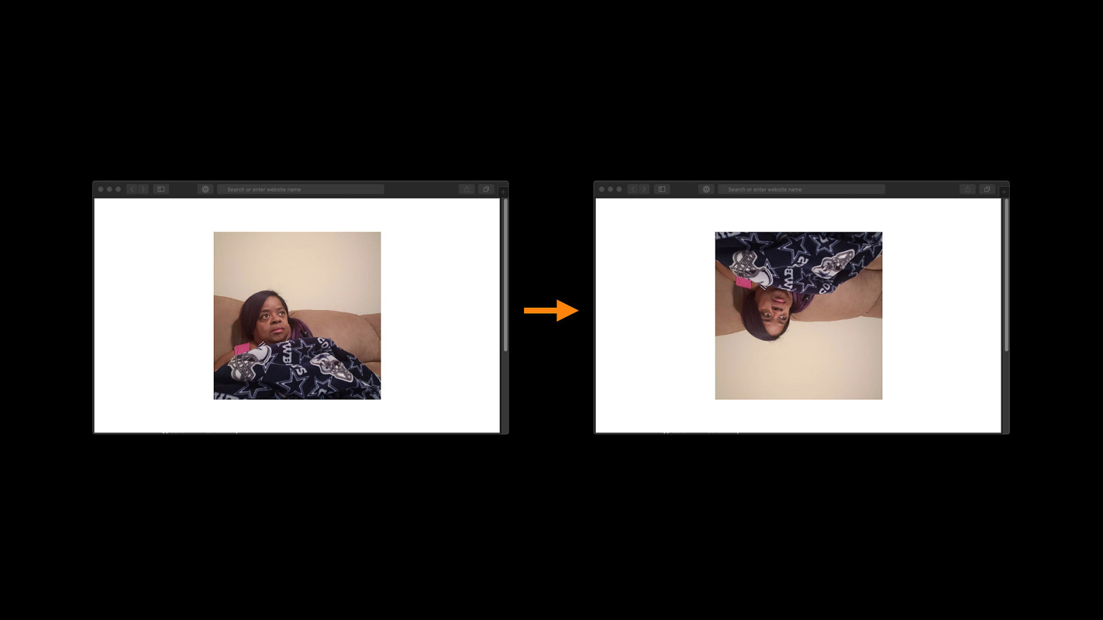
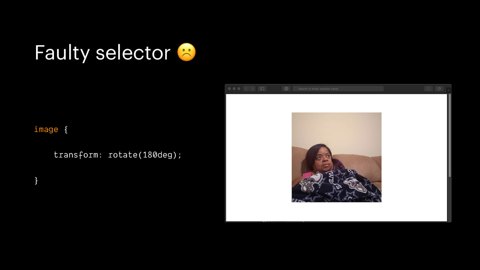
Faulty selector ☹ image { transform: rotate(180deg); }
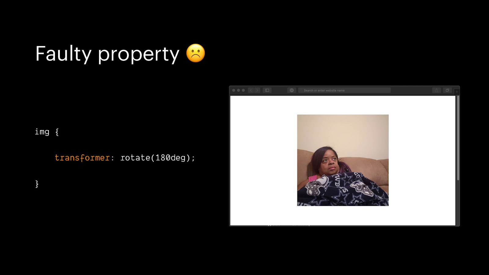
Faulty property ☹ img { transformer: rotate(180deg); }
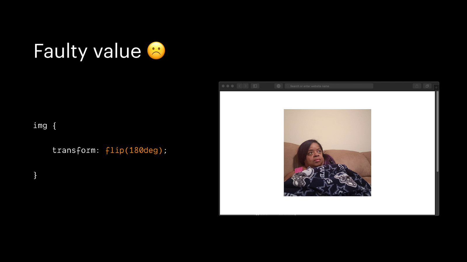
Faulty value ☹ img { transform: flip(180deg); }
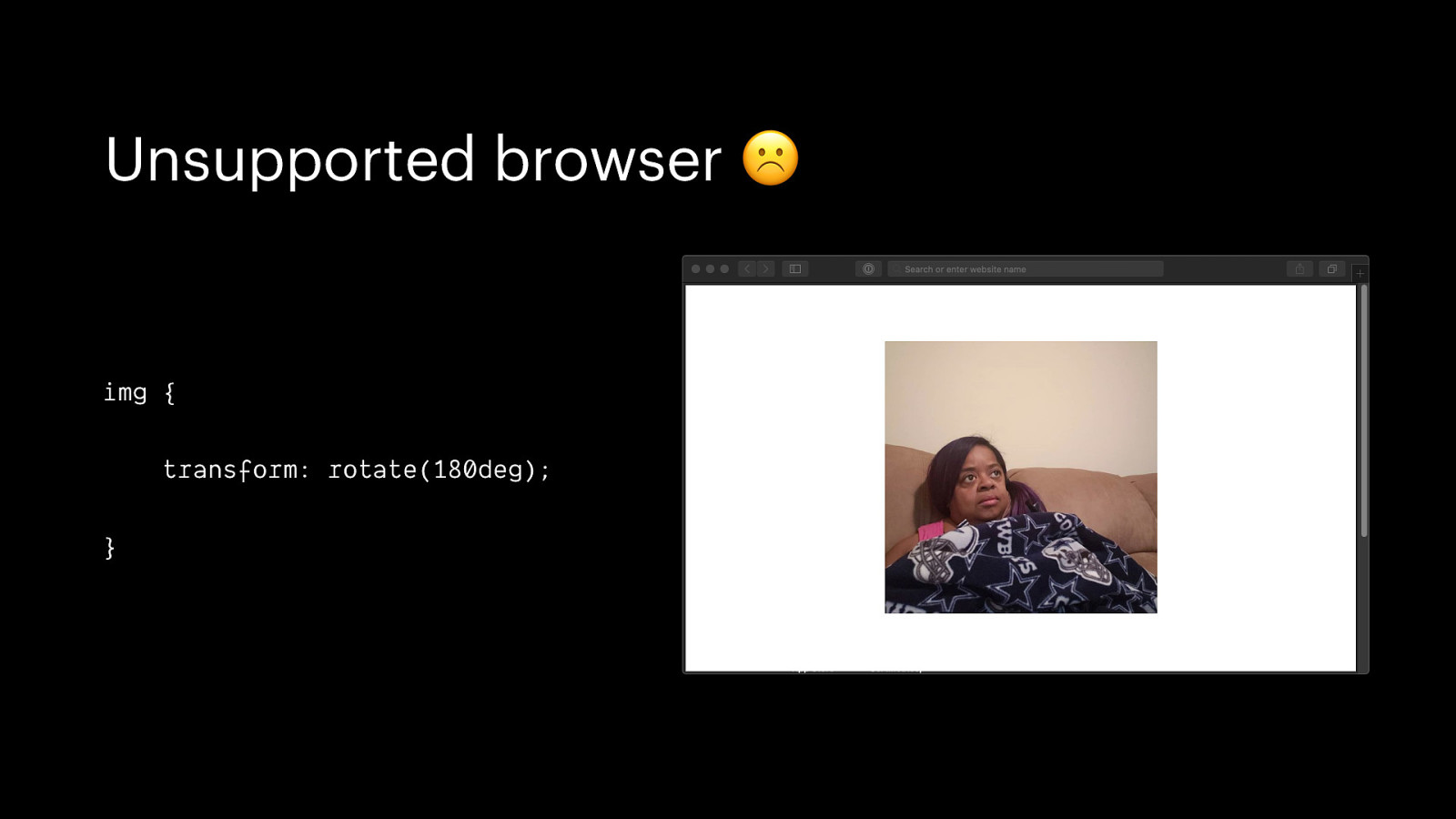
Unsupported browser ☹ img { transform: rotate(180deg); }
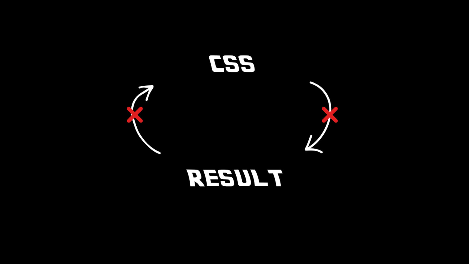
Progressive enhancement with CSS is kinda hard, but still doable
Don’t use CSS (if you don’t have to)
Start with sensible HTML
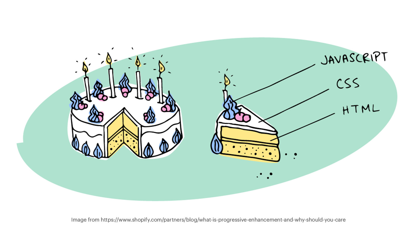
Image from https://www.shopify.com/partners/blog/what-is-progressive-enhancement-and-why-should-you-care
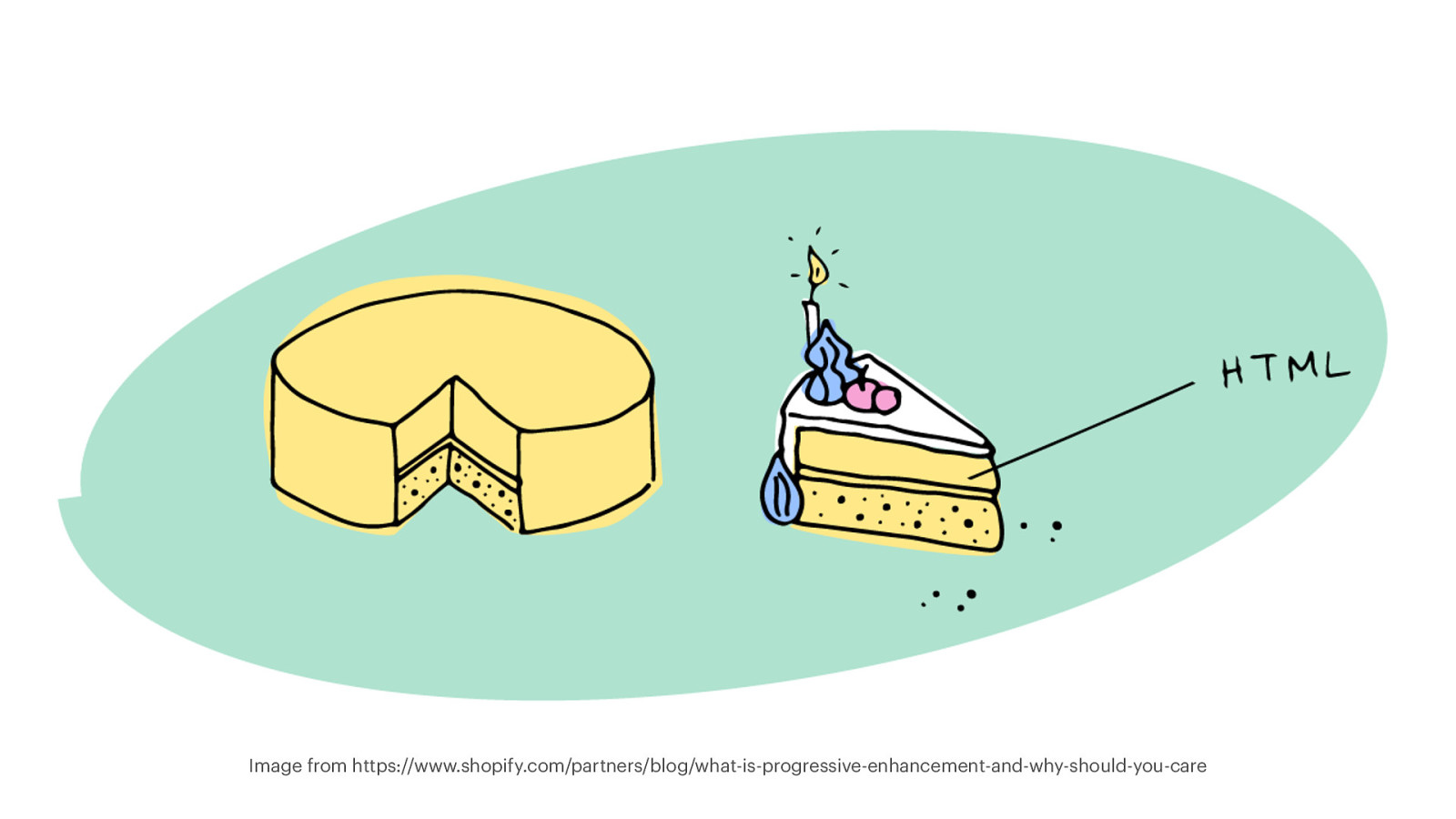
Image from https://www.shopify.com/partners/blog/what-is-progressive-enhancement-and-why-should-you-care
Make sure the document works without CSS in the first place
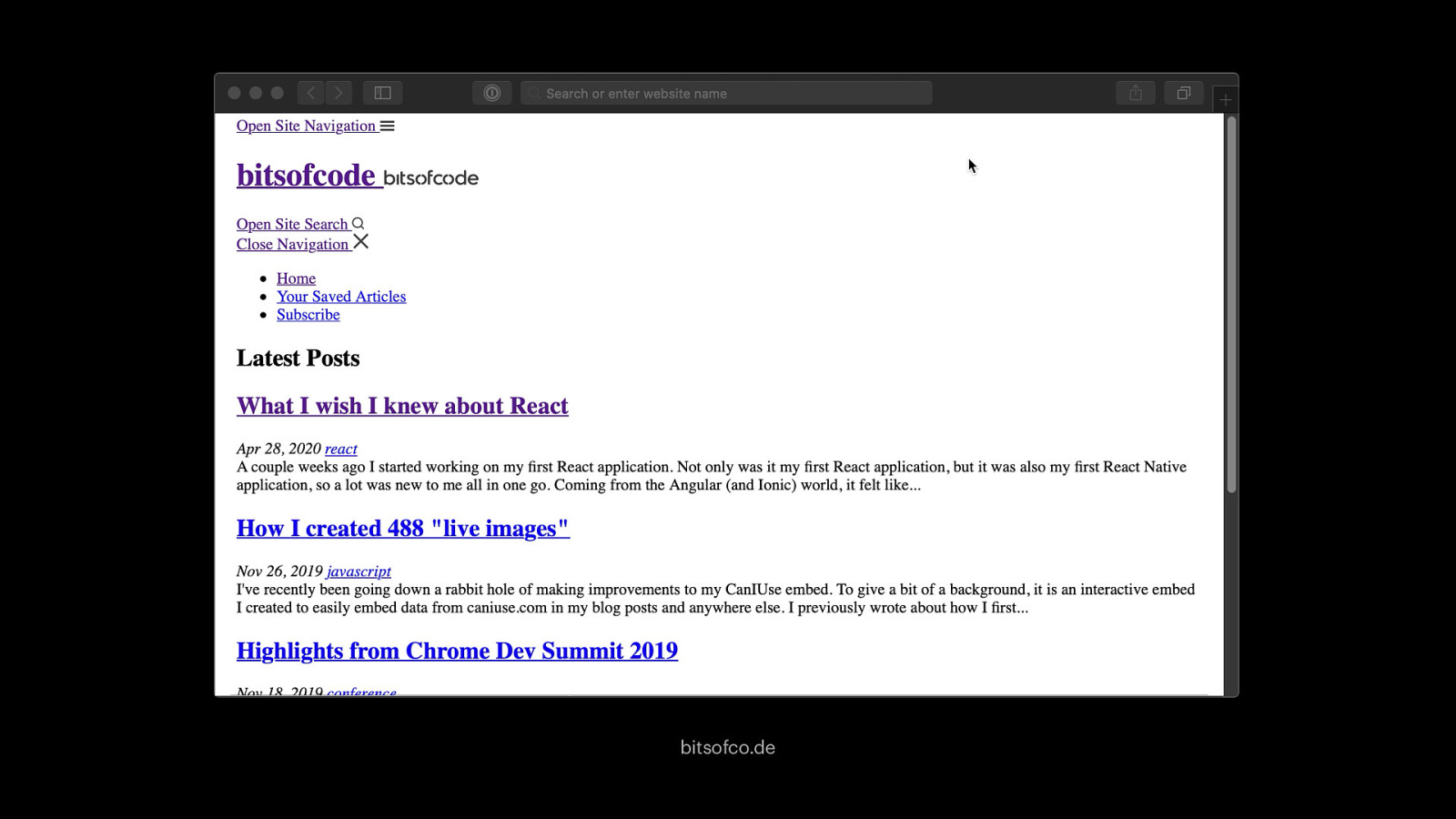
bitsofco.de
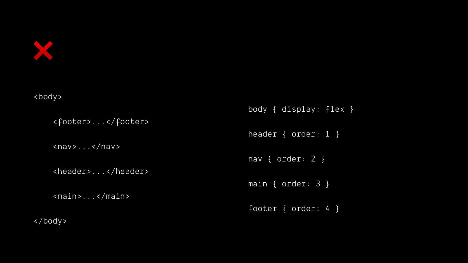
❌ <body> body { display: flex } <footer>…</footer> header { order: 1 } <nav>…</nav> nav { order: 2 } <header>…</header> main { order: 3 } <main>…</main> footer { order: 4 } </body>
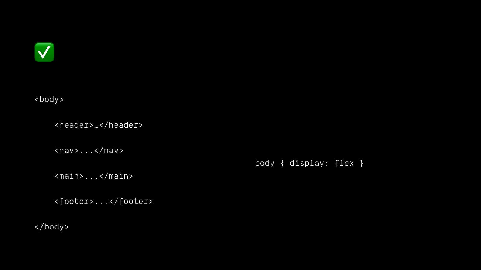
✅ <body> <header>…</header> <nav>…</nav> body { display: flex } <main>…</main> <footer>…</footer> </body>

Use the cascade

The cascade is built-in progressive enhancement
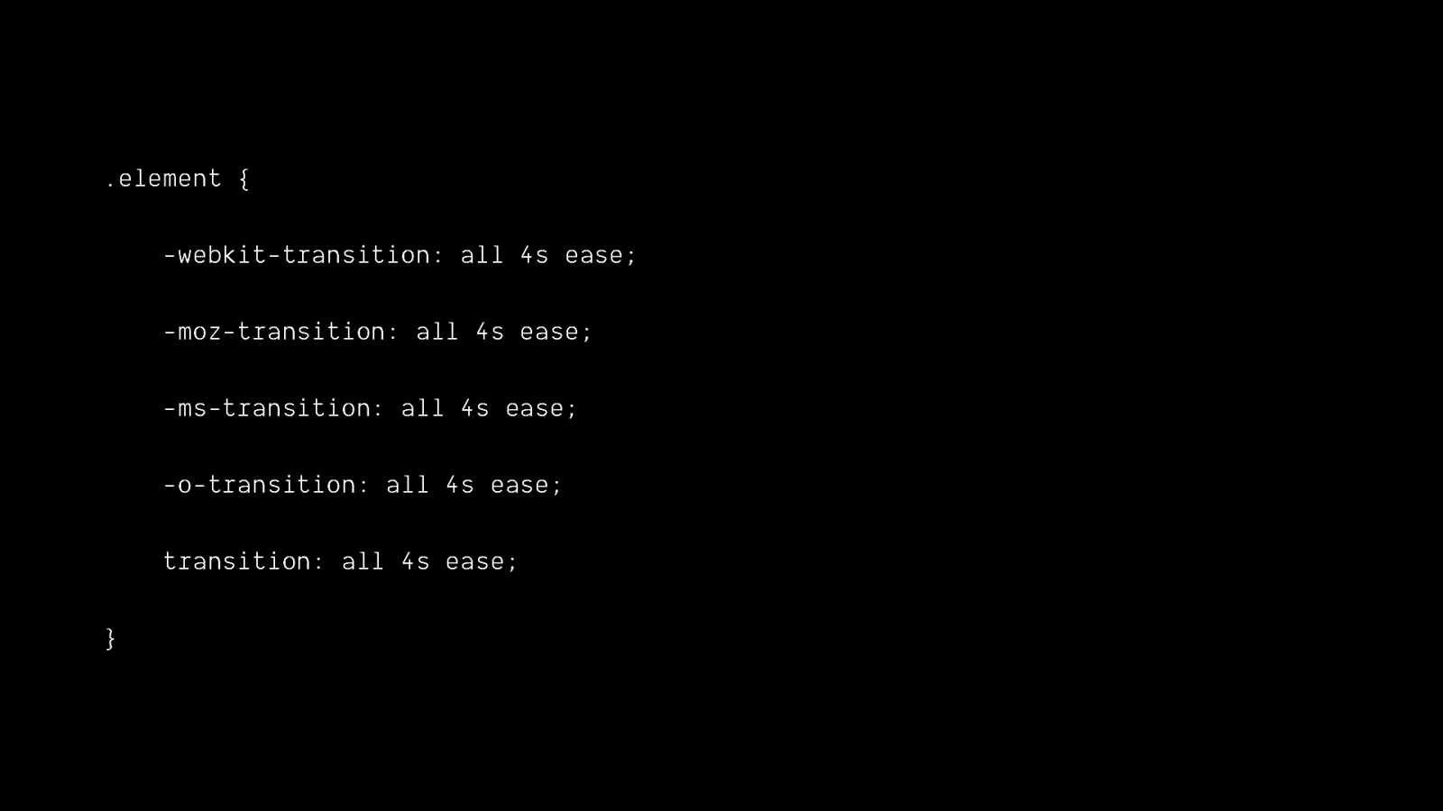
.element { -webkit-transition: all 4s ease; -moz-transition: all 4s ease; -ms-transition: all 4s ease; -o-transition: all 4s ease; transition: all 4s ease; }

body { background: url(fallback.png); background-image: url(awesome.svg), none; }
Write mobile-first CSS

min-width > max-width
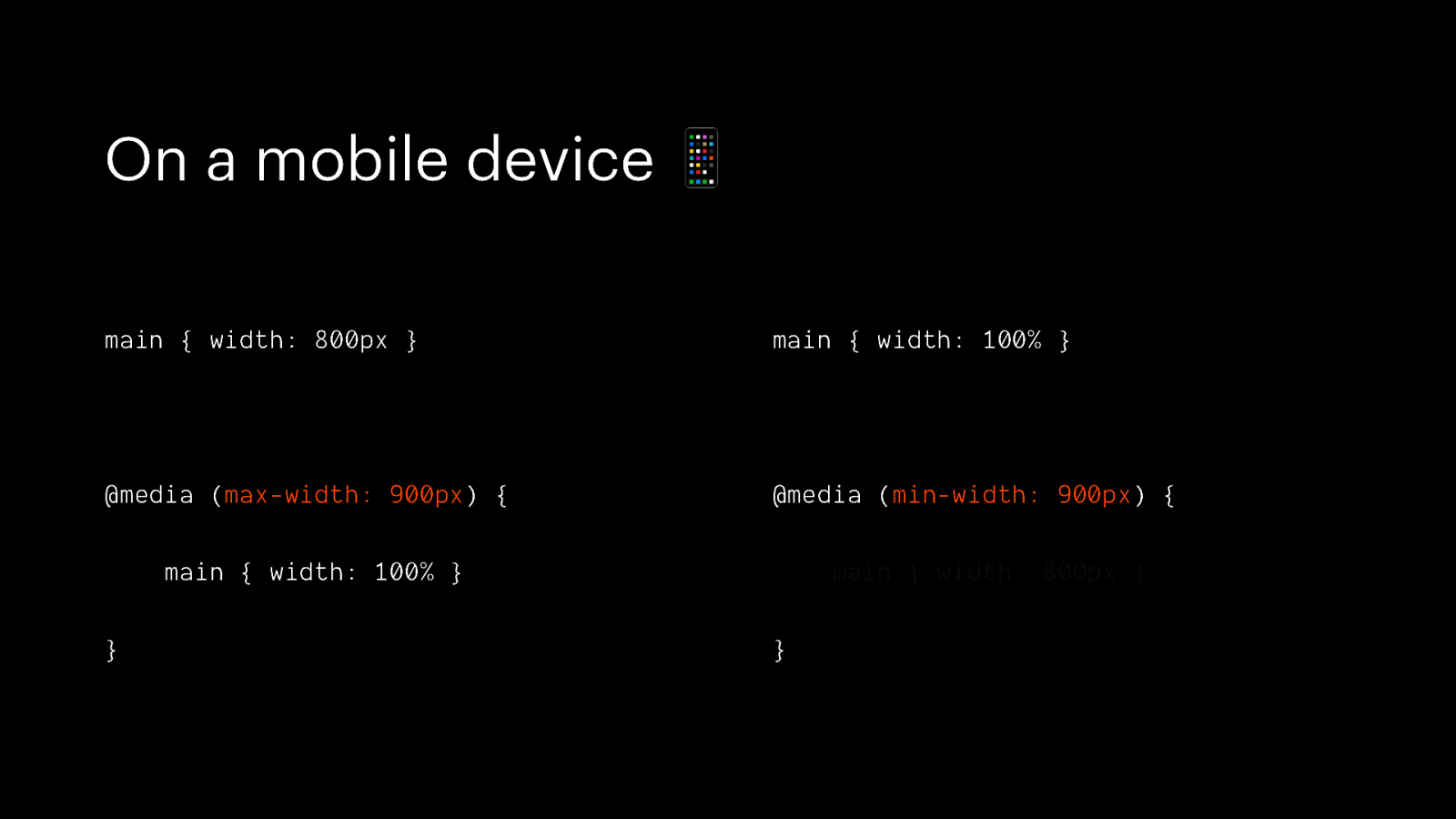
On a mobile device 📱 main { width: 800px } main { width: 100% } @media (max-width: 900px) { @media (min-width: 900px) { main { width: 100% } } main { width: 800px } }
On average, mobile devices are slower and less capable than desktop devices
Mobile styles are more adaptable
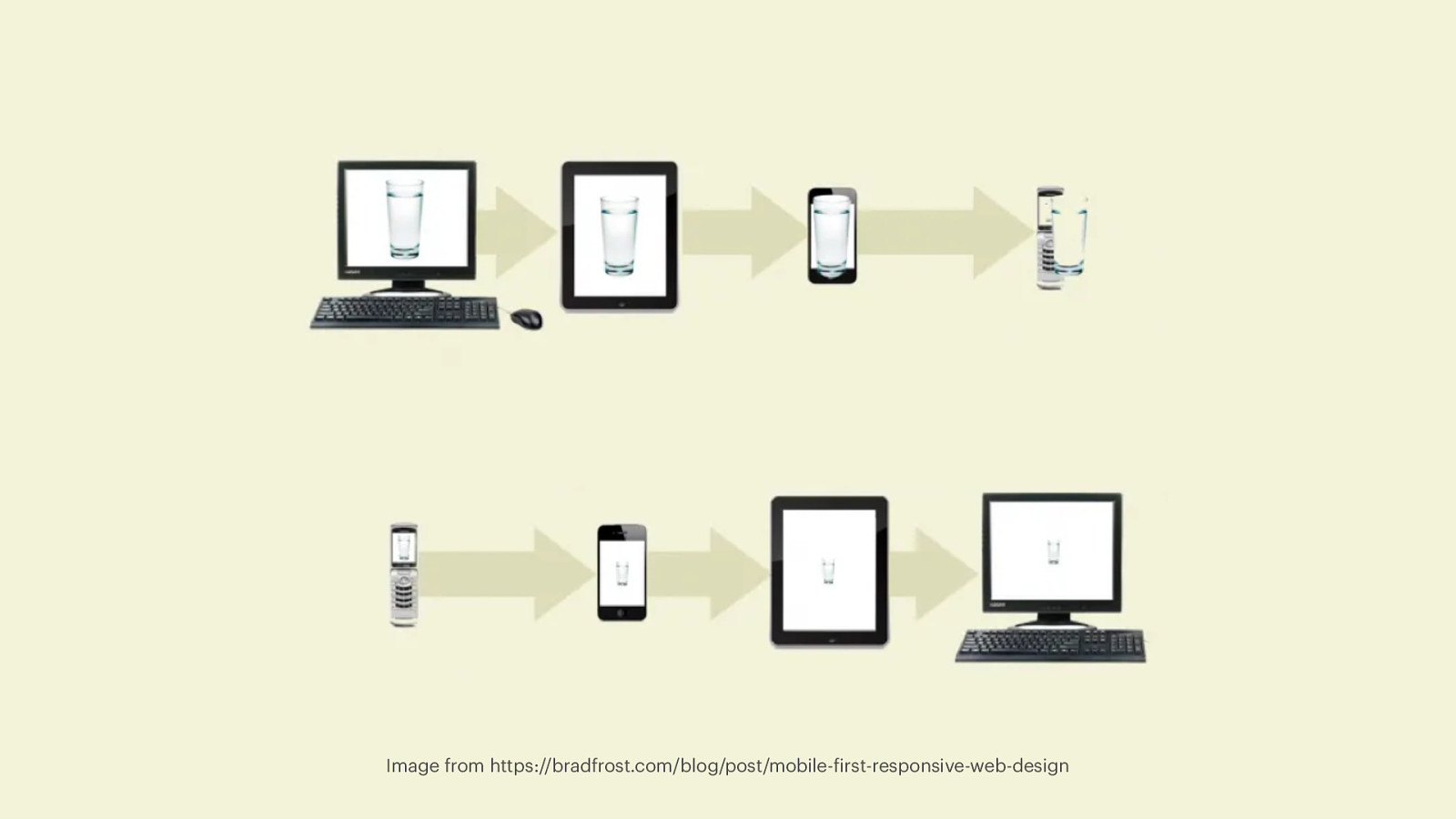
Image from https://bradfrost.com/blog/post/mobile-first-responsive-web-design
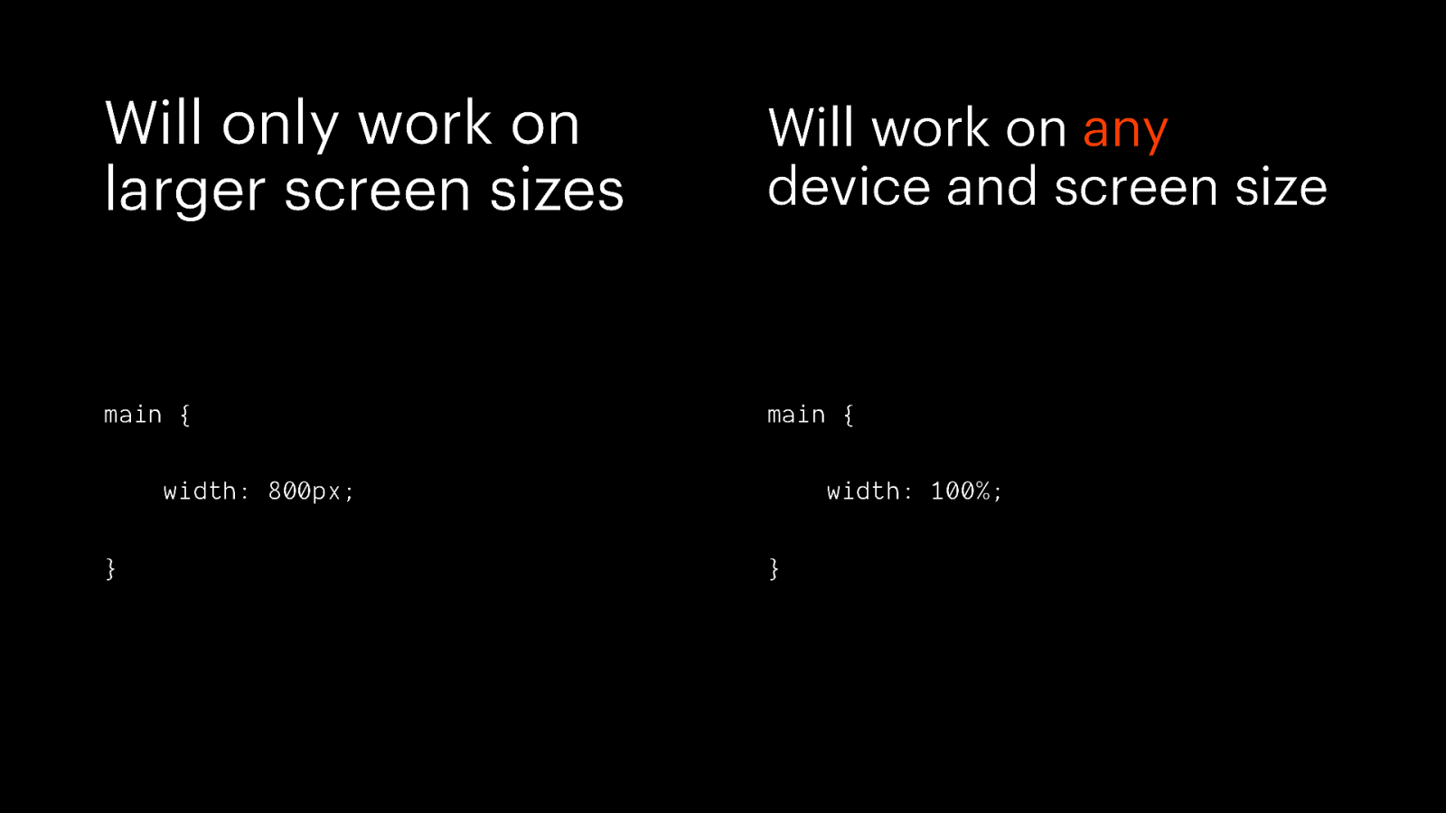
Will only work on larger screen sizes Will work on any device and screen size main { main { width: 800px; } width: 100%; }
Don’t be afraid to use the “old thing”

doineedtouse > caniuse
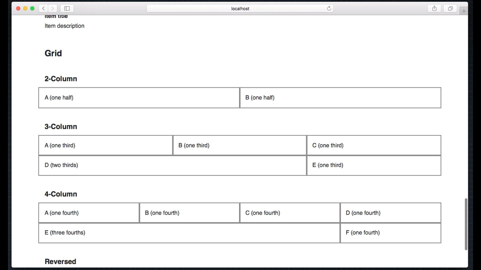
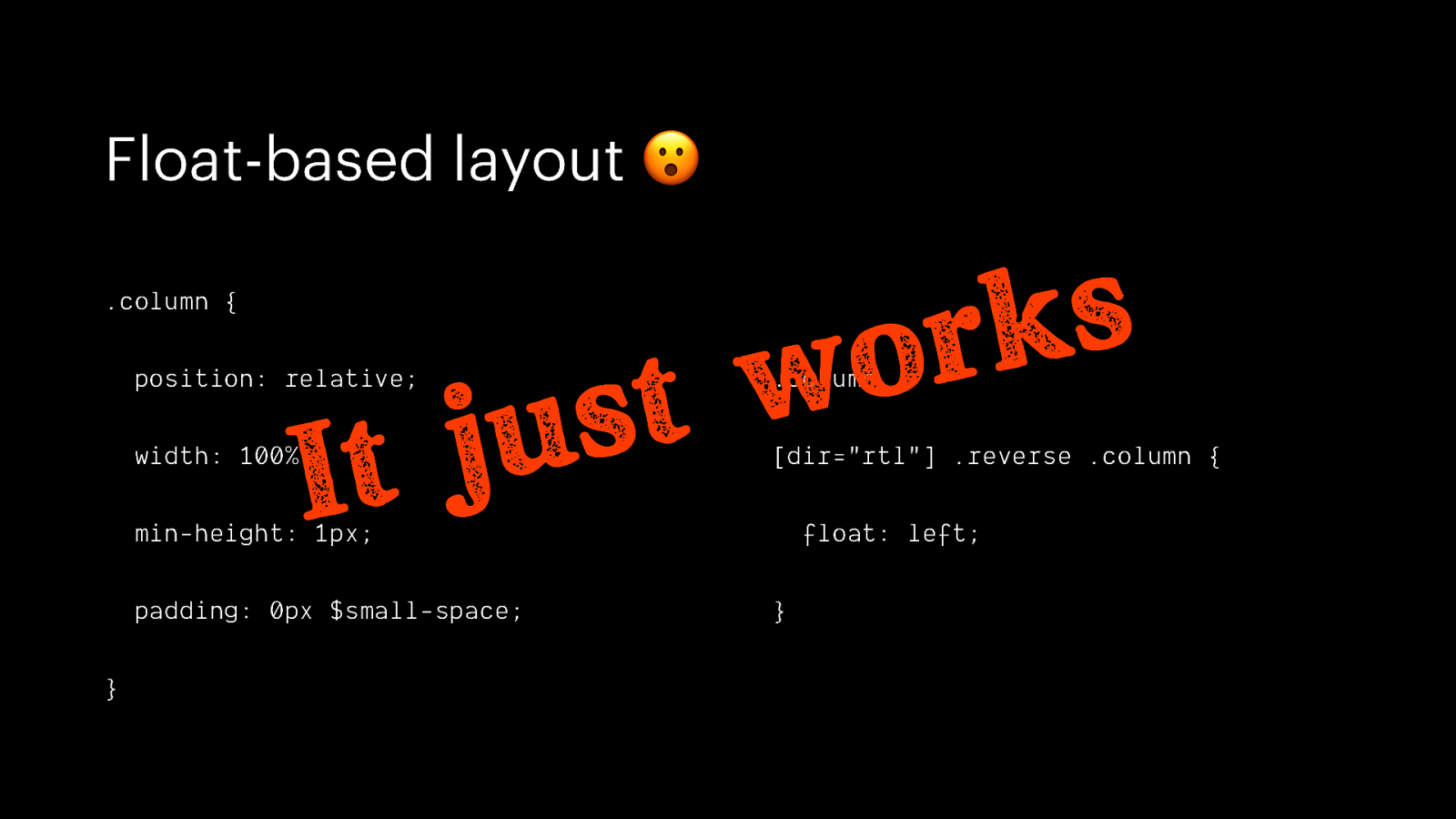
Float-based layout 😮 s k r o .column { w t s u j It position: relative; .column, width: 100%; [dir=”rtl”] .reverse .column { min-height: 1px; padding: 0px $small-space; } float: left; }
The goal of web design is not merely to dazzle, but to deliver information to the widest audience — Stephen Champeon http://hesketh.com/publications/inclusive_web_design_for_the_future/
Ok, but what if I do need to use the “new thing”? 🥺

Use feature queries!
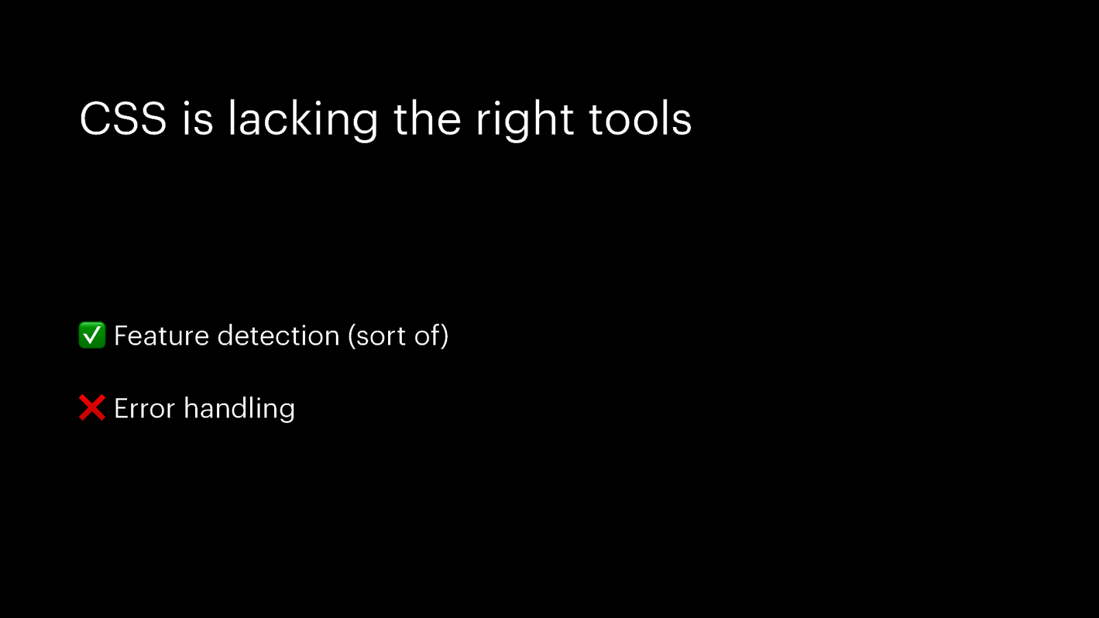
CSS is lacking the right tools ✅ Feature detection (sort of) ❌ Error handling
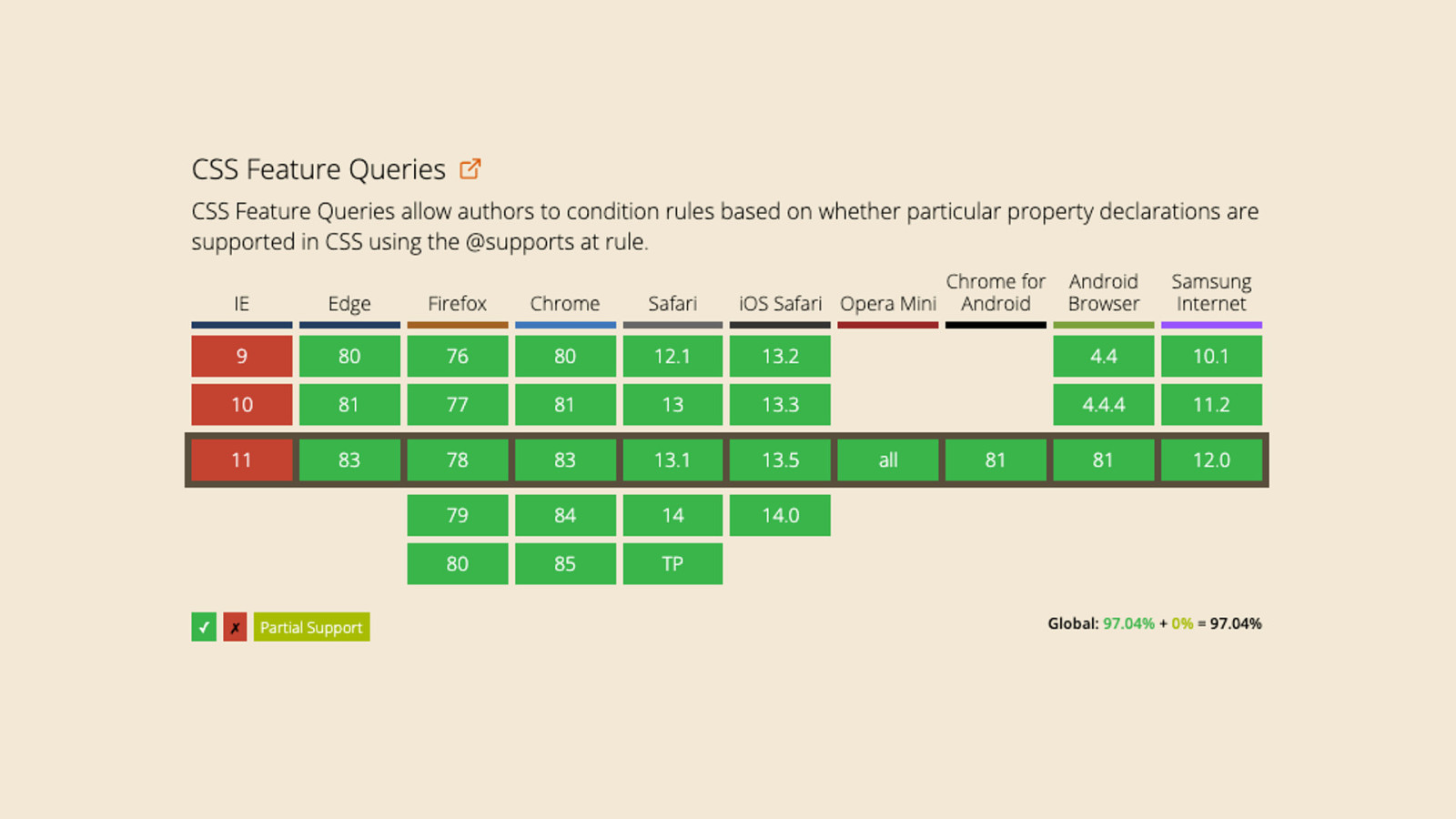
Feature queries allow us to condition rules based on whether particular CSS declarations are supported by the current browser

@supports ( declaration ) { /*” … */$ }
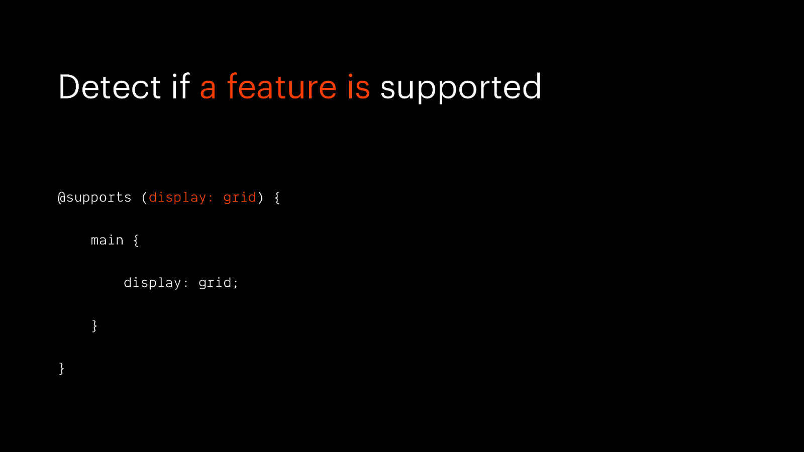
Detect if a feature is supported @supports (display: grid) { main { display: grid; } }
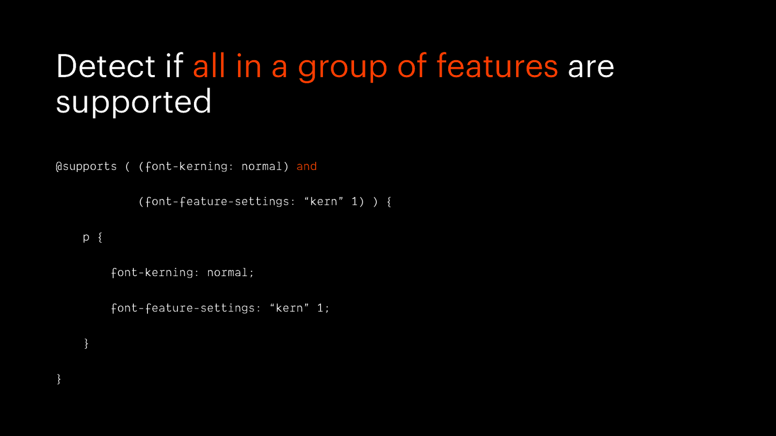
Detect if all in a group of features are supported @supports ( (font-kerning: normal) and (font-feature-settings: “kern” 1) ) { p { font-kerning: normal; font-feature-settings: “kern” 1; } }
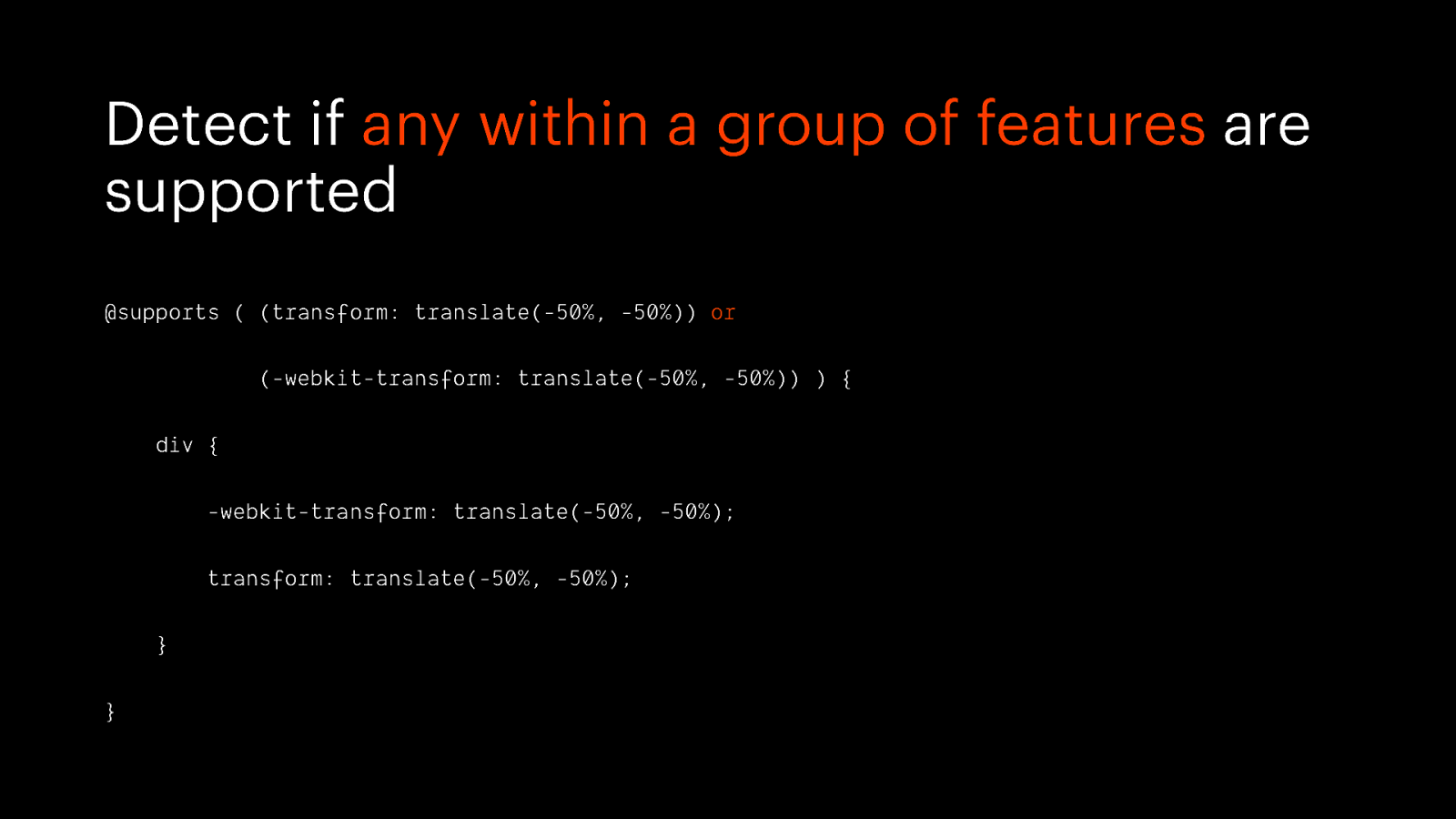
Detect if any within a group of features are supported @supports ( (transform: translate(-50%, -50%)) or (-webkit-transform: translate(-50%, -50%)) ) { div { -webkit-transform: translate(-50%, -50%); transform: translate(-50%, -50%); } }
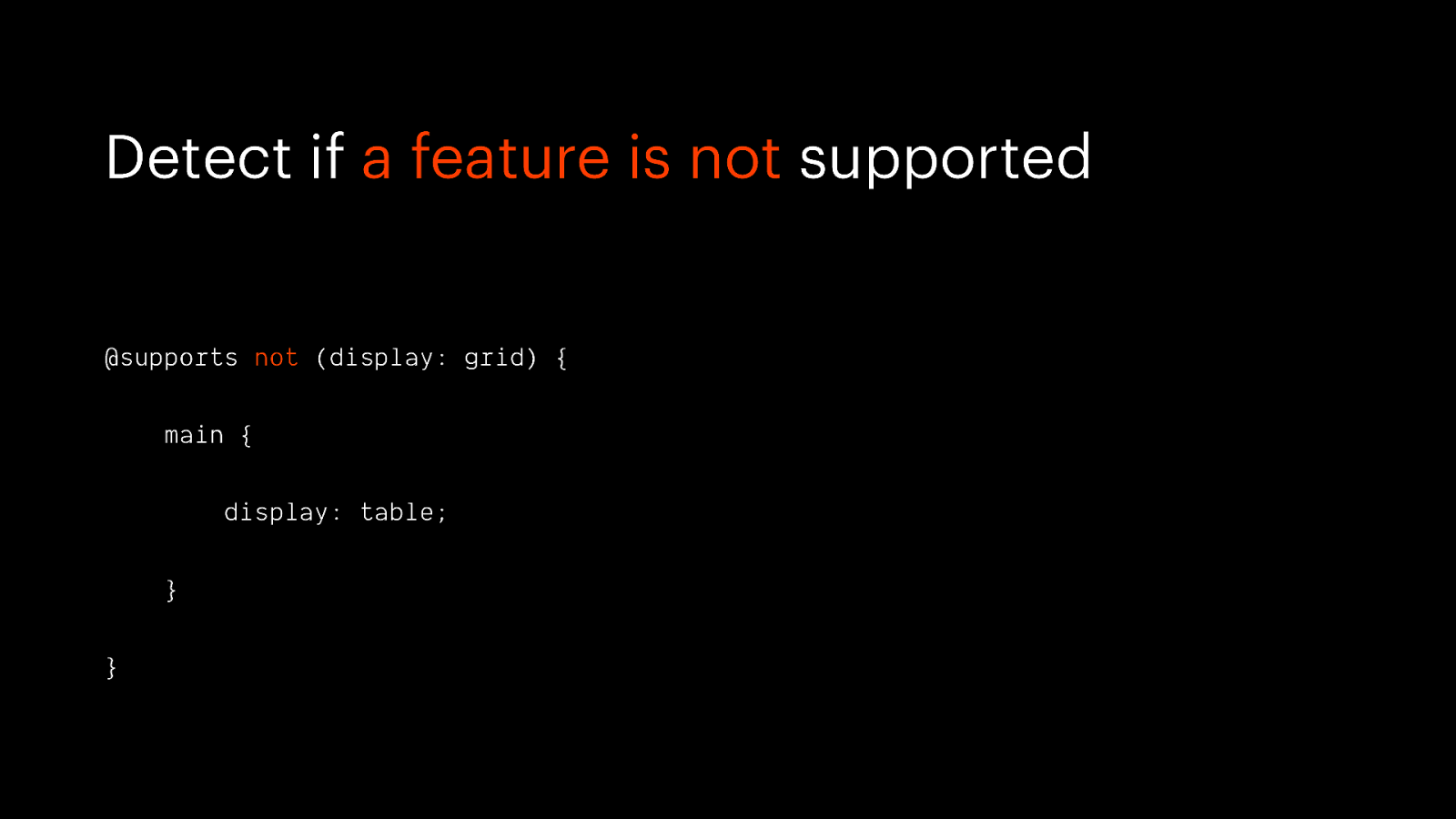
Detect if a feature is not supported @supports not (display: grid) { main { display: table; } }
Use feature queries as an enhancement
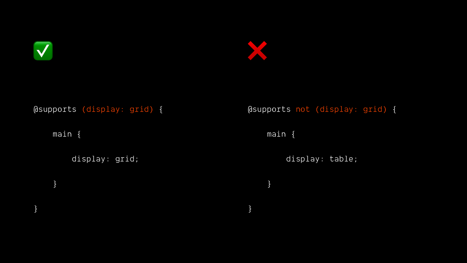
✅ ❌ @supports (display: grid) { @supports not (display: grid) { main { main { display: grid; display: table; } } } }
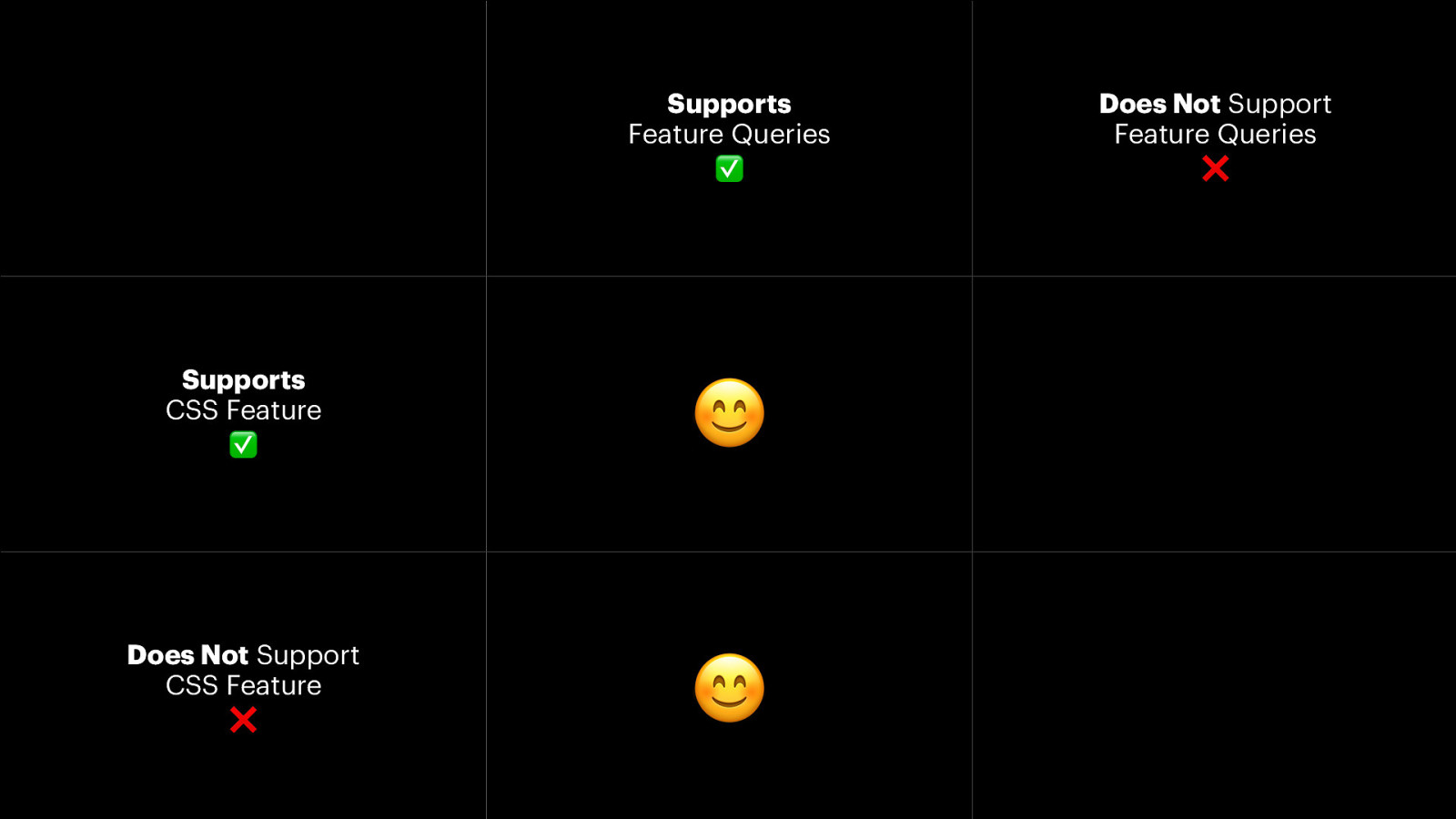
Supports Feature Queries ✅ Supports CSS Feature ✅ 😊 Does Not Support CSS Feature ❌ 😊 Does Not Support Feature Queries ❌
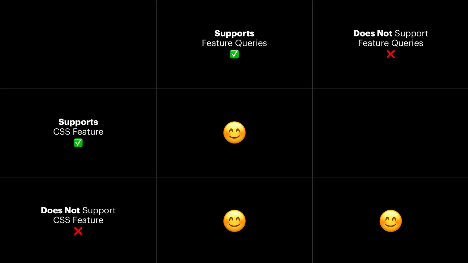
Supports Feature Queries ✅ Supports CSS Feature ✅ 😊 Does Not Support CSS Feature ❌ 😊 Does Not Support Feature Queries ❌ 😊
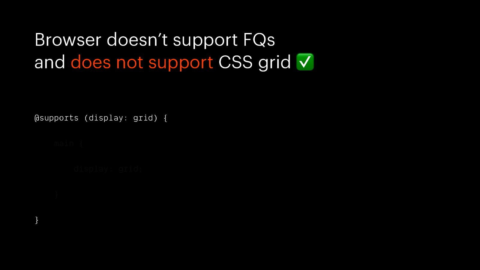
Browser doesn’t support FQs and does not support CSS grid ✅ @supports (display: grid) { main { display: grid; } }
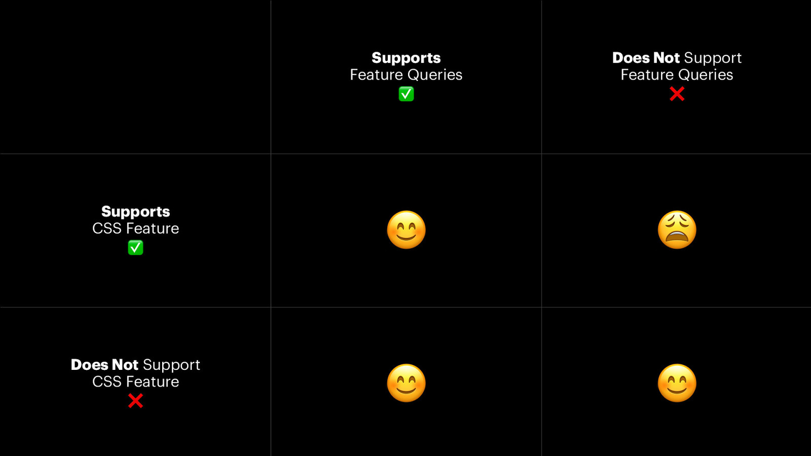
Supports Feature Queries ✅ Does Not Support Feature Queries ❌ Supports CSS Feature ✅ 😊 😩 Does Not Support CSS Feature ❌ 😊 😊
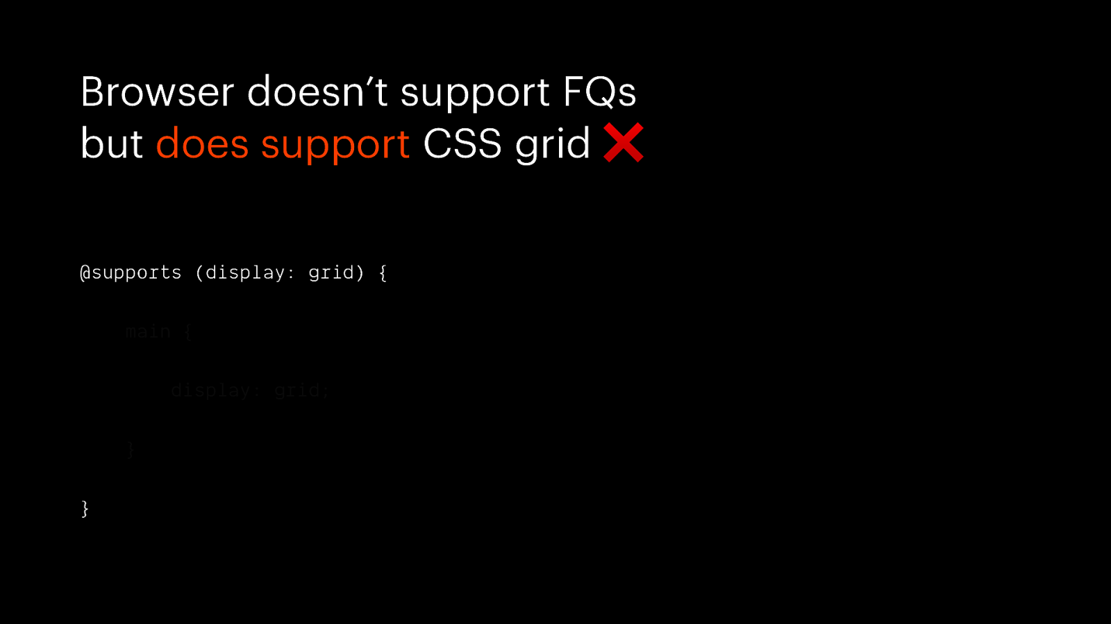
Browser doesn’t support FQs but does support CSS grid ❌ @supports (display: grid) { main { display: grid; } }
What will users look like in the future ?

MORE PEOPLE
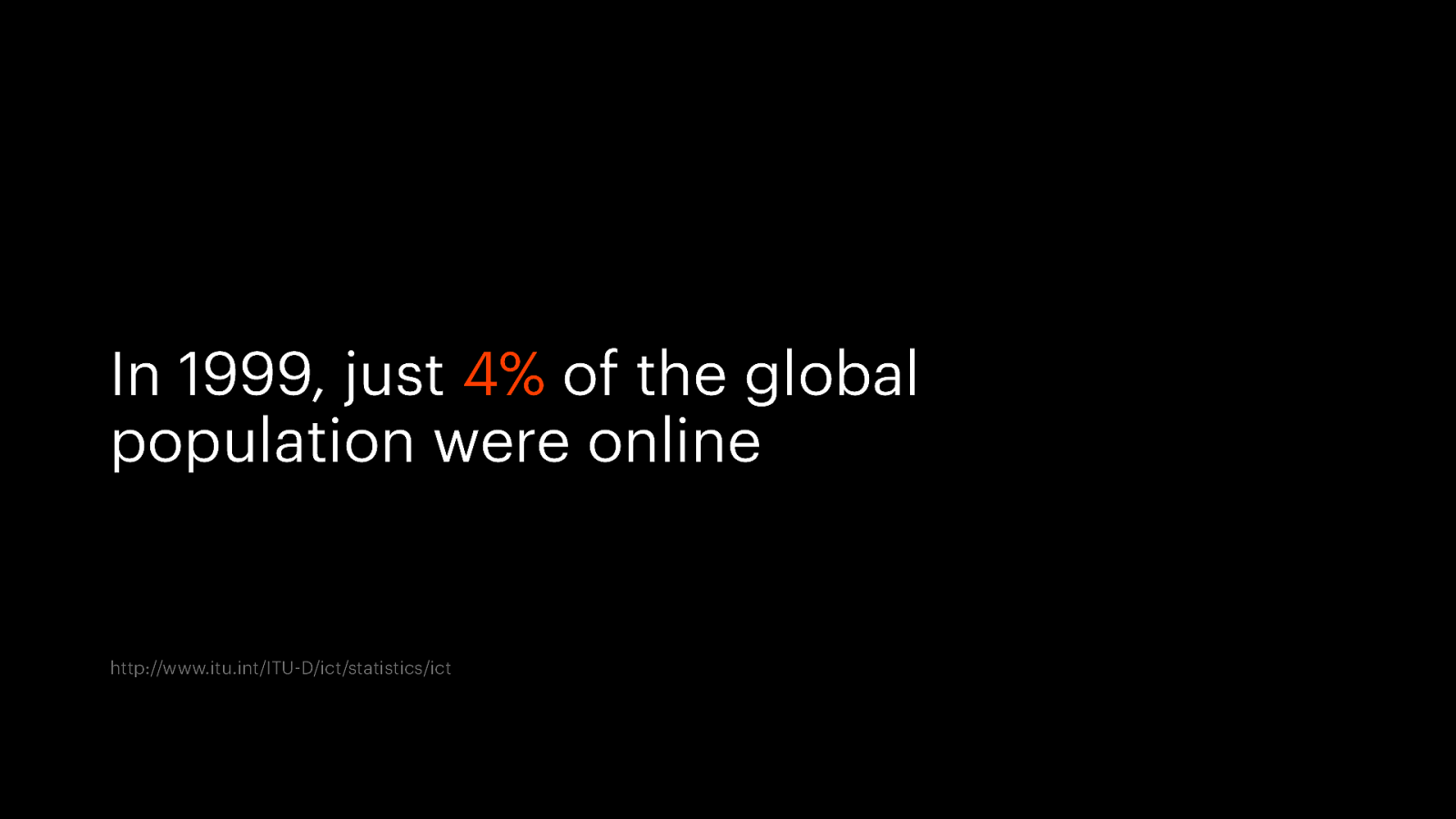
In 1999, just 4% of the global population were online http://www.itu.int/ITU-D/ict/statistics/ict
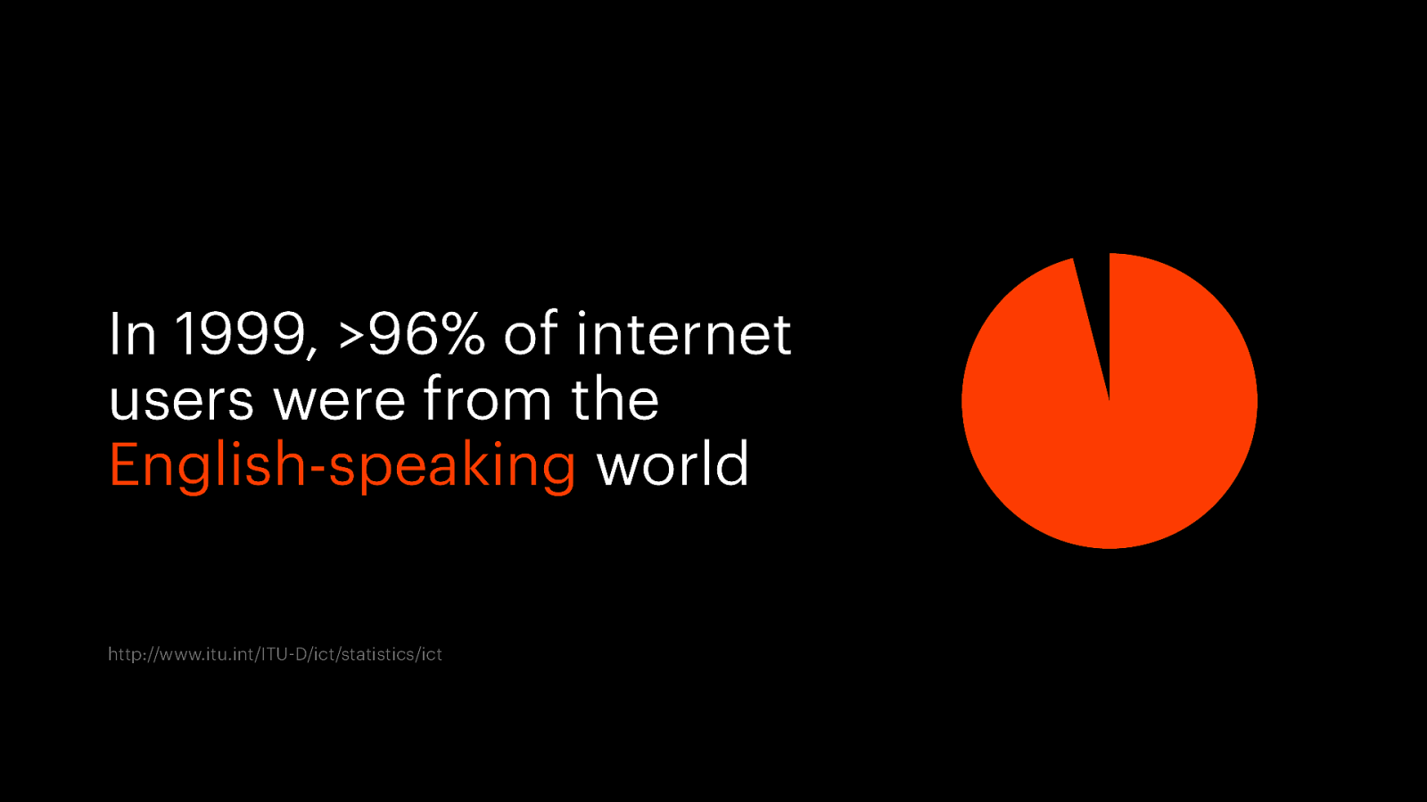
In 1999, >96% of internet users were from the English-speaking world http://www.itu.int/ITU-D/ict/statistics/ict
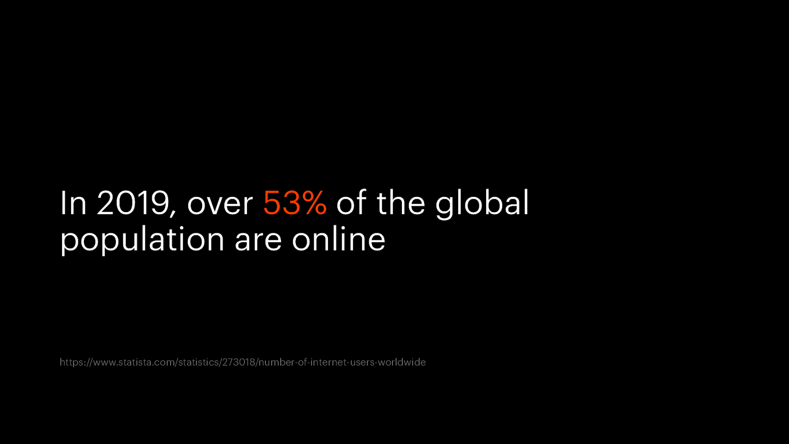
In 2019, over 53% of the global population are online https://www.statista.com/statistics/273018/number-of-internet-users-worldwide
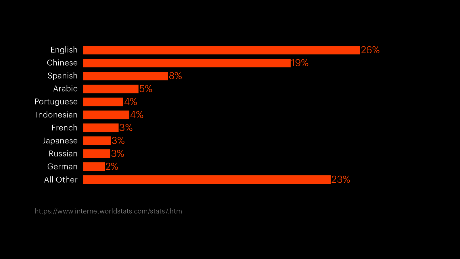
26% English 19% Chinese 8% Spanish Arabic Portuguese Indonesian French Japanese Russian German 5% 4% 4% 3% 3% 3% 2% 23% All Other 0.00 0.08 https://www.internetworldstats.com/stats7.htm 0.15 0.23 0.30
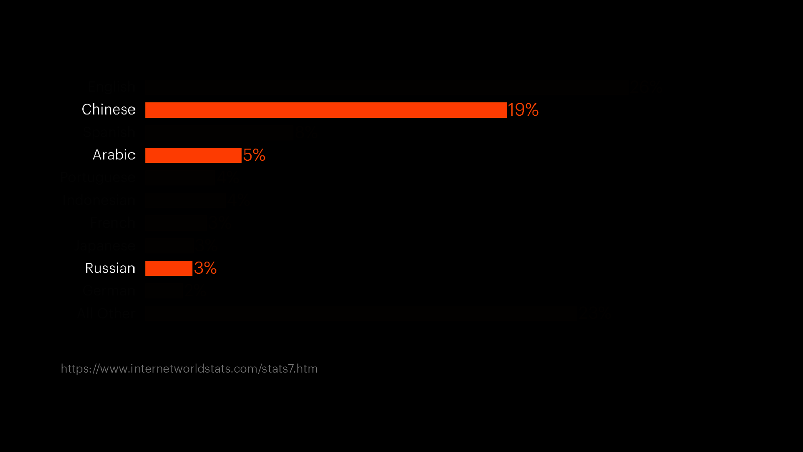
26% English 19% Chinese 8% Spanish Arabic Portuguese Indonesian French Japanese Russian German 5% 4% 4% 3% 3% 3% 2% 23% All Other 0.00 0.08 https://www.internetworldstats.com/stats7.htm 0.15 0.23 0.30

Русский использует совершенно другой алфавит

تتم قراءة اللغة العربية من اليمني إلى اليسار

和 从 上 到 下 阅 读 中 ⽂ 可 以 从 右 到 左

internationalisation

direction & writing-mode & text-orientation & unicode-bidi
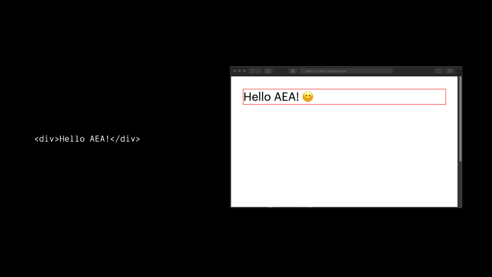
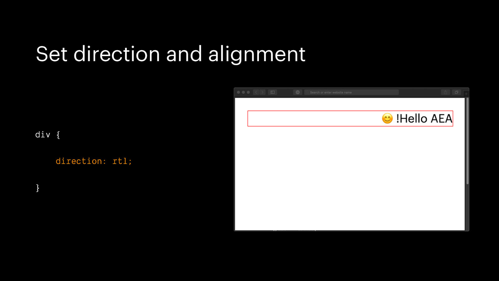
Set direction and alignment div { direction: rtl; }
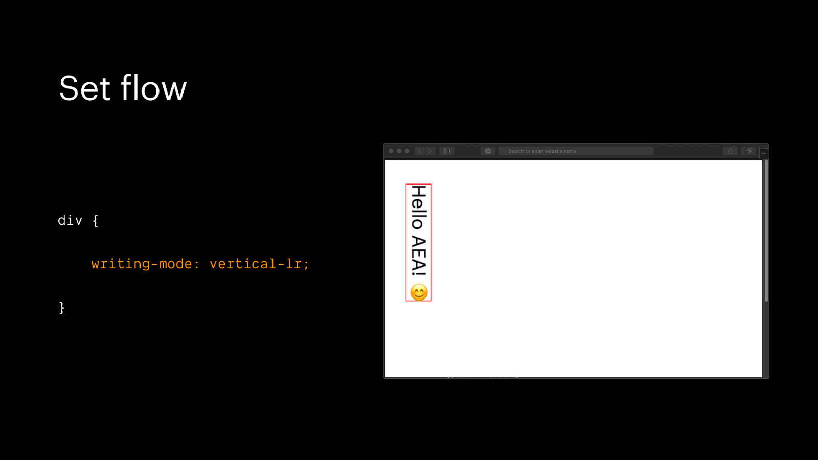
Set flow div { writing-mode: vertical-lr; }
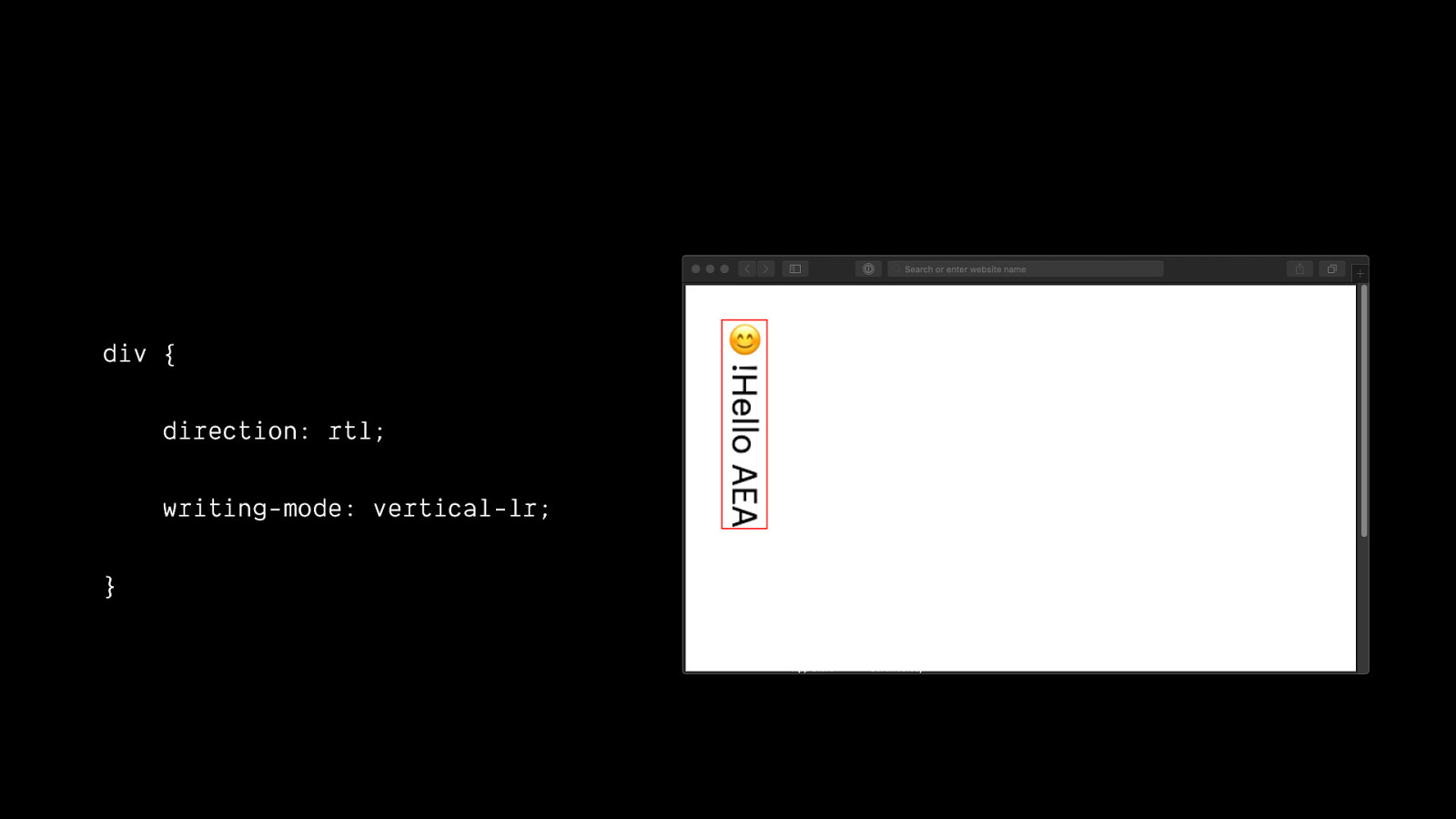
div { direction: rtl; writing-mode: vertical-lr; }
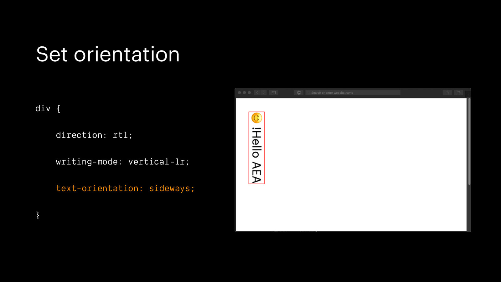
Set orientation div { direction: rtl; writing-mode: vertical-lr; text-orientation: sideways; }
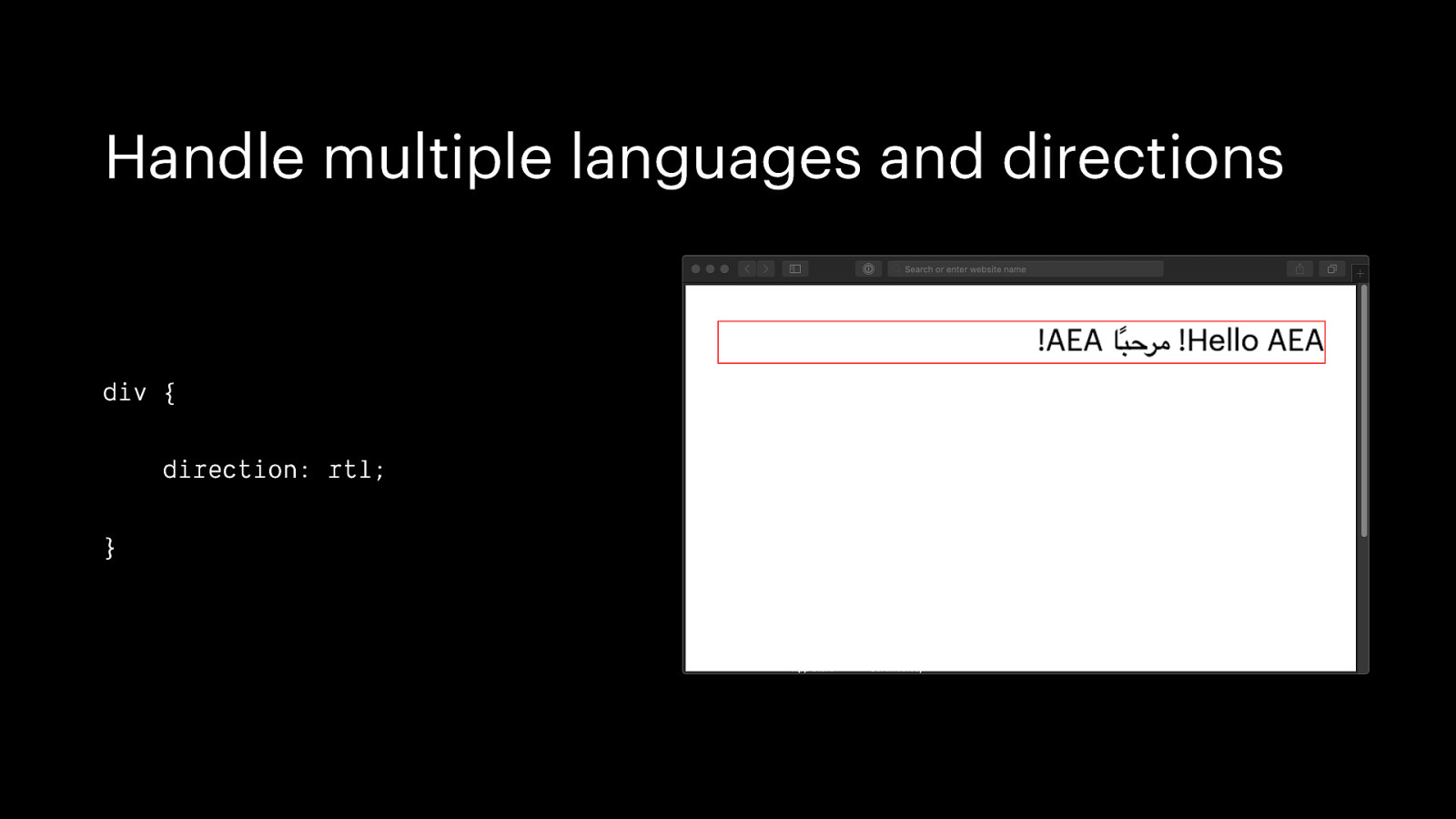
Handle multiple languages and directions div { direction: rtl; }
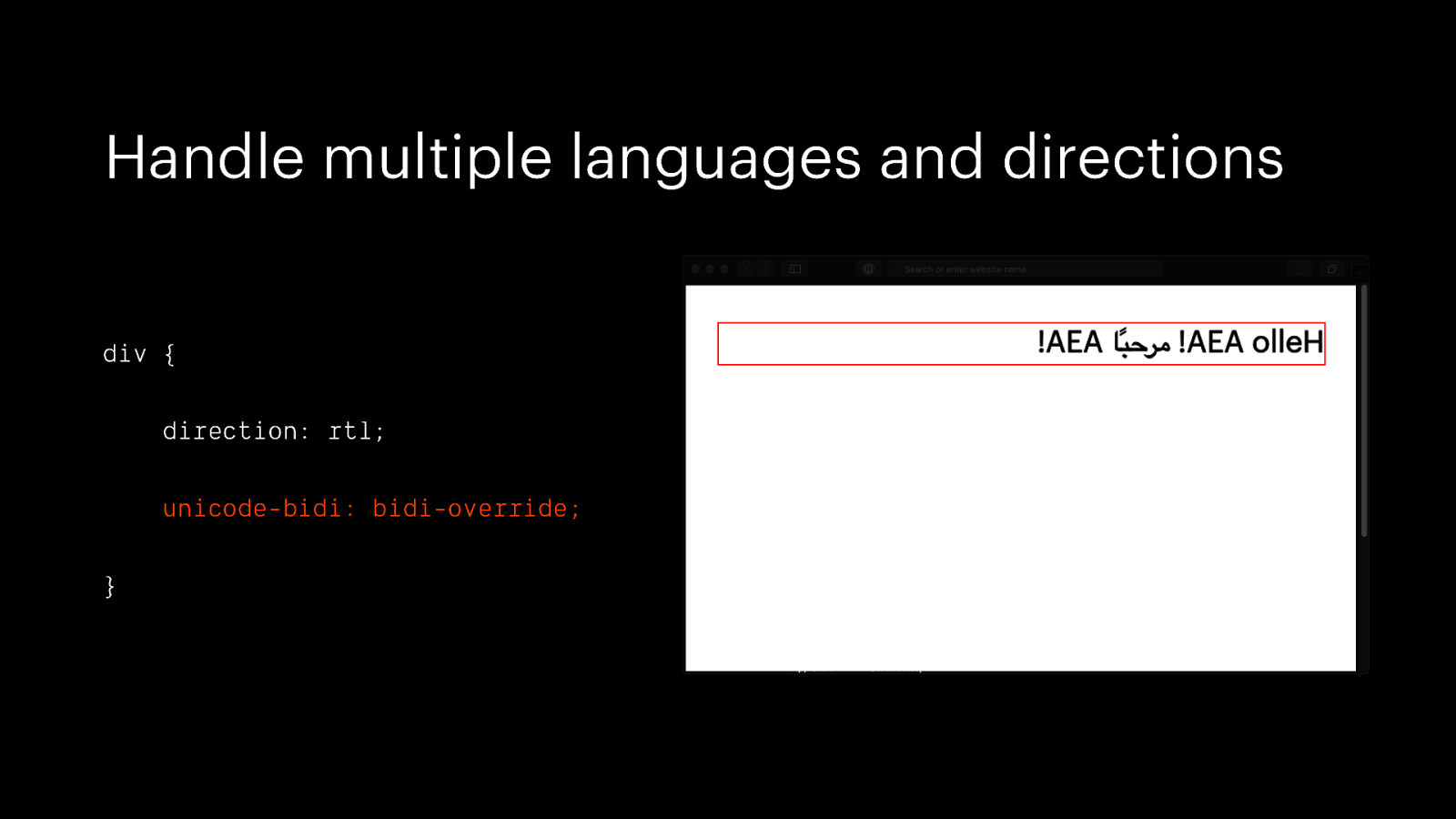
Handle multiple languages and directions div { direction: rtl; unicode-bidi: bidi-override; }
Use logical CSS properties
CSS has, so far, largely been written for English alone ☹
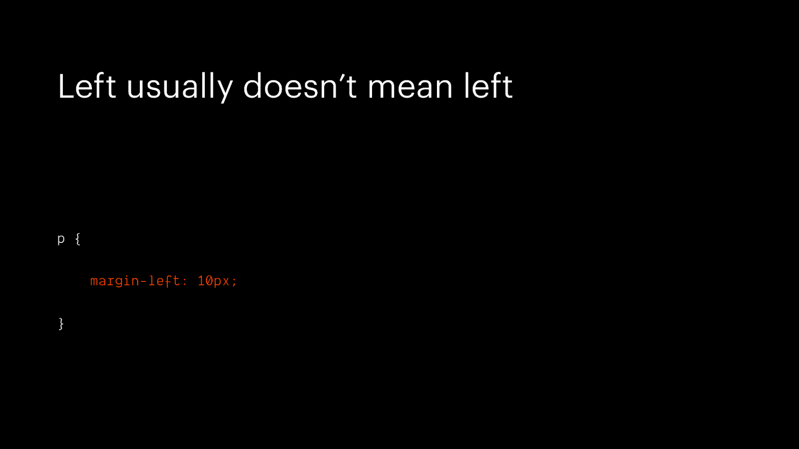
Left usually doesn’t mean left p { margin-left: 10px; }
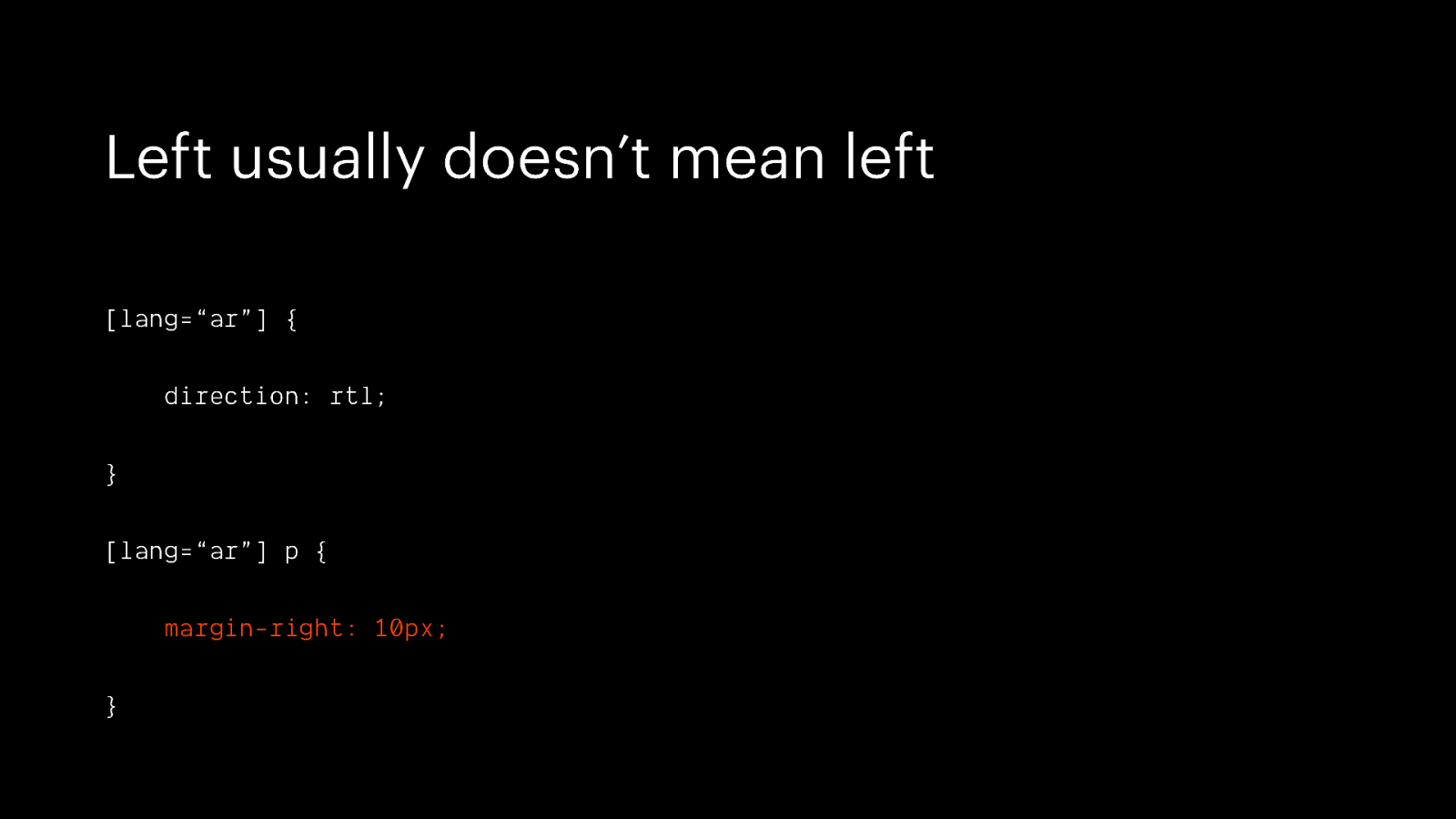
Left usually doesn’t mean left [lang=“ar”] { direction: rtl; } [lang=“ar”] p { margin-right: 10px; }
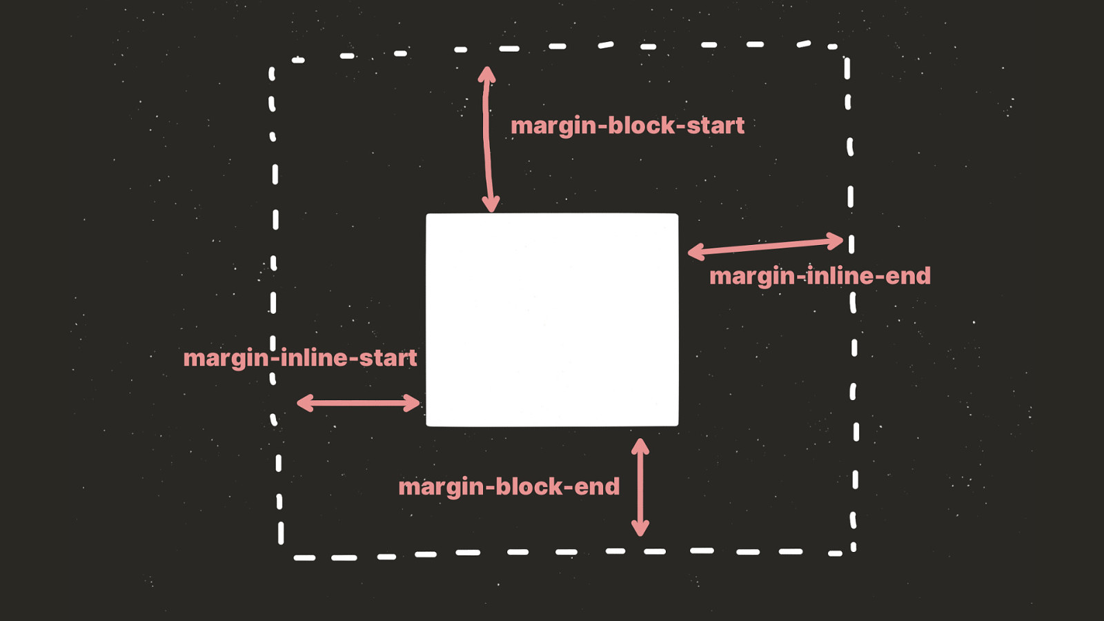
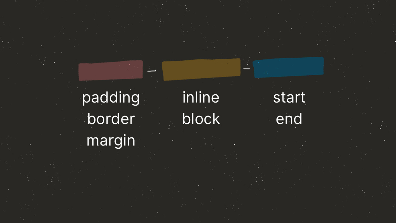

left inline-start p { margin-inline-start: 10px; }
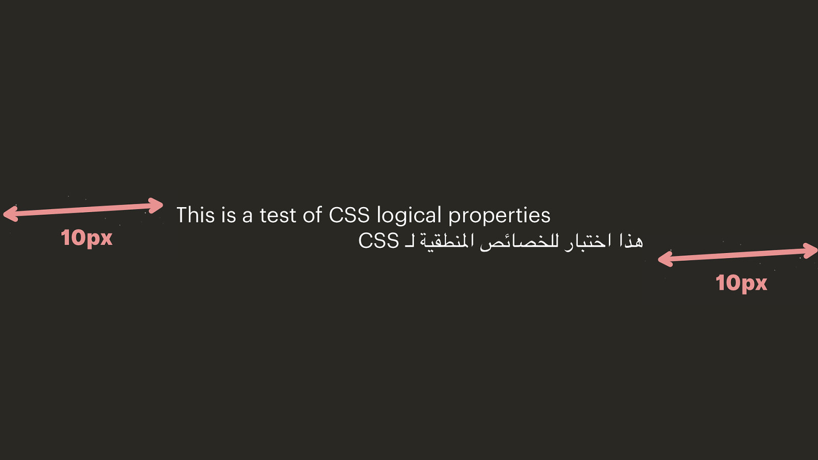
This is a test of CSS logical properties CSS هذا اختبار للخصائص املنطقية لـ

Use left when you actually mean left

Use logical naming conventions
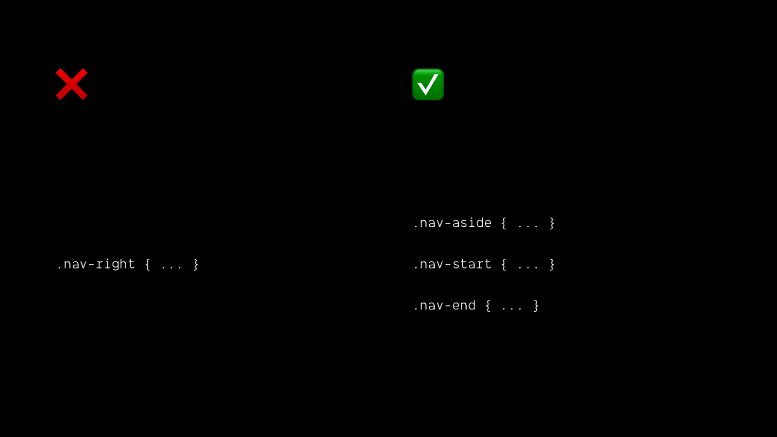
❌ ✅ .nav-aside { … } .nav-right { … } .nav-start { … } .nav-end { … }
More users = more variation in users
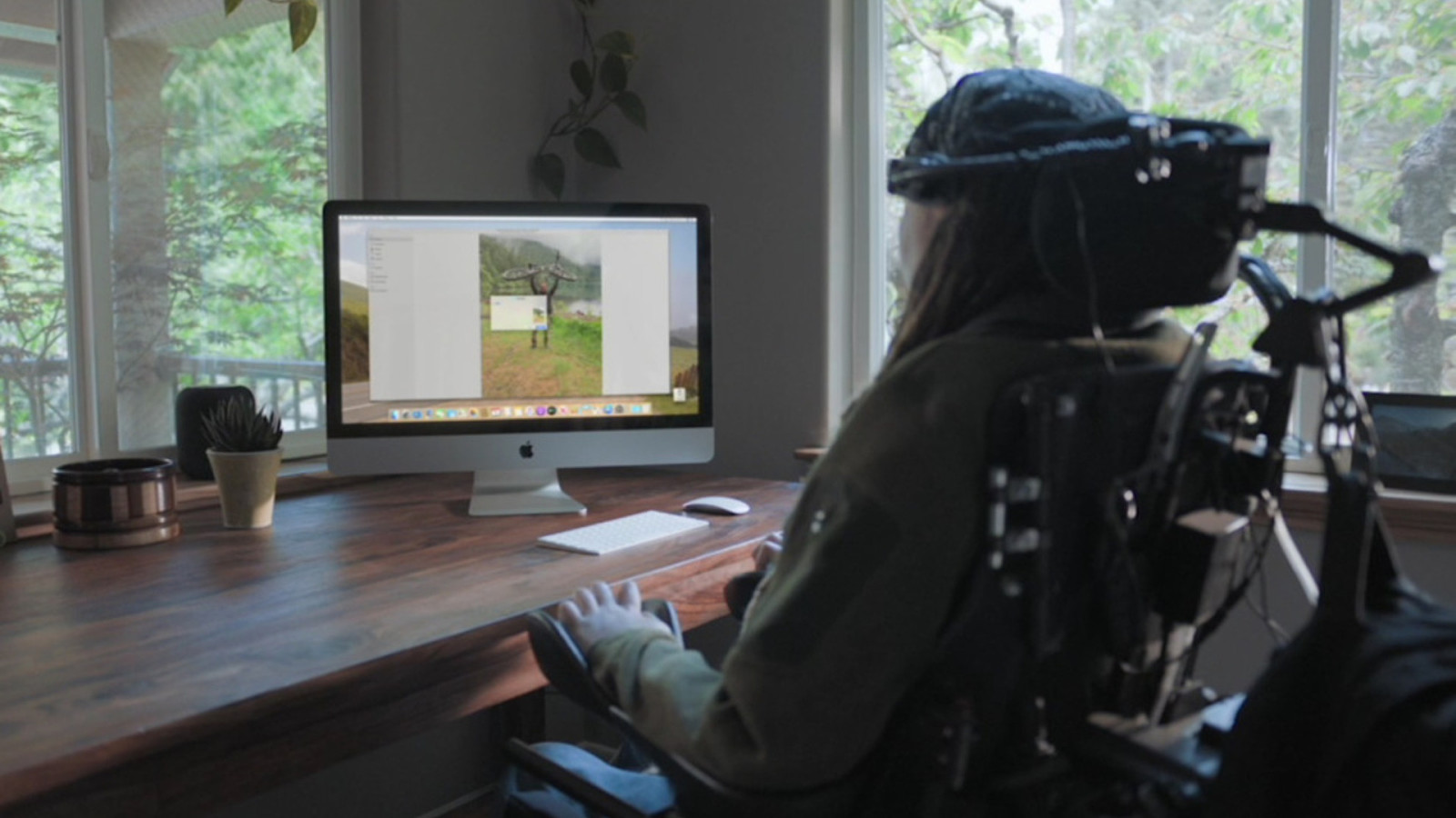
We can’t assume one type of user 👨💻👨💻👨💻👨💻👨💻👨💻👨💻👨💻👨💻👨💻👨💻👨💻👨💻


Image from https://www.maltron.com/store/p25/Maltron_Expanded_Keyboard_-_US_English.html

Image from https://theweco.com/motor-skill-related-disabilities-navigating-and-designing-websites
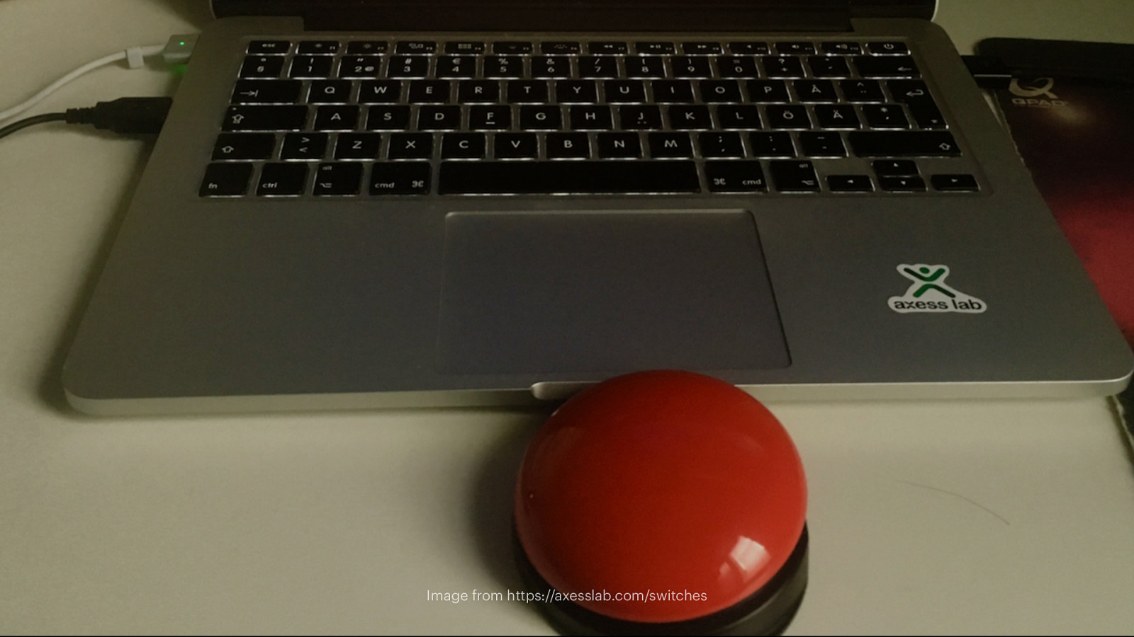
Image from https://axesslab.com/switches
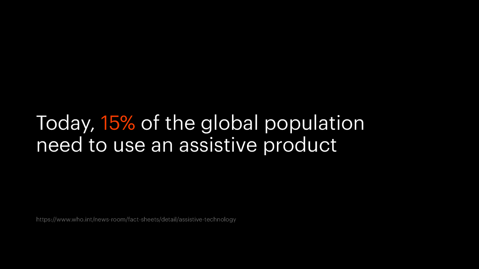
Today, 15% of the global population need to use an assistive product https://www.who.int/news-room/fact-sheets/detail/assistive-technology
Accessibility Image from https://design.google/library/designers-guide-accessibility-research
HTML is by default accessible. It’s our jobs, as developers, to not f😮ck that up. — @estellevw
Only use CSS for styling

Image from https://www.shopify.com/partners/blog/what-is-progressive-enhancement-and-why-should-you-care
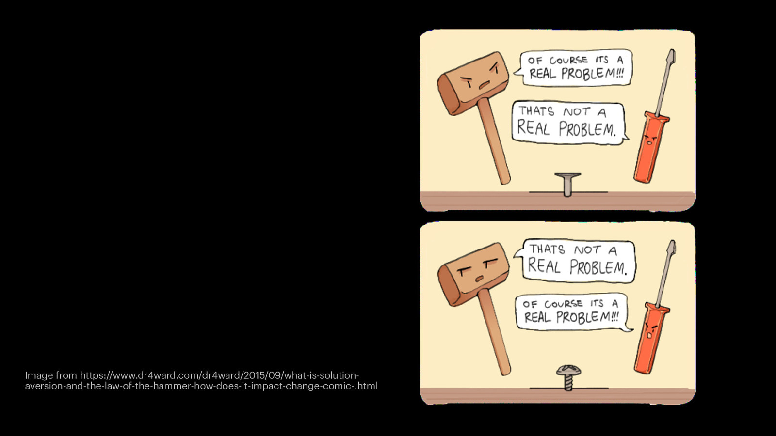
Image from https://www.dr4ward.com/dr4ward/2015/09/what-is-solutionaversion-and-the-law-of-the-hammer-how-does-it-impact-change-comic-.html
Don’t use CSS for content
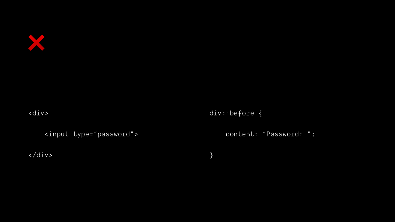
❌
<div> div::(before { <input type=“password”> </div> content: “Password: ”; }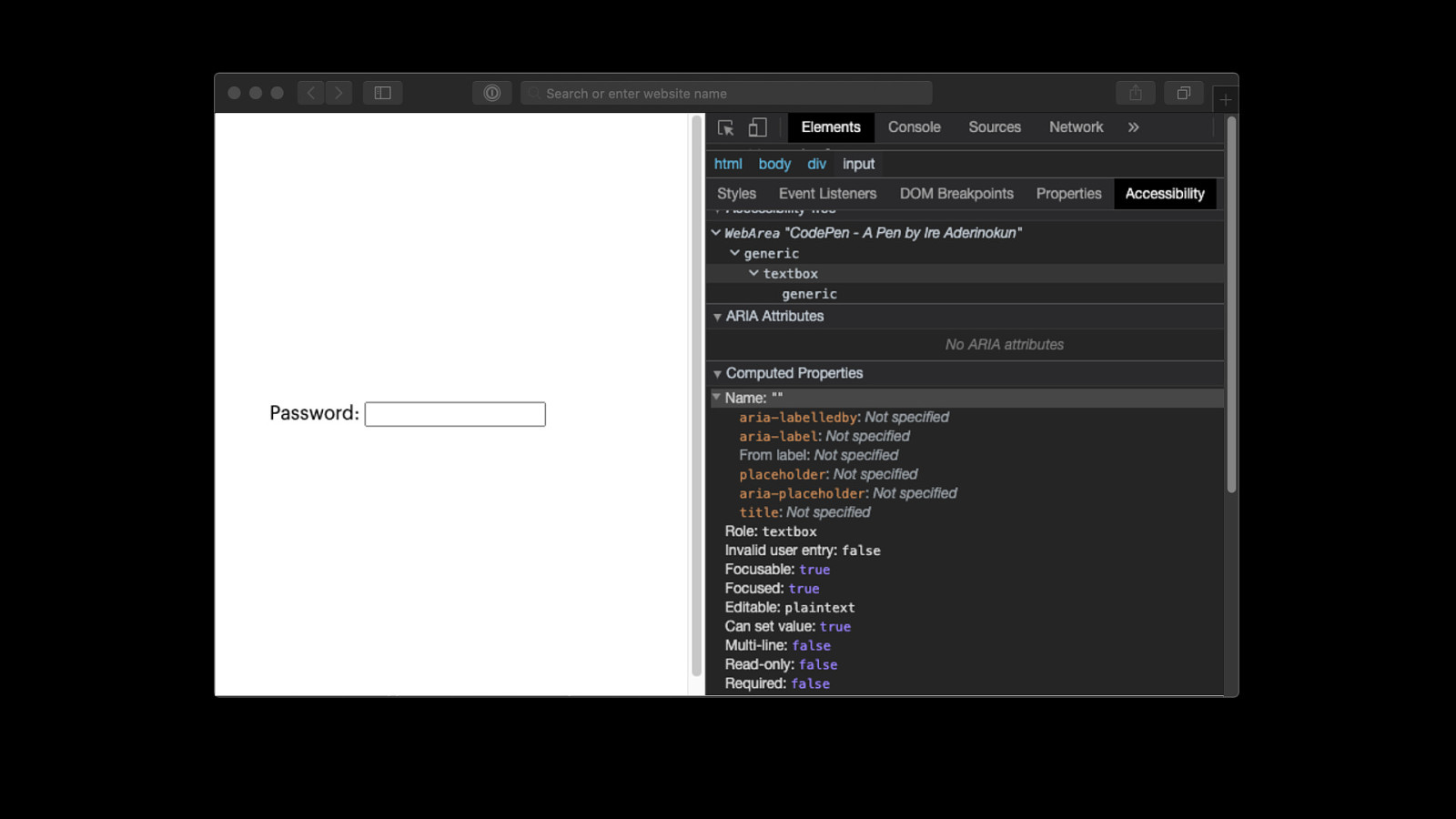
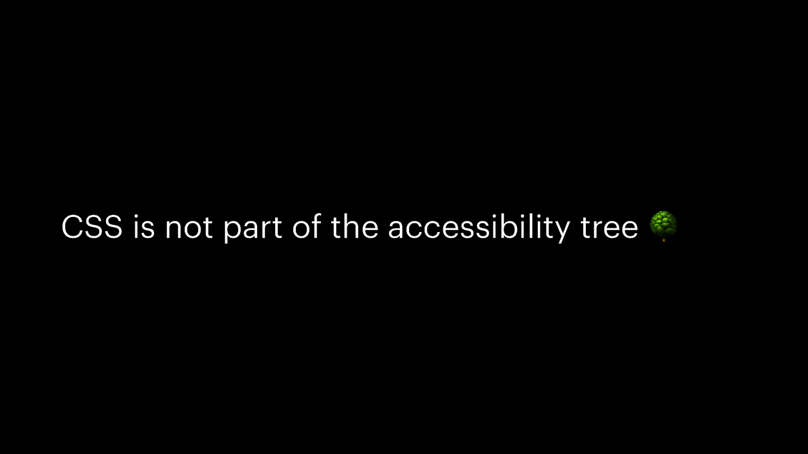
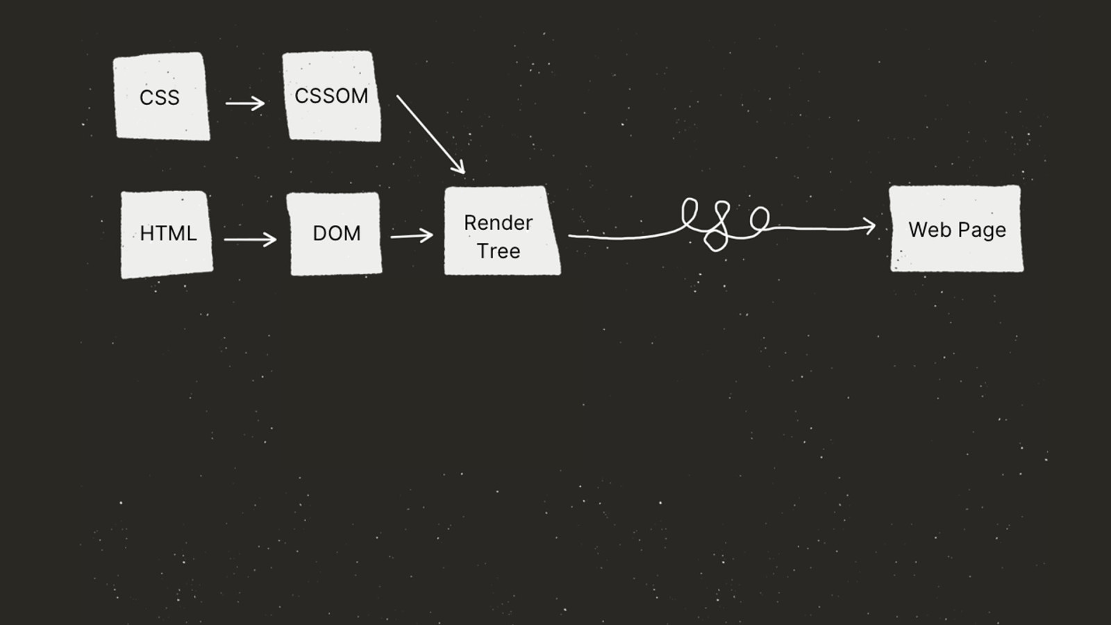
CSS is not part of the accessibility tree 🌳
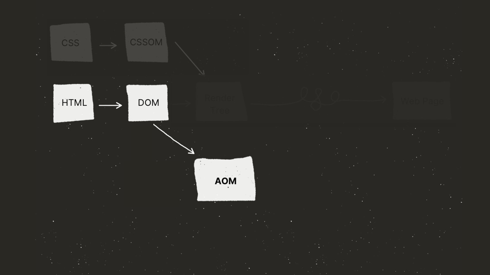

✅
<div> <label for=“pw”>Password</label> <input id=“pw” type=“password”> </div>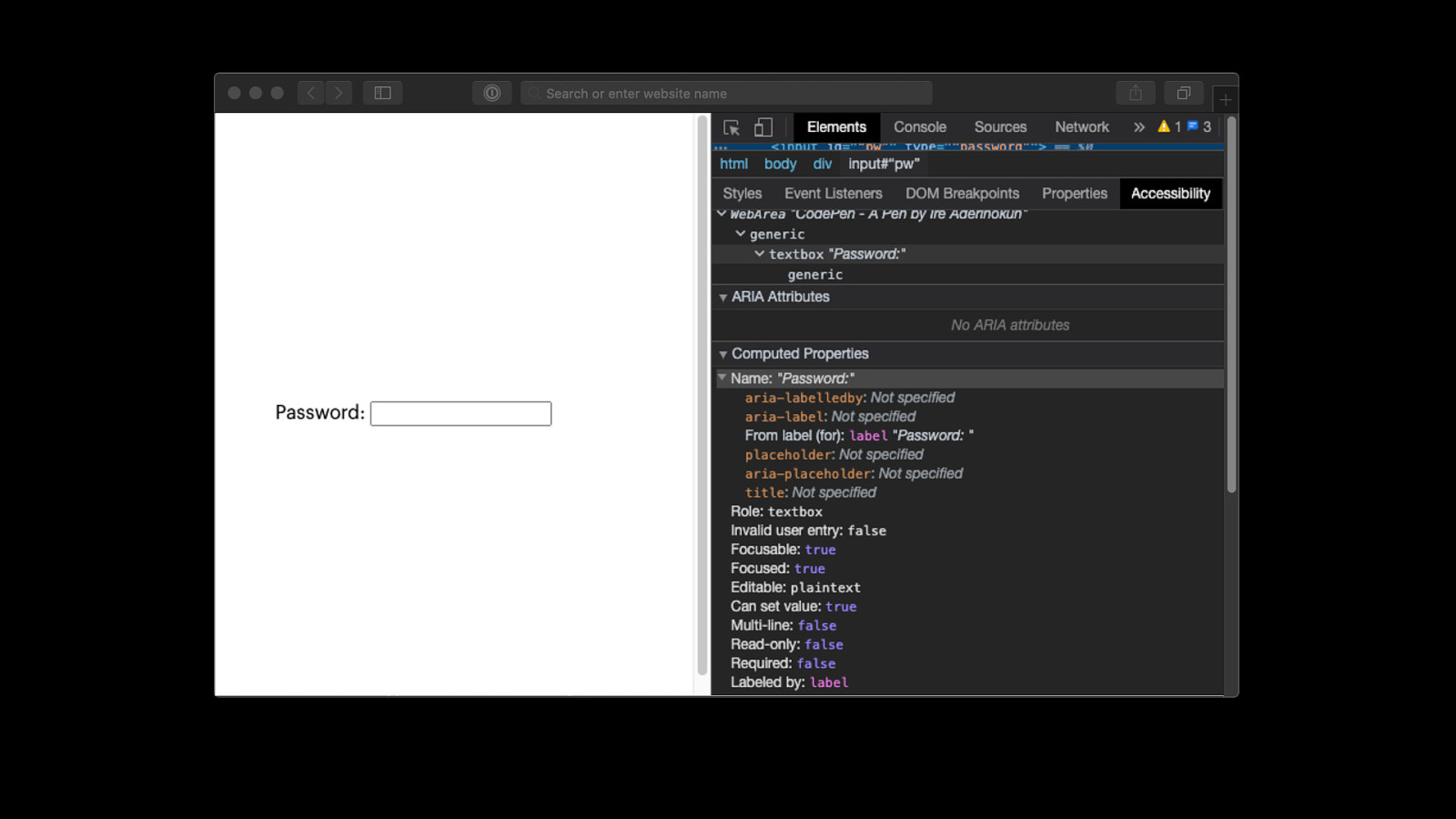
Don’t use CSS for functionality
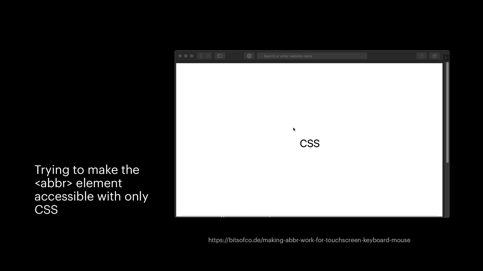
Trying to make the <abbr> element accessible with only CSS https://bitsofco.de/making-abbr-work-for-touchscreen-keyboard-mouse
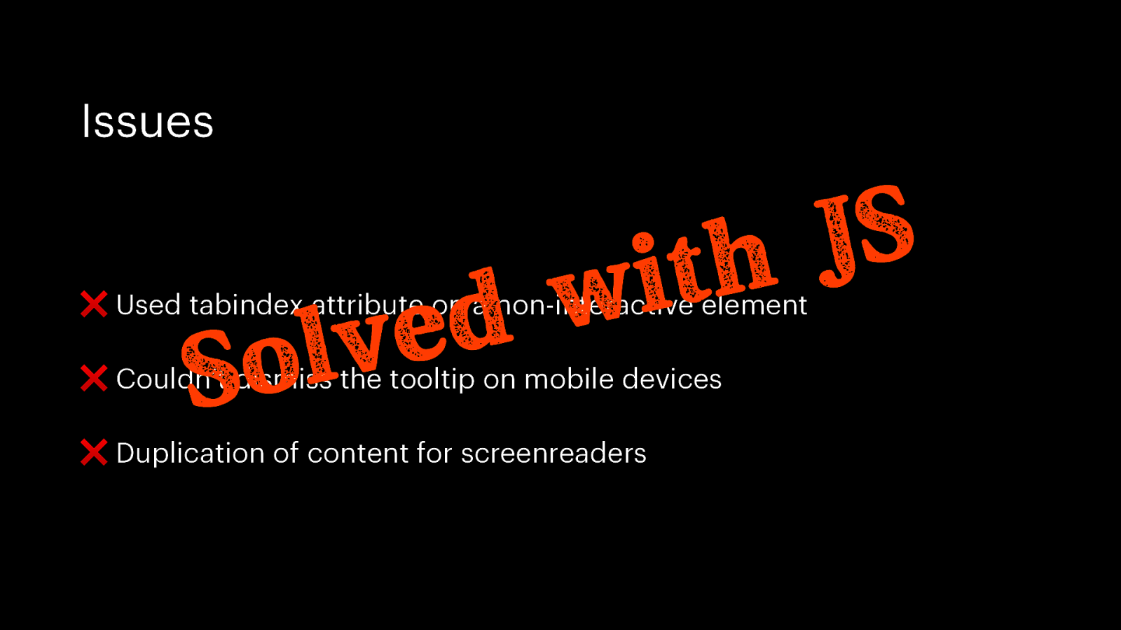
Issues S J h t i w d e v l o S ❌ Used tabindex attribute on a non-interactive element ❌ Couldn’t dismiss the tooltip on mobile devices ❌ Duplication of content for screenreaders

Change, don’t undo, the default accessible styles
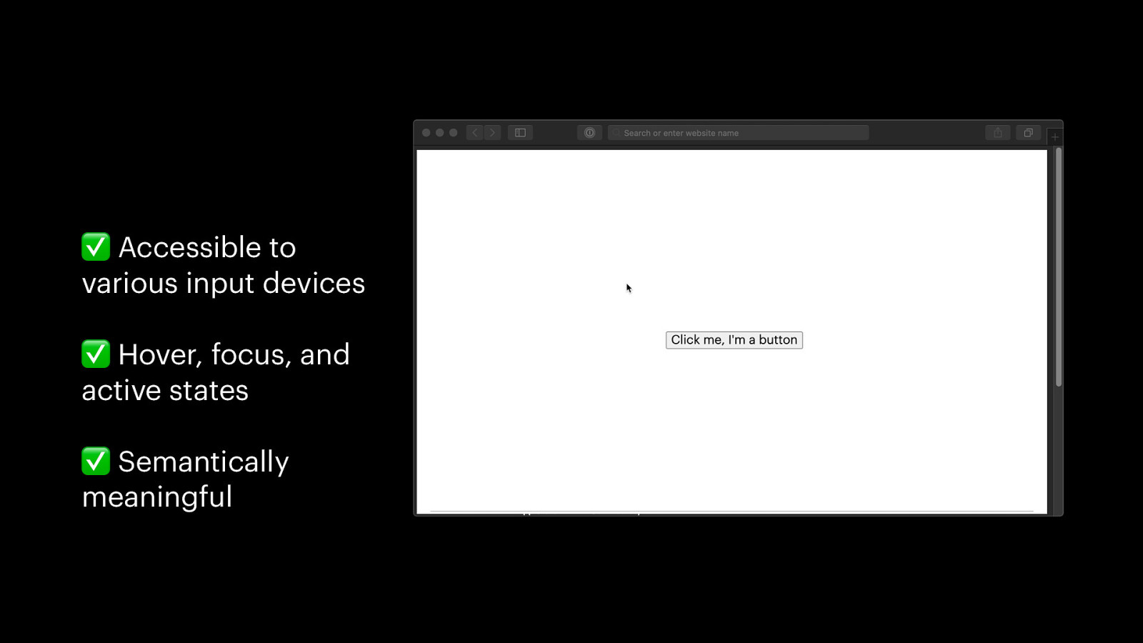
✅ Accessible to various input devices ✅ Hover, focus, and active states ✅ Semantically meaningful
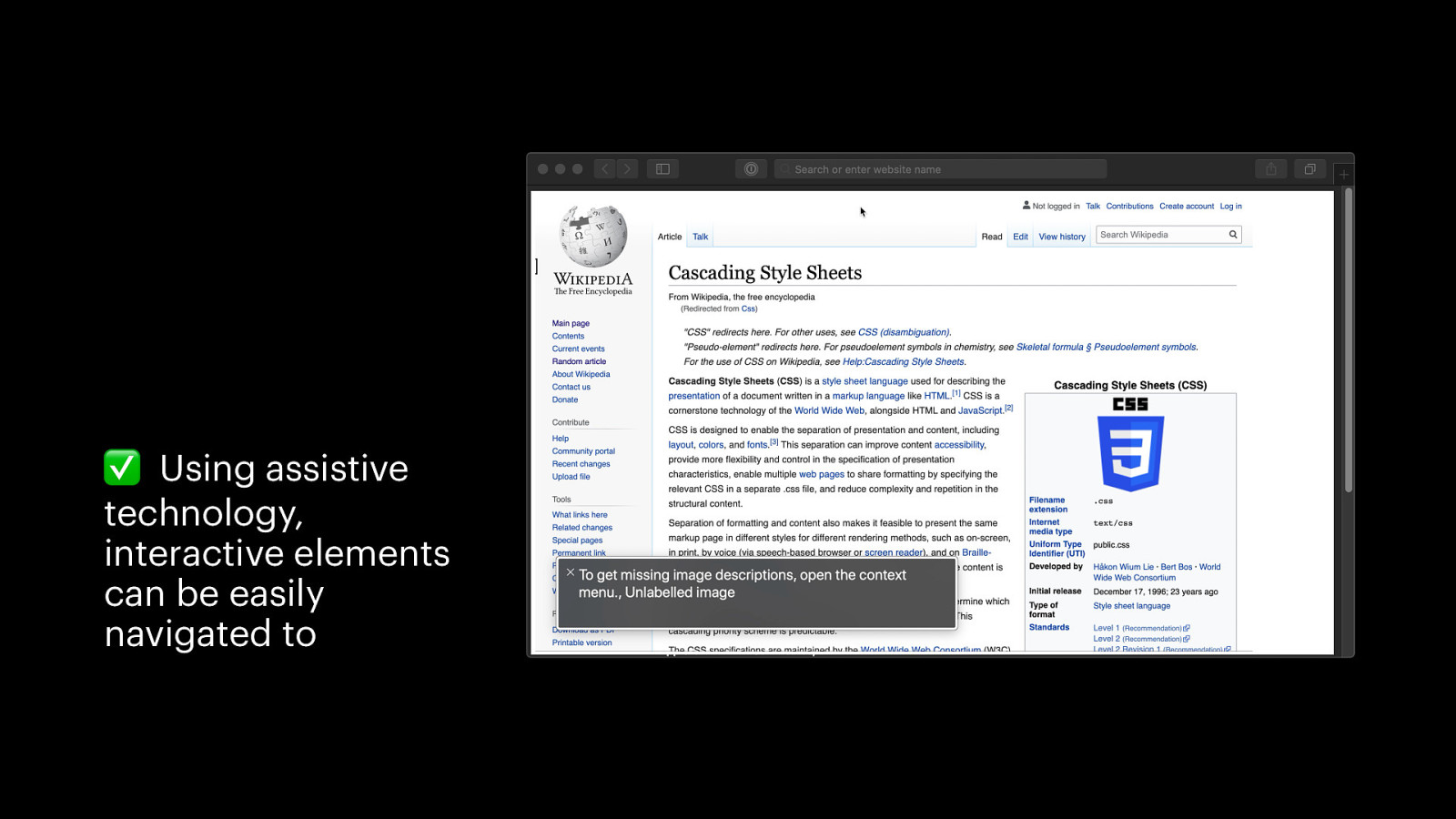
✅ Using assistive technology, interactive elements can be easily navigated to
We can still change the default styles
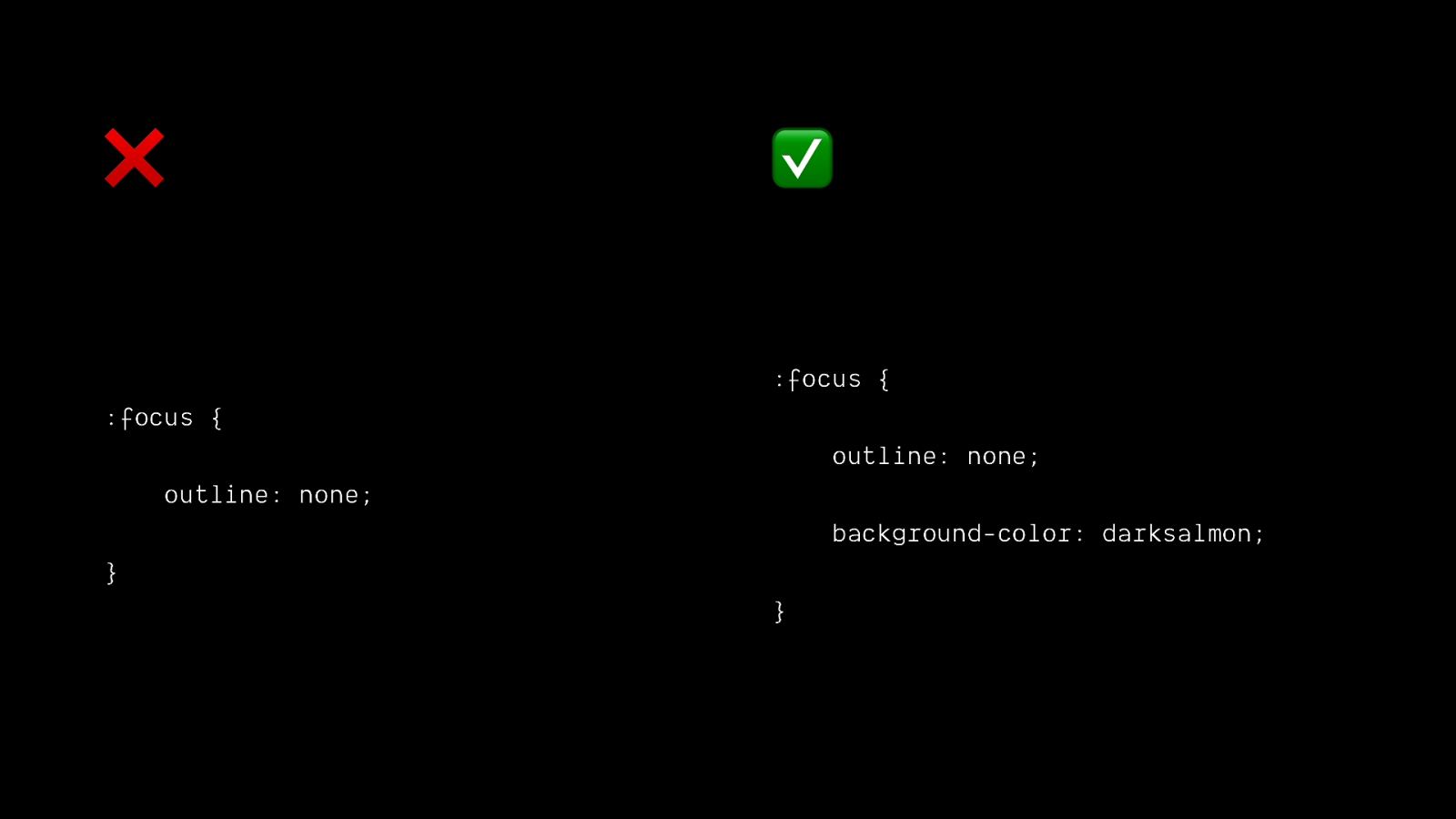
❌ ✅ :focus { :focus { outline: none; outline: none; background-color: darksalmon; } }
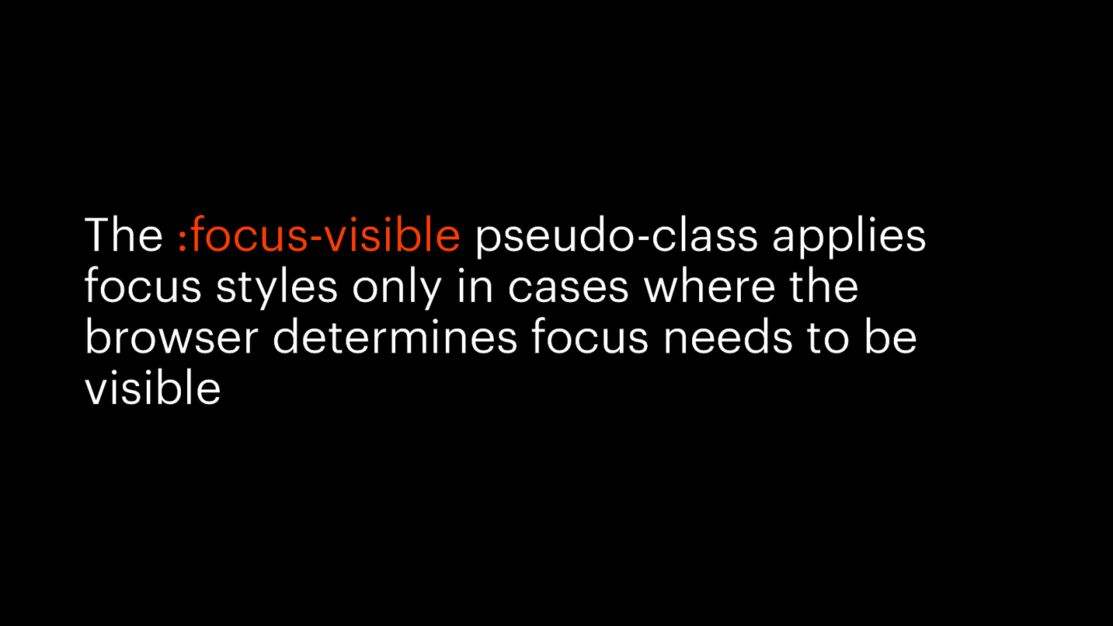
The :focus-visible pseudo-class applies focus styles only in cases where the browser determines focus needs to be visible
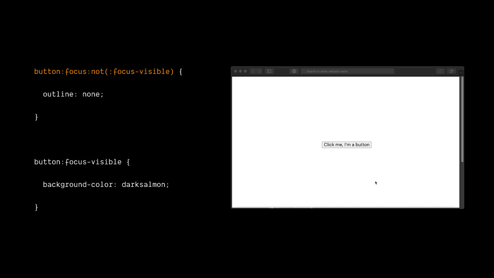
button:focus:not(:focus-visible) { outline: none; } button:focus-visible { background-color: darksalmon; }
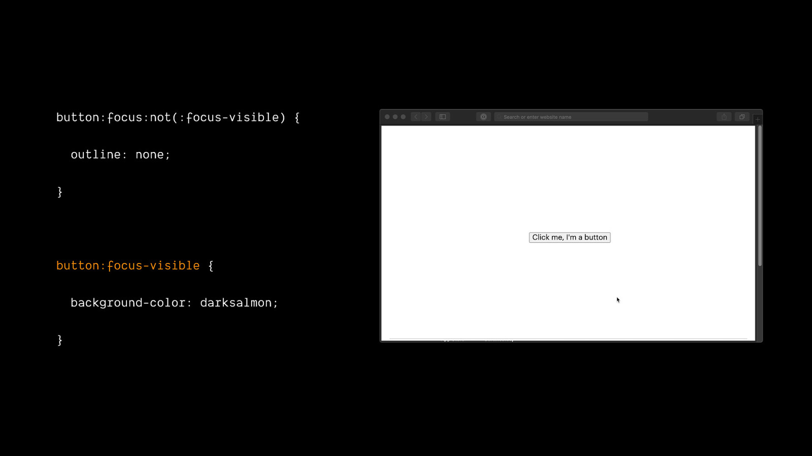
button:focus:not(:focus-visible) { outline: none; } button:focus-visible { background-color: darksalmon; }
Follow styling conventions
One material should not be used as a substitute for another, otherwise the end result is deceptive — Jeremy Keith https://resilientwebdesign.com
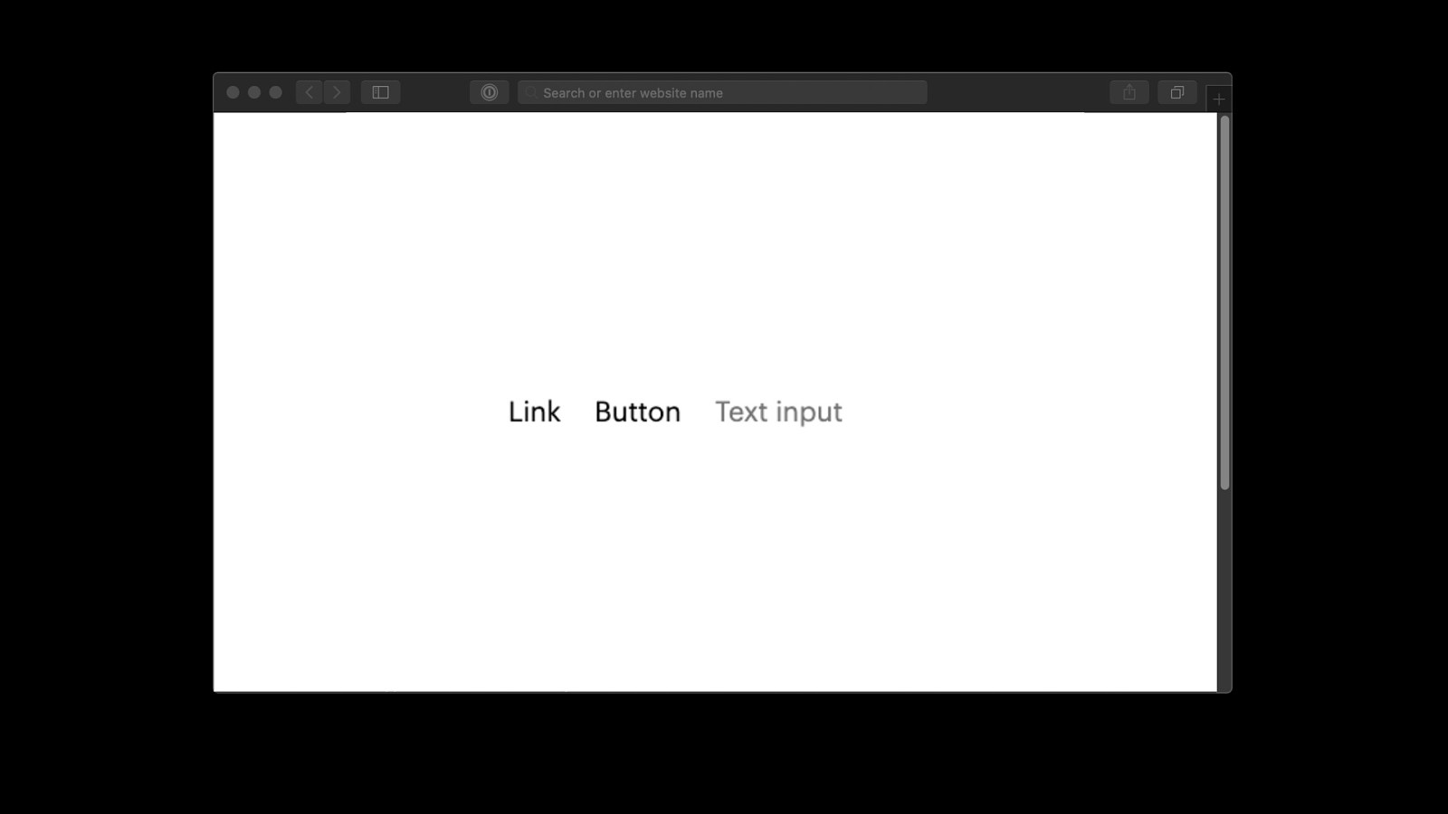
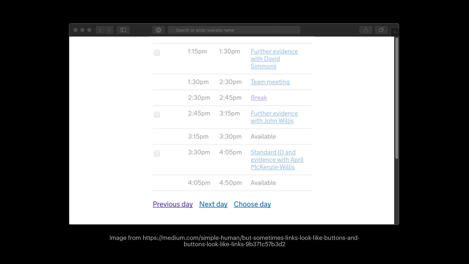
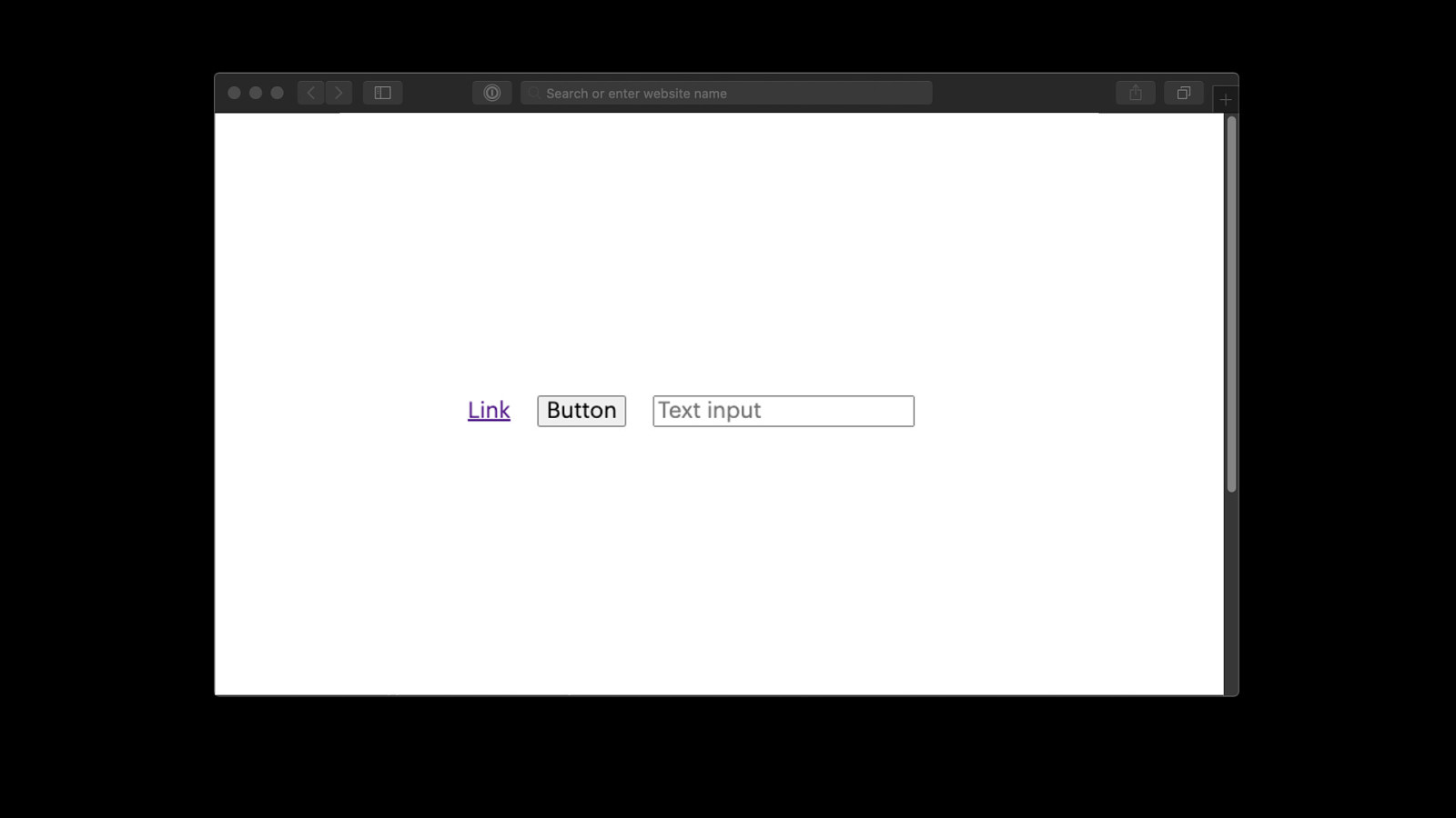
Image from https://medium.com/simple-human/but-sometimes-links-look-like-buttons-andbuttons-look-like-links-9b371c57b3d2

Be proactive about compliance

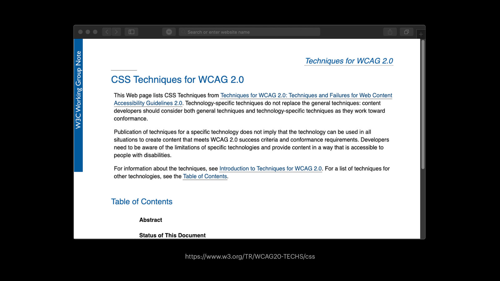
https://www.w3.org/TR/WCAG20-TECHS/css
Firefox accessibility inspector
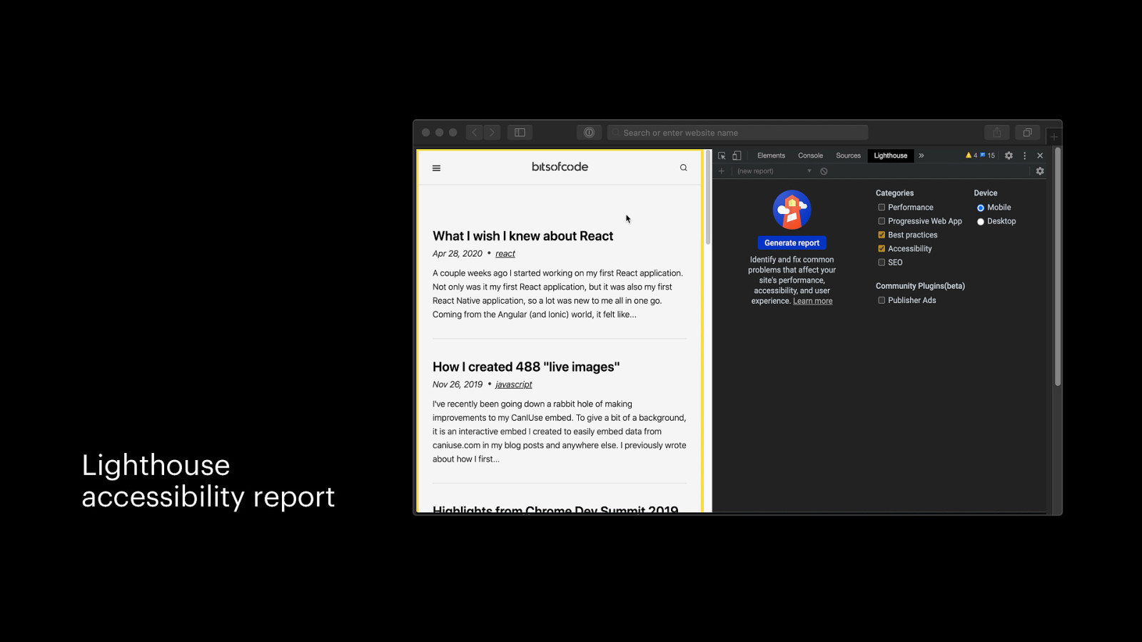
Lighthouse accessibility report
CSS is subjective, so tools can only tell you so much
Image from https://www.citmagazine.com/article/1526238/why-personalisation-key-measuring-events-success personalisation
Write adaptive CSS
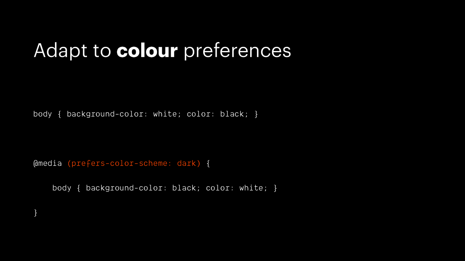
Adapt to colour preferences body { background-color: white; color: black; } @media (prefers-color-scheme: dark) { body { background-color: black; color: white; } }
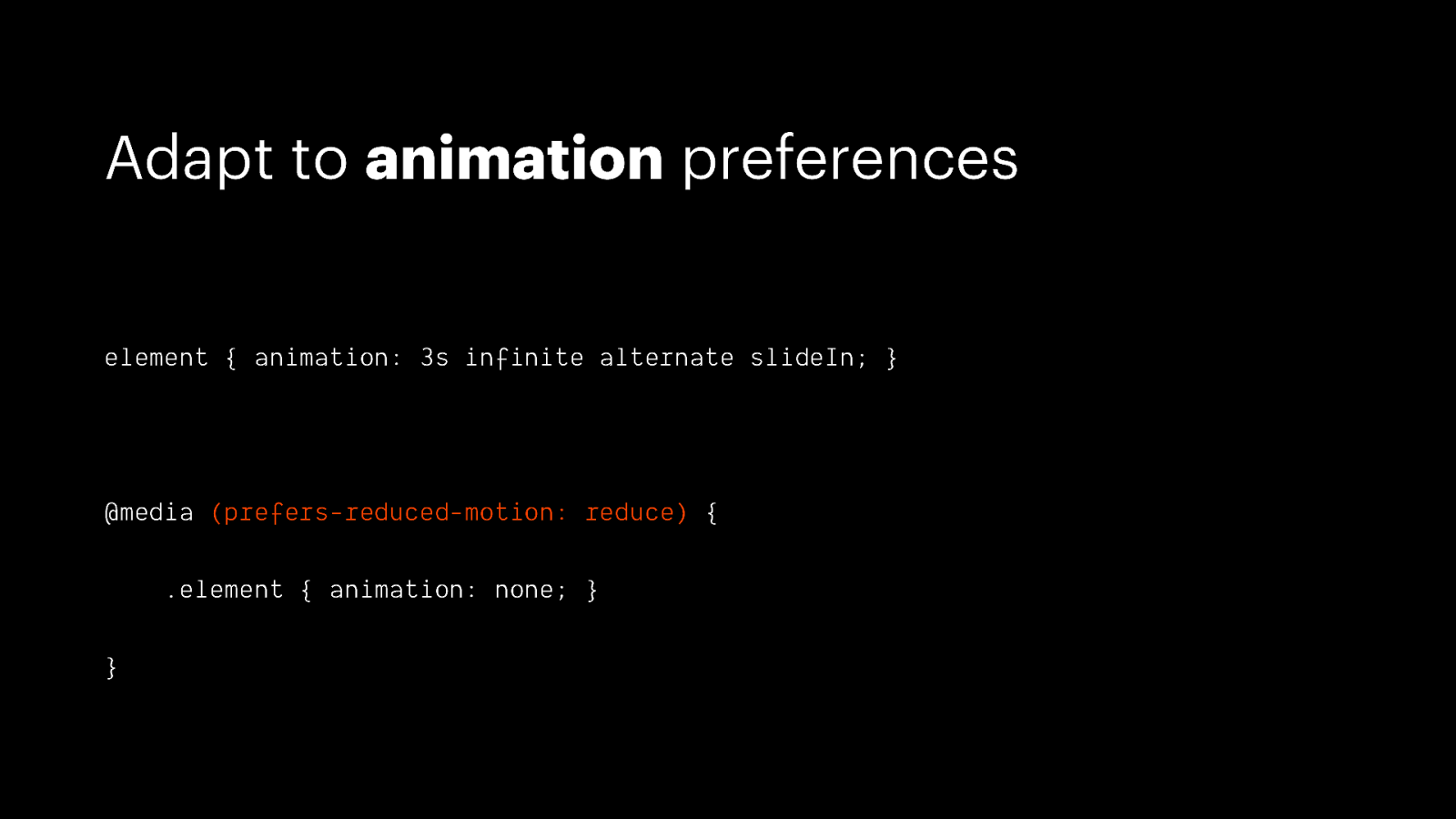
Adapt to animation preferences element { animation: 3s infinite alternate slideIn; } @media (prefers-reduced-motion: reduce) { .element { animation: none; } }
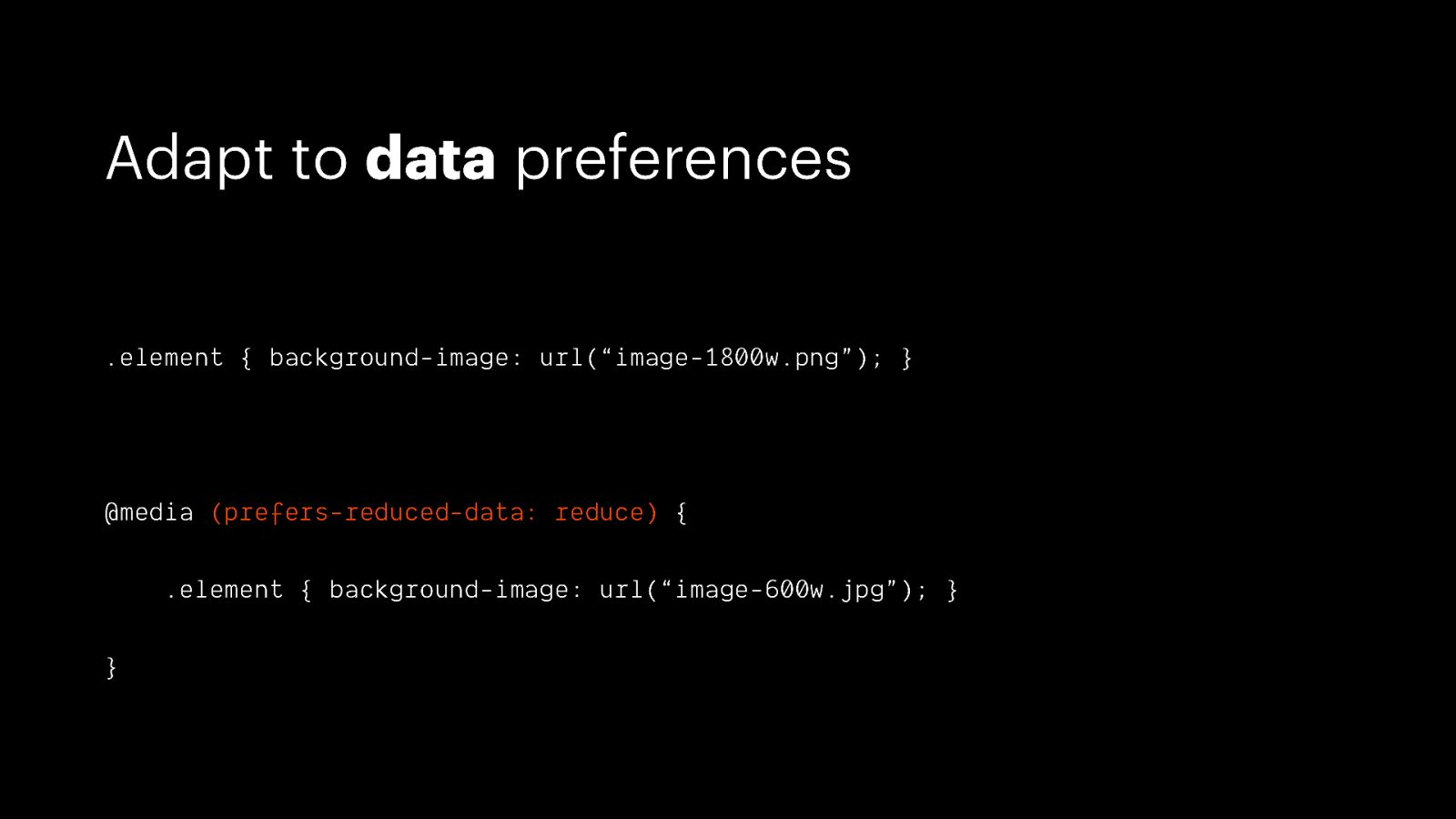
Adapt to data preferences .element { background-image: url(“image-1800w.png”); } @media (prefers-reduced-data: reduce) { .element { background-image: url(“image-600w.jpg”); } }
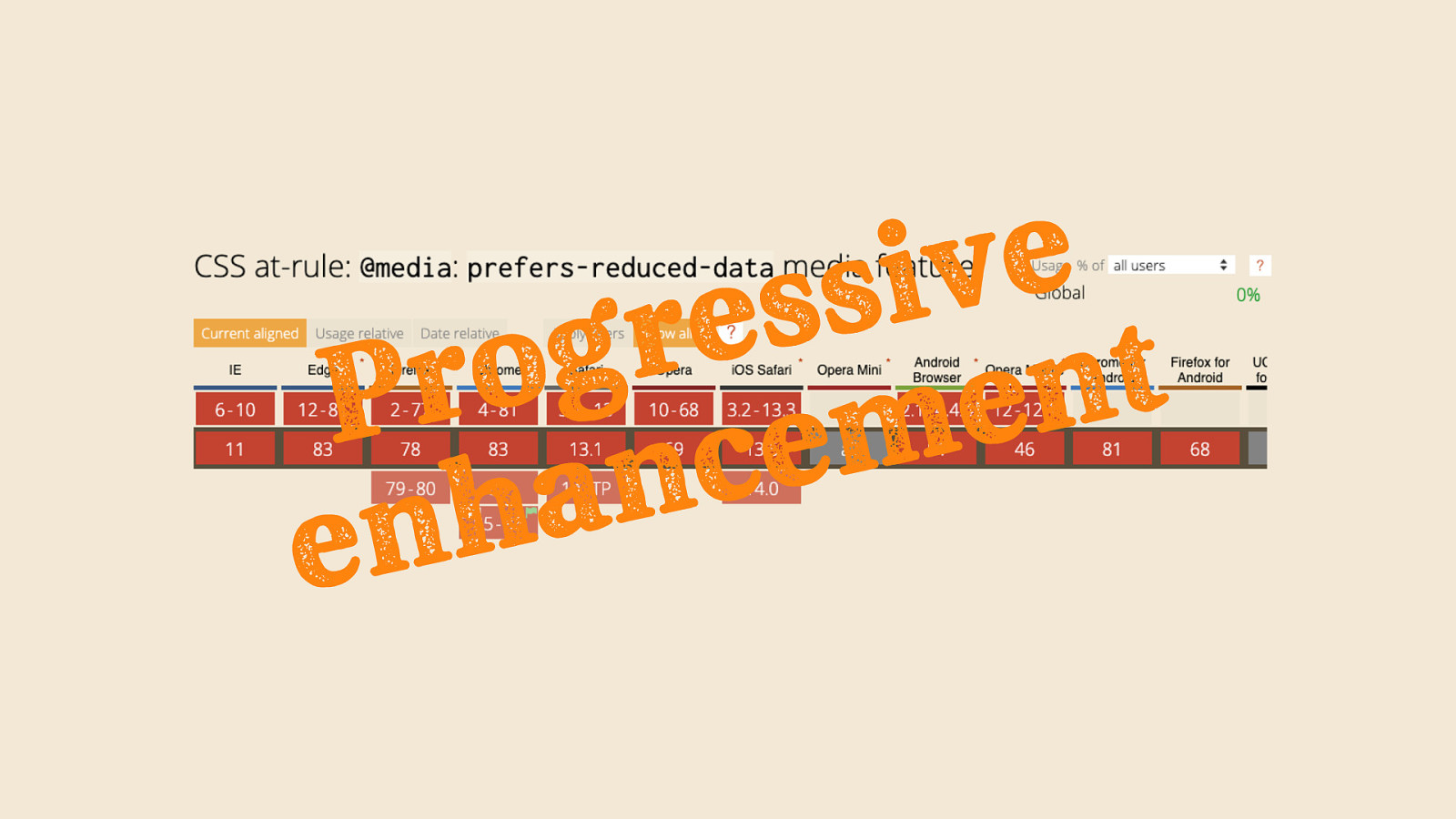
e v i s s e r g o t r n P e m e c n a h n e

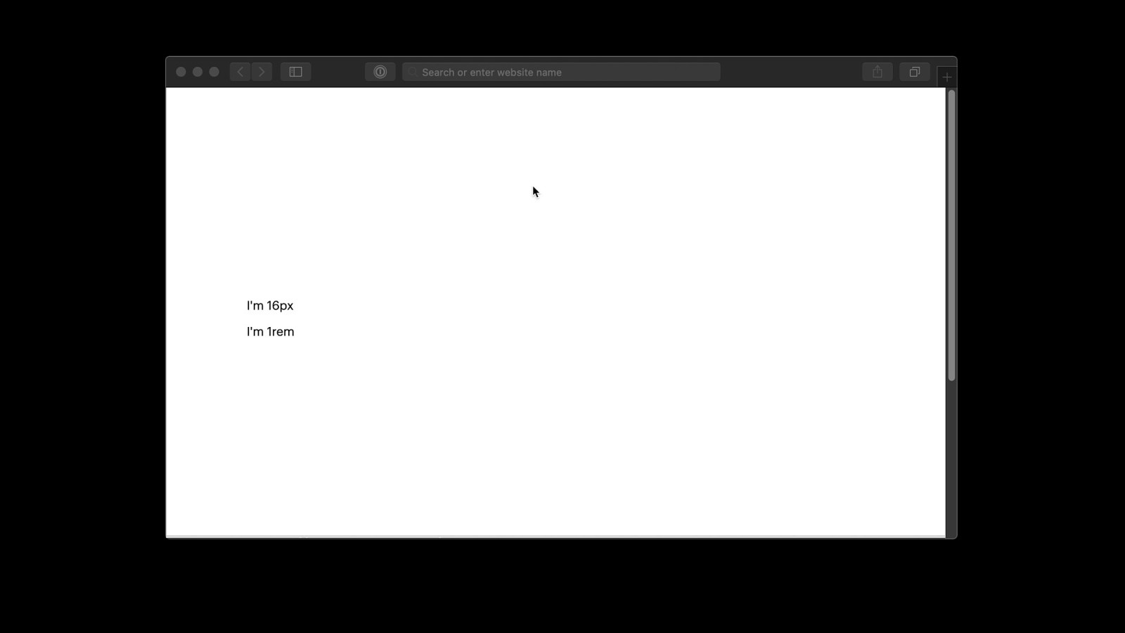
Use rems over pixels for sizes
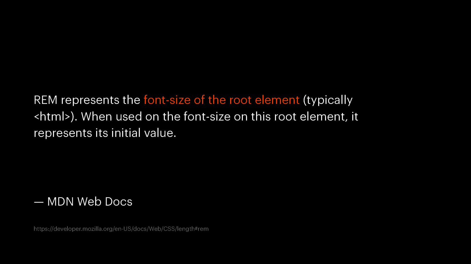
REM represents the font-size of the root element (typically <html>). When used on the font-size on this root element, it represents its initial value. — MDN Web Docs https://developer.mozilla.org/en-US/docs/Web/CSS/length#rem
Using rems allows a website to automatically adapt to user preferences
Future-proof css 🚀
Future-proofing == past-proofing
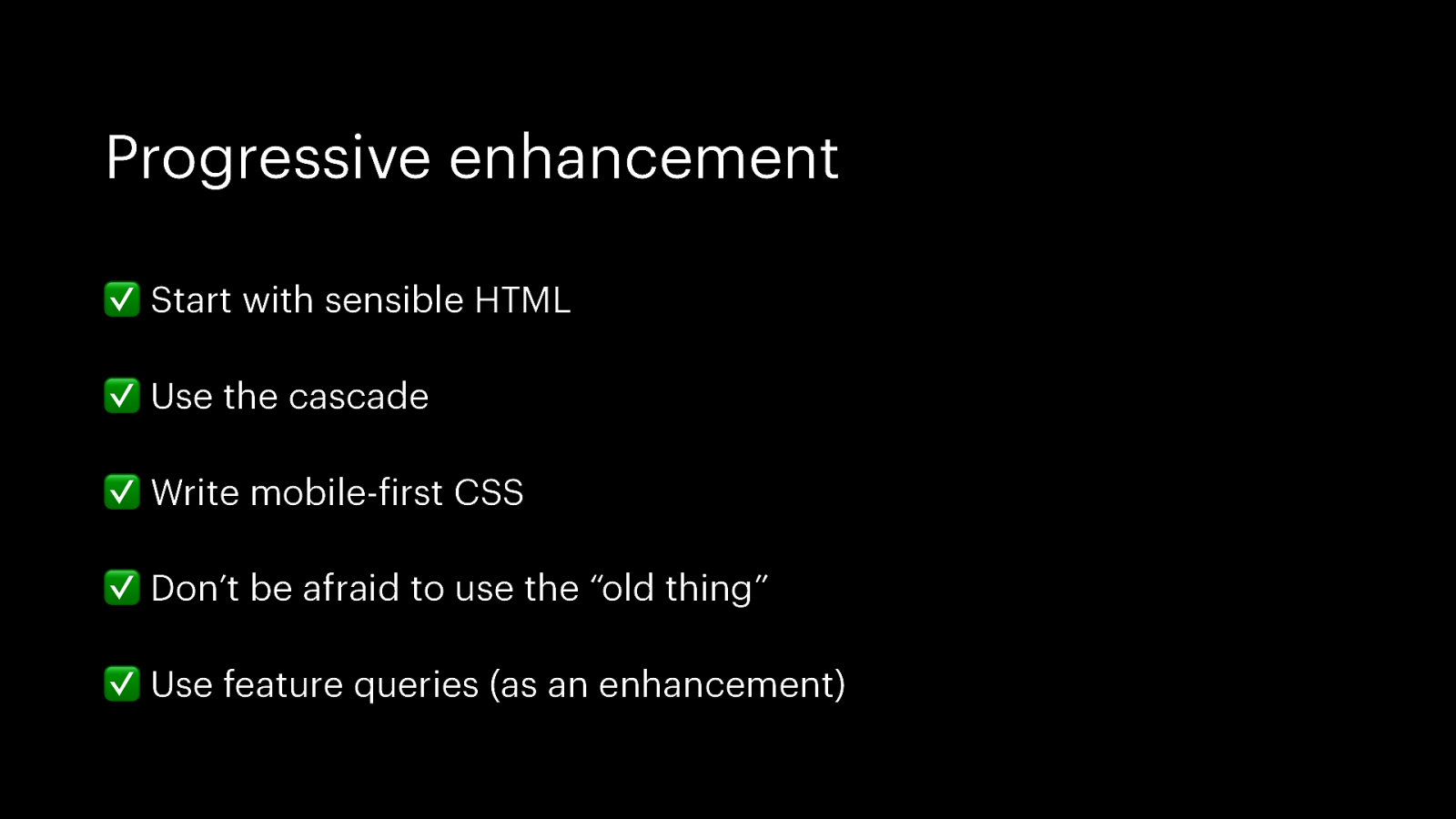
Progressive enhancement ✅ Start with sensible HTML ✅ Use the cascade ✅ Write mobile-first CSS ✅ Don’t be afraid to use the “old thing” ✅ Use feature queries (as an enhancement)
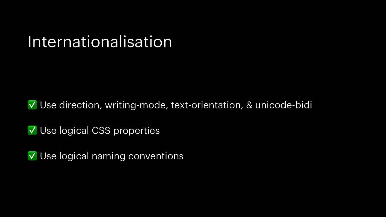
Internationalisation ✅ Use direction, writing-mode, text-orientation, & unicode-bidi ✅ Use logical CSS properties ✅ Use logical naming conventions
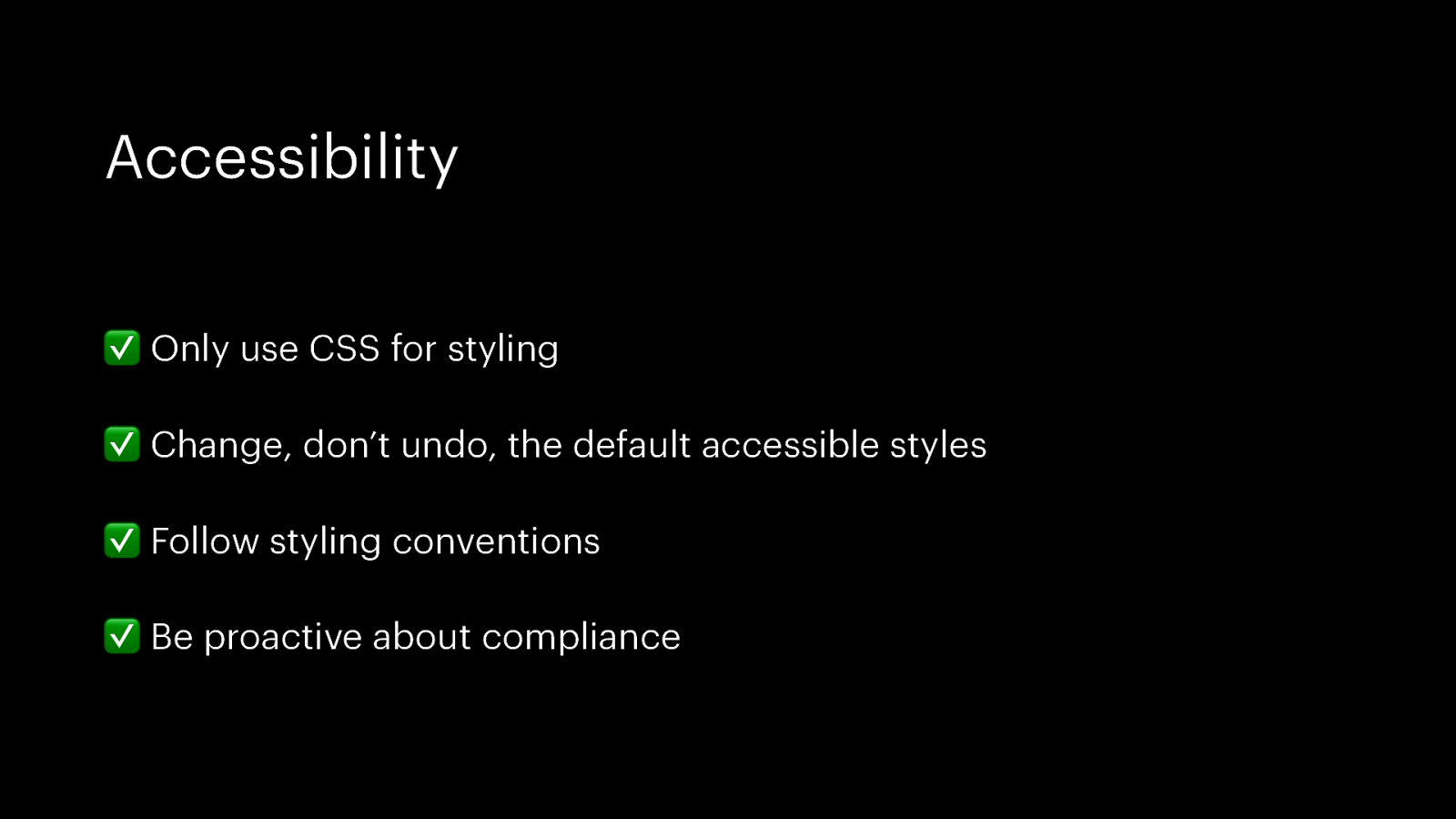
Accessibility ✅ Only use CSS for styling ✅ Change, don’t undo, the default accessible styles ✅ Follow styling conventions ✅ Be proactive about compliance
Personalisation ✅ Write adaptive CSS ✅ Use rems over pixels for sizes
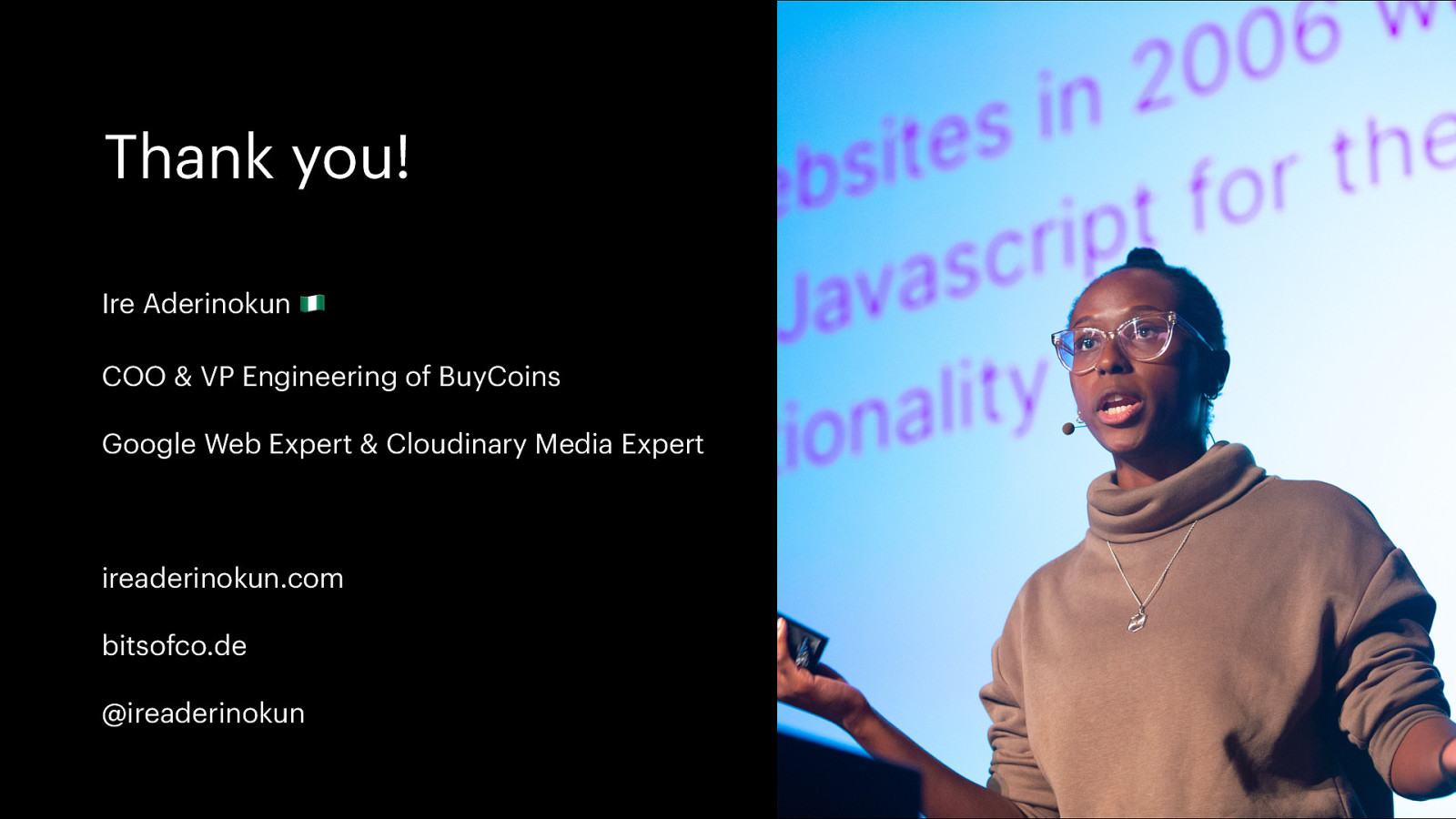
Thank you! Ire Aderinokun 🇳🇬 COO & VP Engineering of BuyCoins Google Web Expert & Cloudinary Media Expert ireaderinokun.com bitsofco.de @ireaderinokun
The concept of “not breaking the web” is one of its oldest and most foundational. When we build a web page, we do it knowing that it could theoretically last as long as the internet itself. The CSS we write today is, or should be, future-proof. But how will your CSS hold up in 10, 50, or even 100 years? In this talk, we’ll cover how to write CSS that stands the test of time. From progressive enhancement techniques to accessibility considerations, we’ll learn how to write CSS for 100 years in the future (and, of course, today).
Buzz and feedback
Here’s what was said about this presentation on social media.
-
Loving every single thing about @IreAderinokun’s @AnEventApart talk!https://t.co/x3lmERfjcZ
— Jeremy Keith (@adactio) August 17, 2020 -
“Use feature queries as an enhancement, not a dependency.” Do this by using positive (“supports”) queries. – @ireaderinokun puts @adactio’s design principles into hands-on practice.
— zeldman ✺ Heroes wear masks. (@zeldman) August 17, 2020
Future-Proof CSS #AEAOT #CSS -
One of those neat conference things happened at @aneventapart #AEAOT. @adactio opened with a talk about "Principles" (finding your own) and now @ireaderinokun is talking about "Not Breaking the Web" and it's a serendipitous reinforcement about applying principles in development.
— Dave Rupert (@davatron5000) August 17, 2020
