Writing CSS in 100 Years
A presentation at DotCSS in in Paris, France by Ire Aderinokun
Writing CSS in 100 Years
Ire Aderinokun @ dotCSS
So, how are we writing CSS in 100 years?

f a s e L e r u p x l o a B V n e & l w & s b o i r s e x i e t B e i l t n r F e r e r p e t o r D e l P k r o s e W i t n S r o S i e t C p a o a n r i m c i i n g lP S A J o L S s d S e i l r C b g n a i b o r u y a e S V B S t n S I e C P m A A n t t o u r S i o S v y n C a E a L m ) a ( s b s i e : i O t r e s I p e P i o t A r r P t o e t n p i s m o a u r o P C P l a d c i i r e l g G u o L d S o S * M C t s r u I e o f P y A e A a r s L p s e e x u l n o a B w V o e r l & B b i s n x e e i r e t l r r F e e D p o r t s P e e l i r t k r r e e o p S p o W S r n C P o i l n t i a a c i S m i g J n o L A s e l b d i S a r i S r g a C n b n V o u o y t S y e n S e B S m I C n P o r A i t v u n S o E S y C a a L s e m i ) t a ( r e b s e i p : O p o r o P s I e i P t m A r o t e t s p n i u o r a C P P l a c i d e i g l r o u o G L d L o S * S M d i s t r r u g e f o b e y u r a S p L S x n S o C w B o r e l B S n b i S e o x r y C r e l a a e F L m a ) ( b s i O t : e l k r s S o e i S t W C n er Lots of new features!
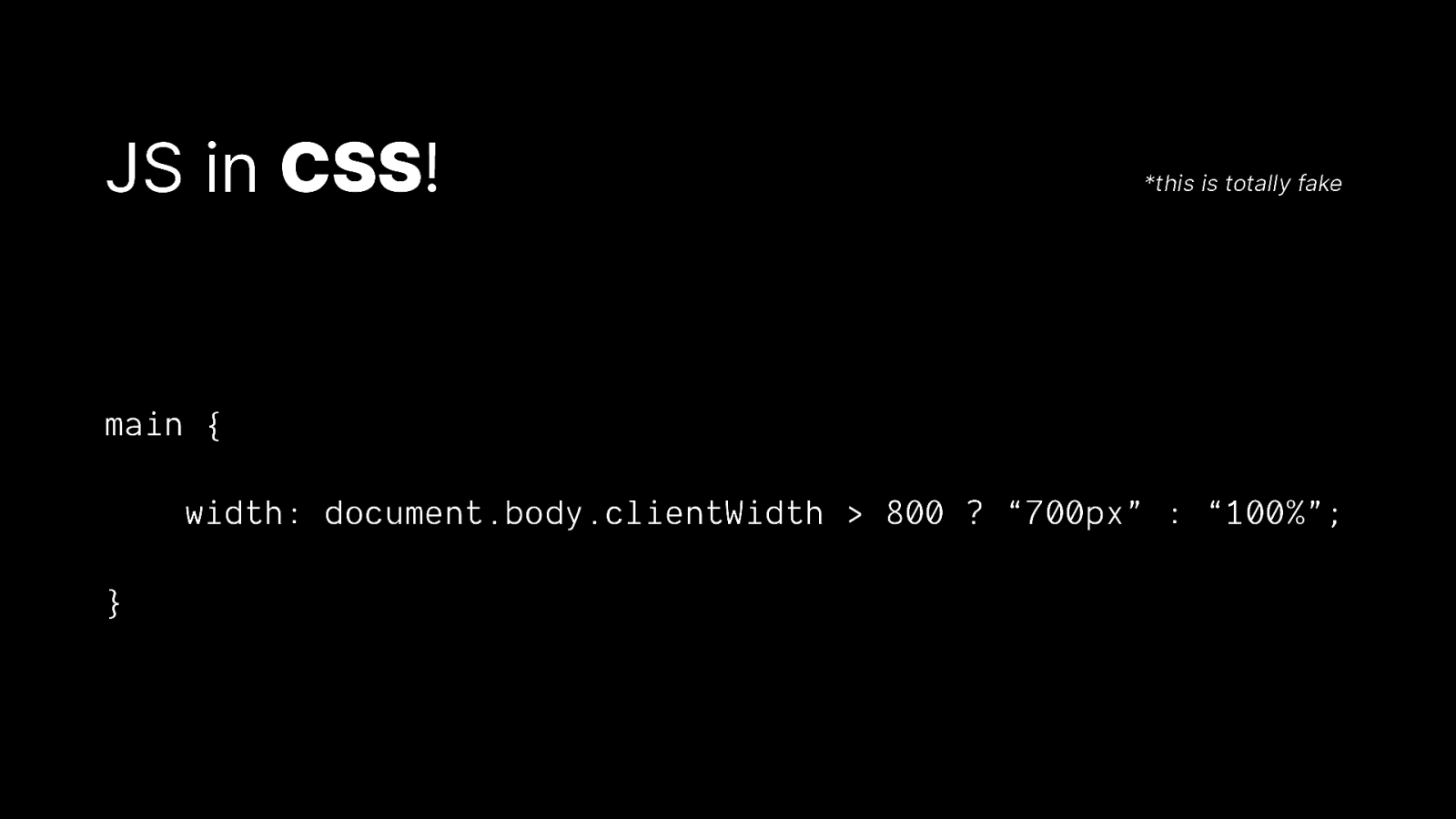
JS in CSS! *this is totally fake main { width: document.body.clientWidth > 800 ? “700px” : “100%”; }
But still, we don’t break the web
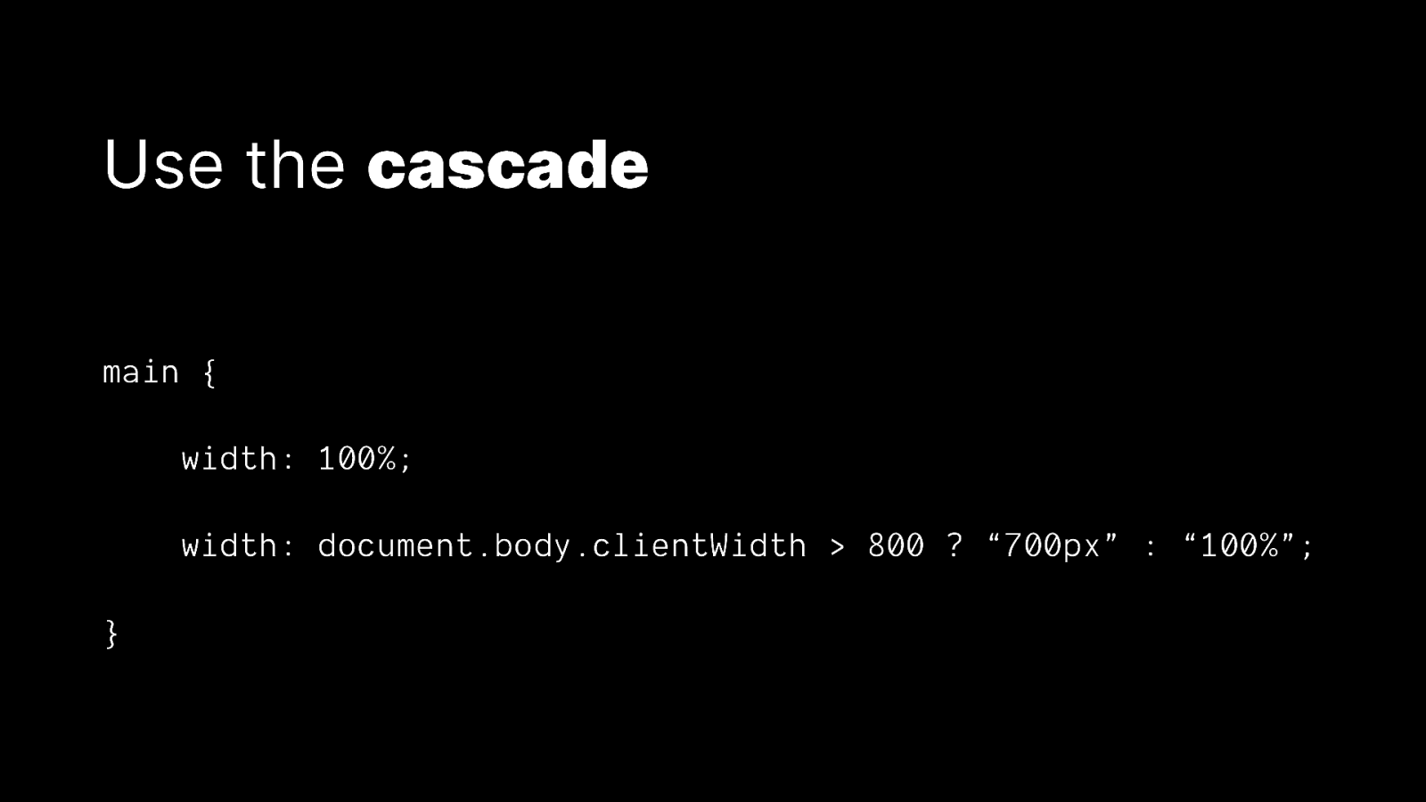
Use the cascade main { width: 100%; width: document.body.clientWidth > 800 ? “700px” : “100%”; }
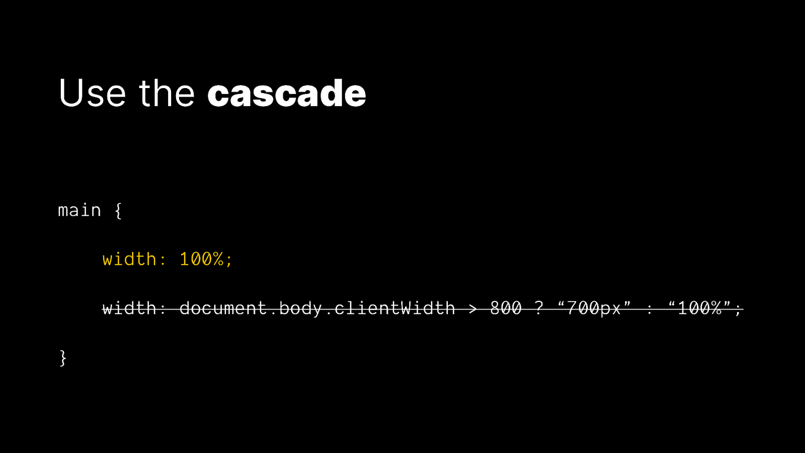
Use the cascade main { width: 100%; width: document.body.clientWidth > 800 ? “700px” : “100%”; }
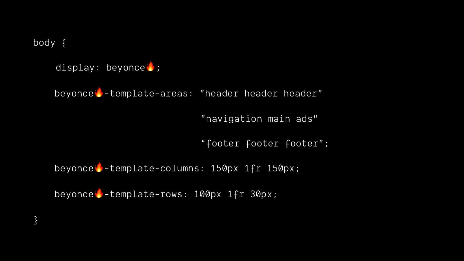
body { display: beyonce🔥; beyonce🔥-template-areas: “header header header” “navigation main ads” “footer footer footer”; beyonce🔥-template-columns: 150px 1fr 150px; beyonce🔥-template-rows: 100px 1fr 30px; }
Use feature queries body { /*” fallback rules here /$ } @supports (display: beyonce🔥) { body { /” awesome rules here */$ } }
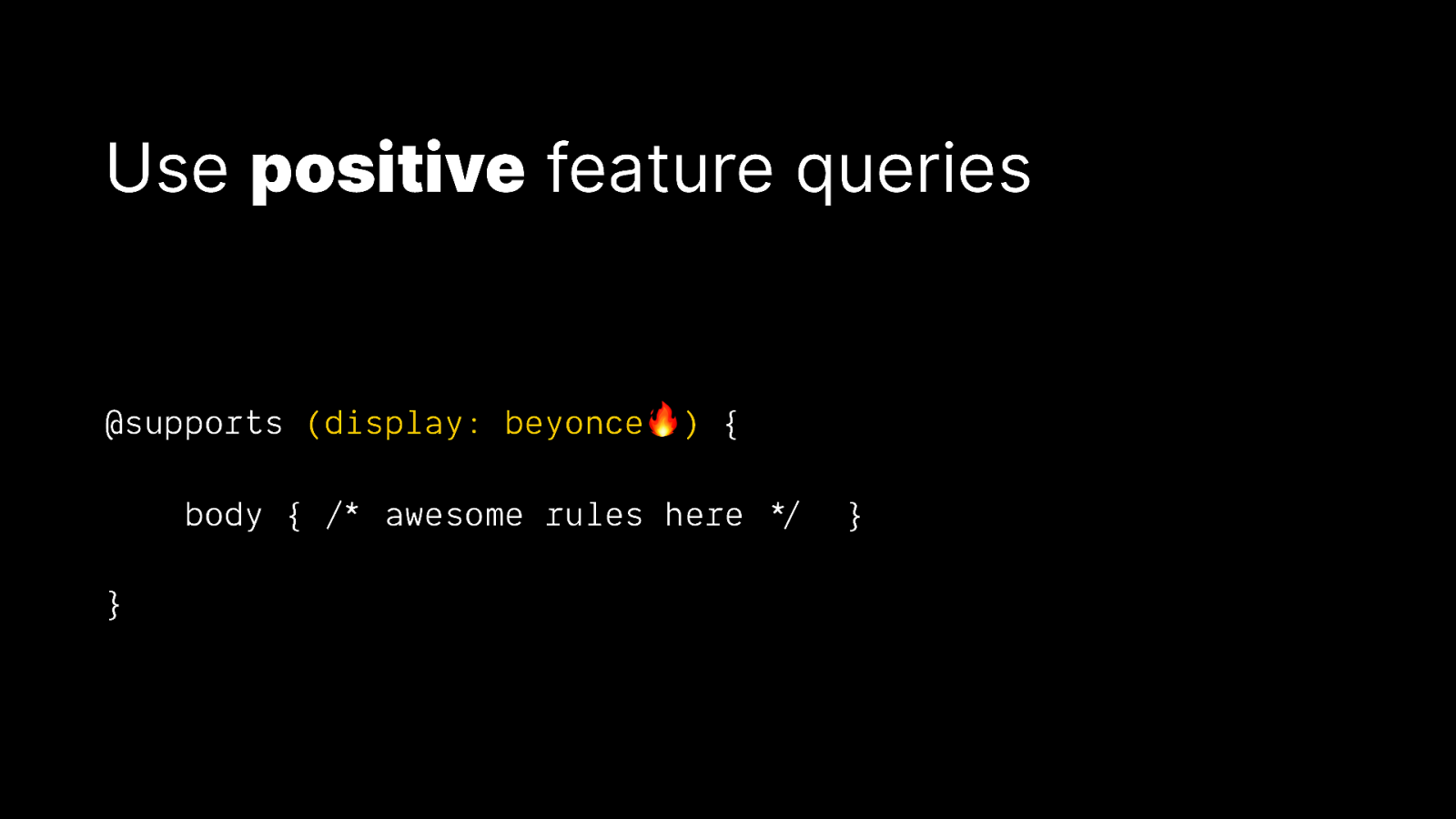
Use positive feature queries @supports (display: beyonce🔥) { body { /*” awesome rules here */$ } }
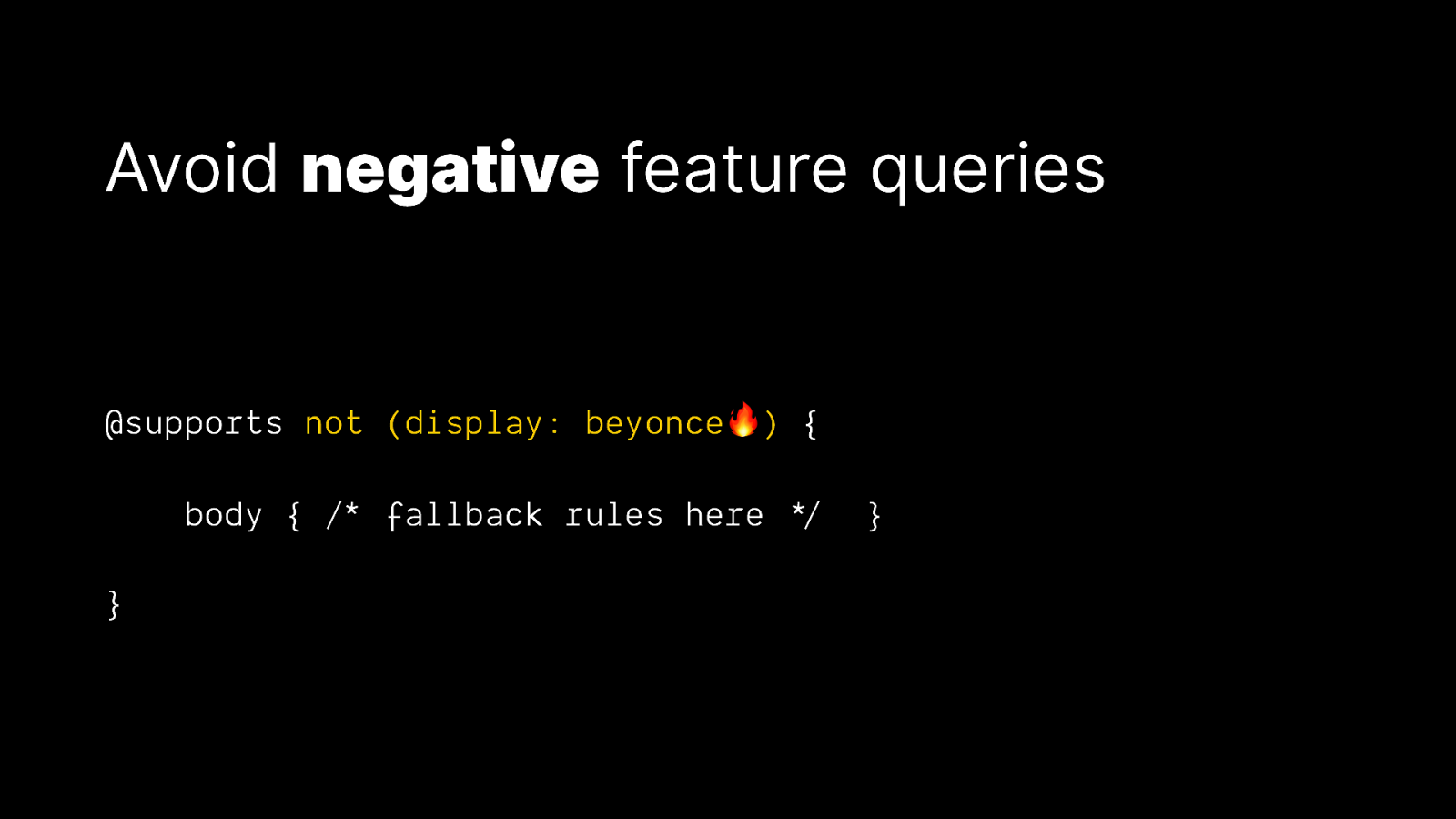
Avoid negative feature queries @supports not (display: beyonce🔥) { body { /*” fallback rules here */$ } }

Everyone is online
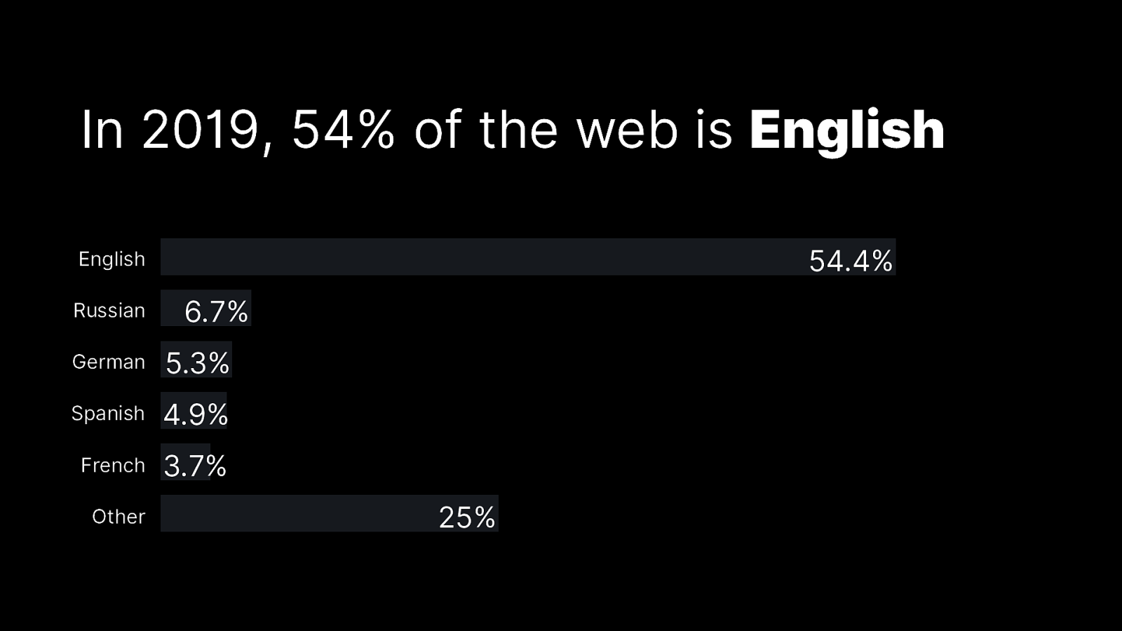
In 2019, 54% of the web is English 54.4% English Russian 6.7% German 5.3% Spanish 4.9% French 3.7% Other 25%
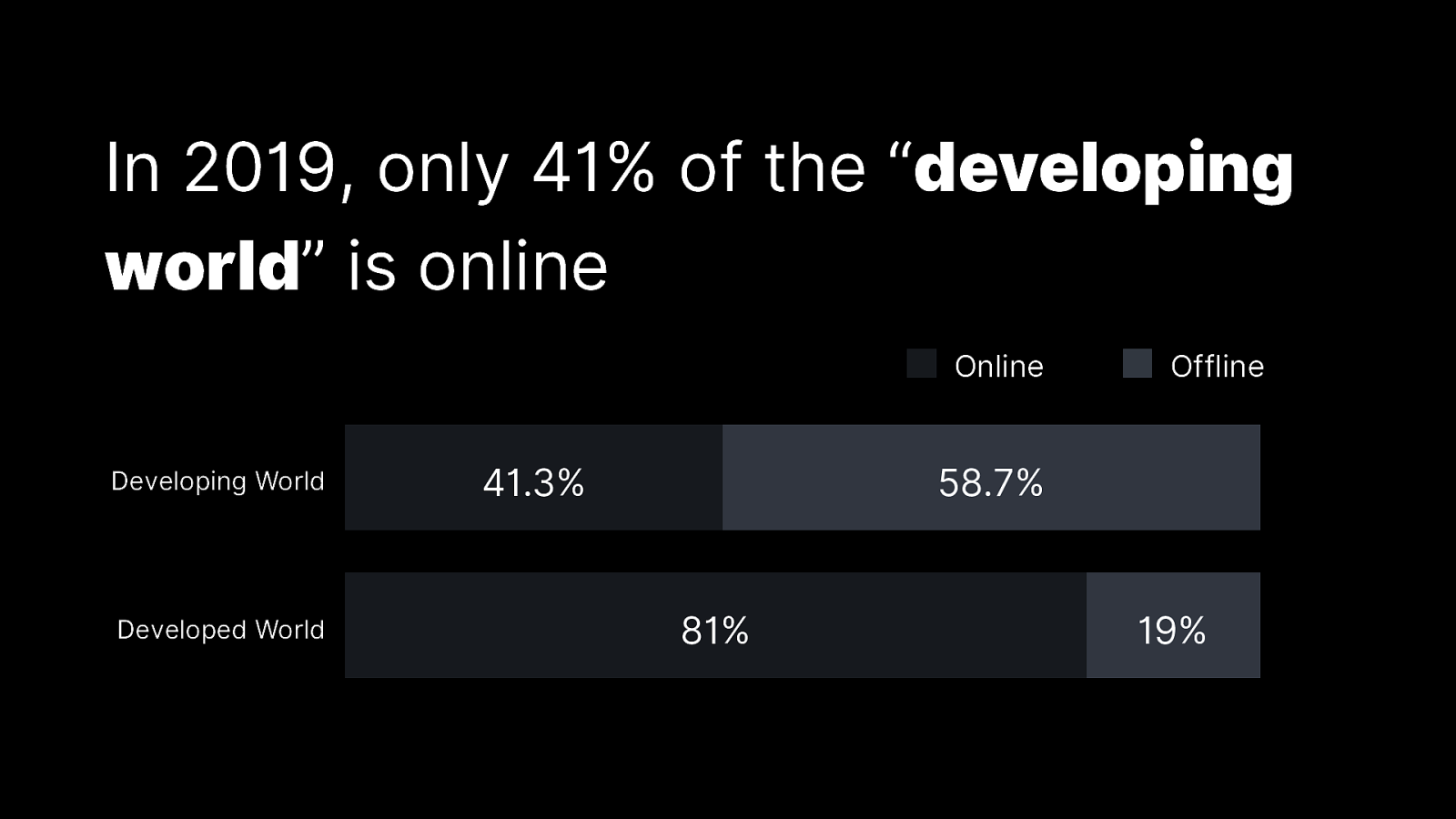
In 2019, only 41% of the “developing world” is online Online Developing World Developed World 41.3% Offline 58.7% 81% 19%

In 100 years, 100% of humans are online
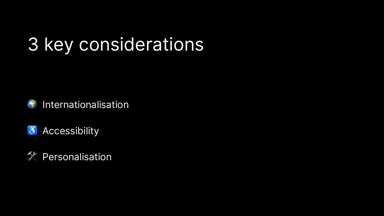
3 key considerations 🌍 Internationalisation ♿ Accessibility 🛠 Personalisation

🌍 We can’t assume LtR-TtB
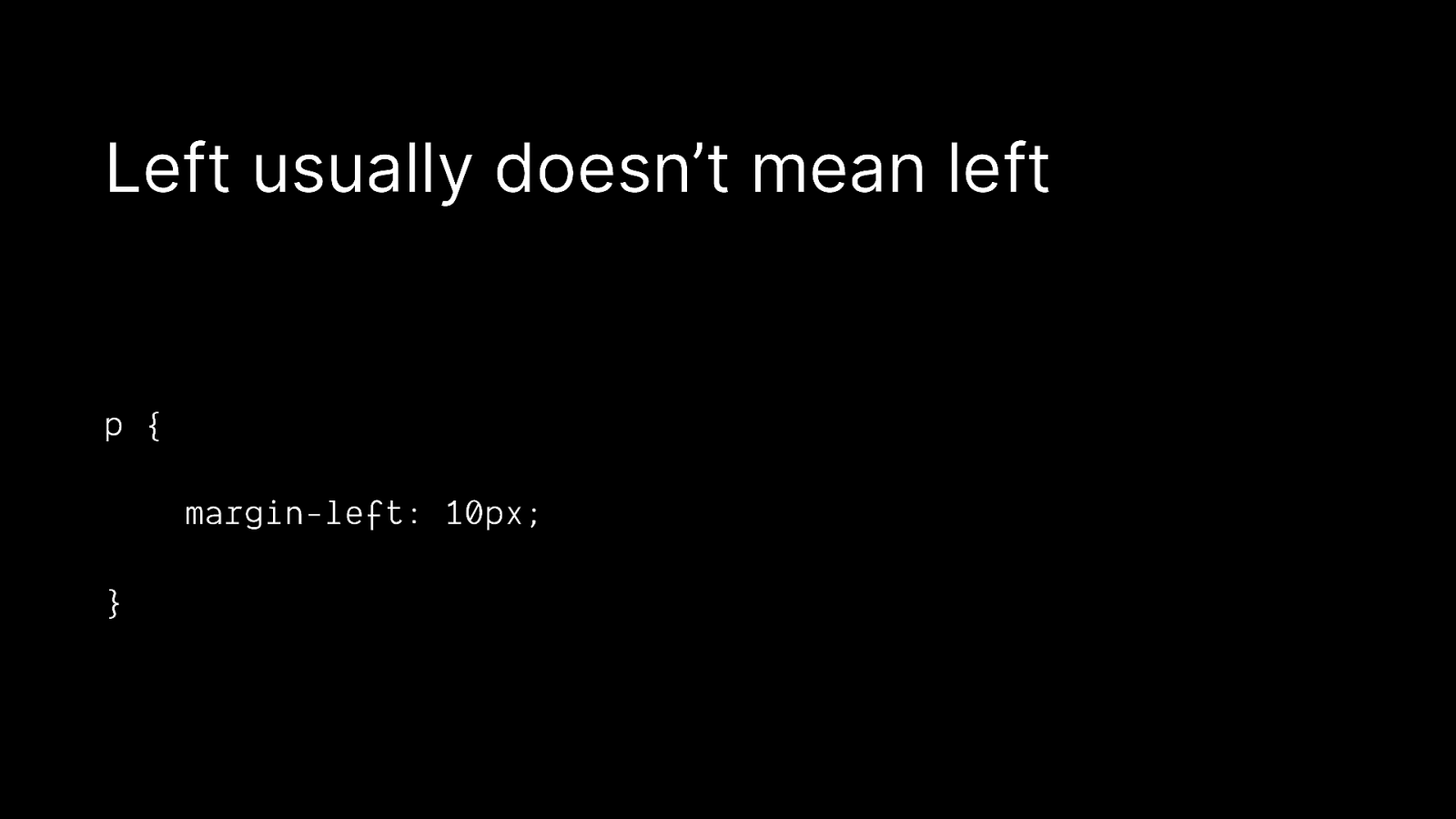
Left usually doesn’t mean left p { margin-left: 10px; }
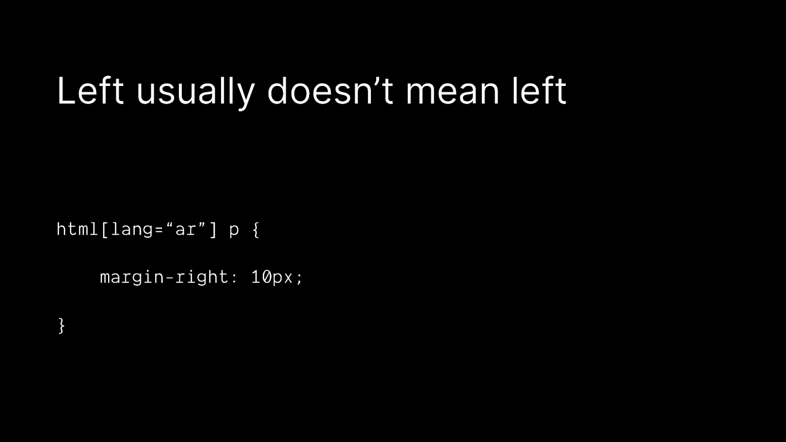
Left usually doesn’t mean left html[lang=“ar”] p { margin-right: 10px; }
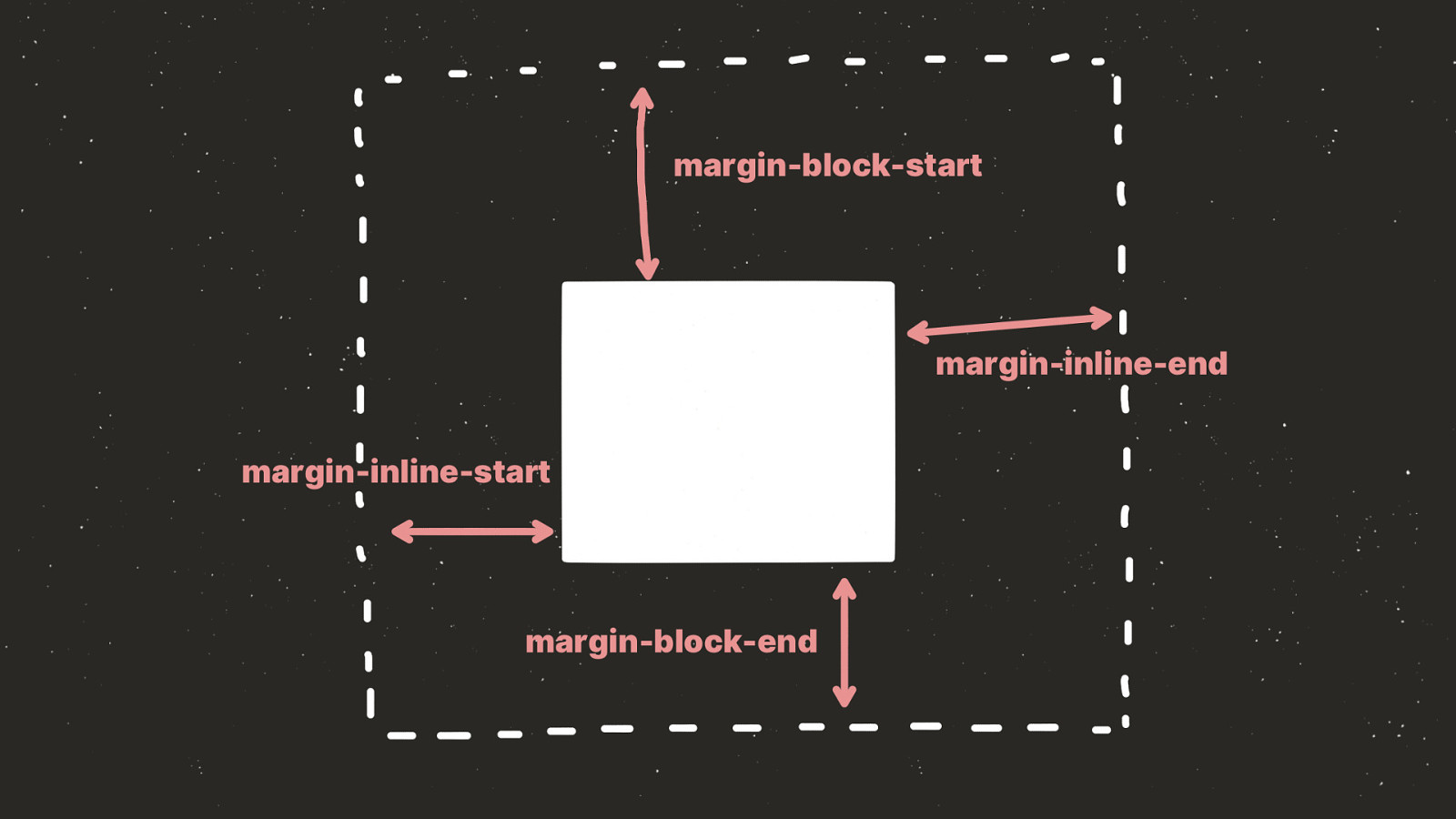
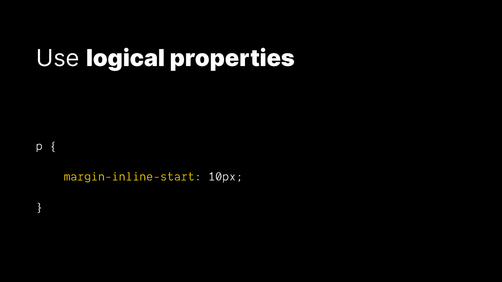
Use logical properties p { margin-inline-start: 10px; }
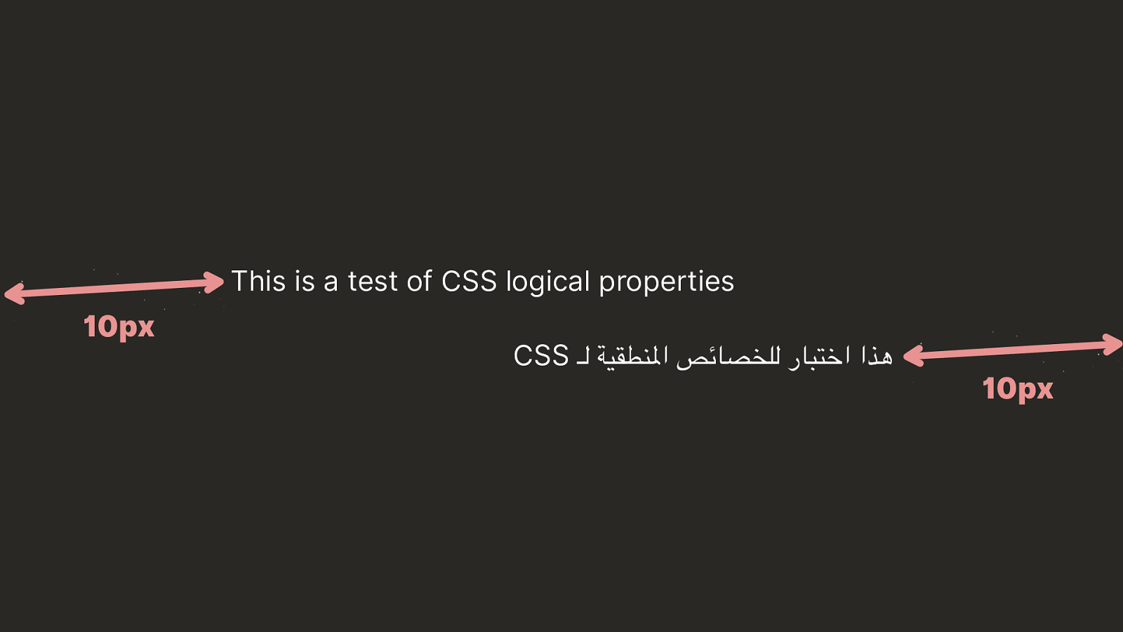
This is a test of CSS logical properties CSS هذا اختبار للخصائص املنطقية لـ

♿ Don’t break the a11y of HTML
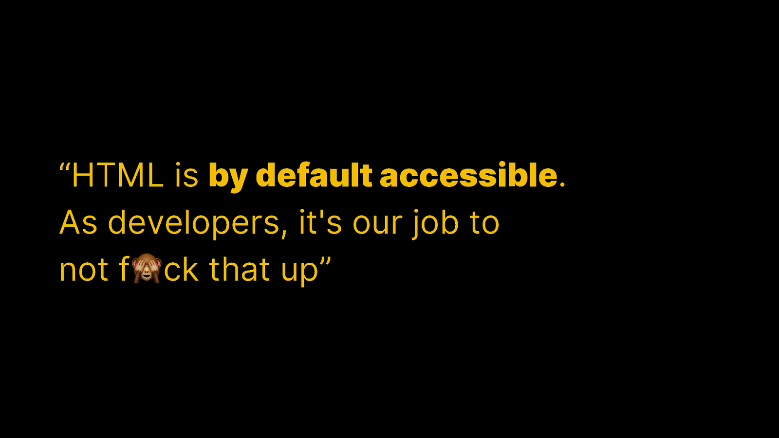
“HTML is by default accessible. As developers, it’s our job to not f🙈ck that up”
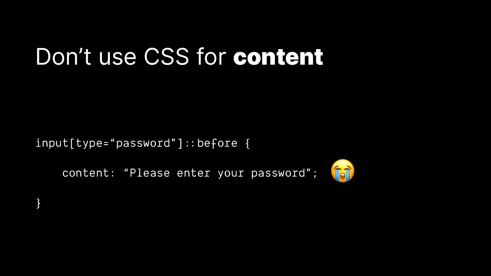
Don’t use CSS for content input[type=“password”]::&before { content: “Please enter your password”; } 😭
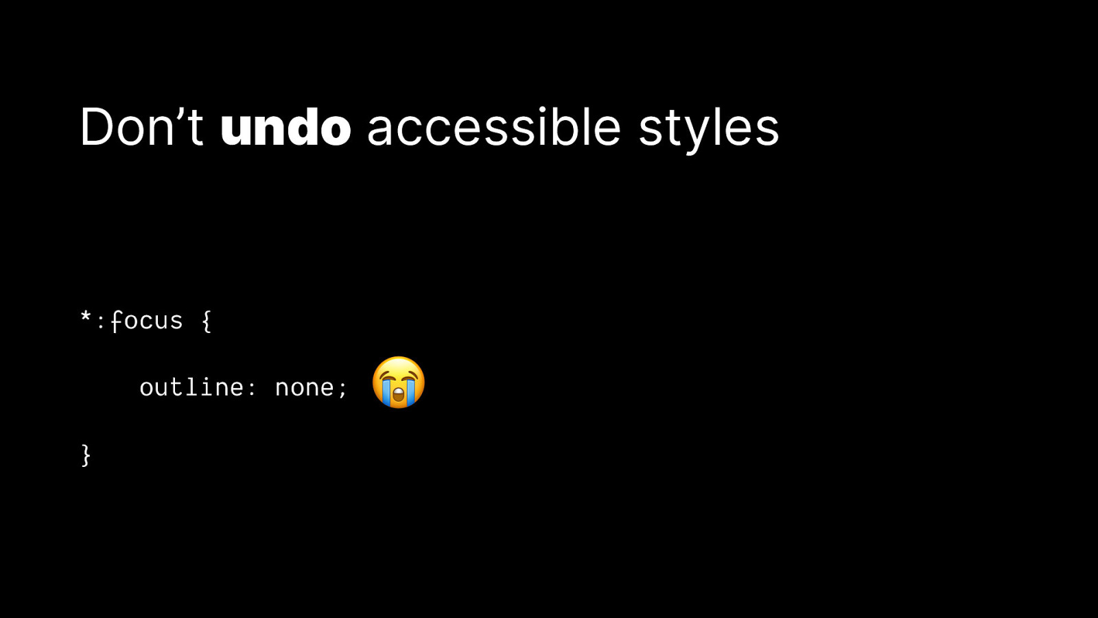
Don’t undo accessible styles *:focus { outline: none; } 😭
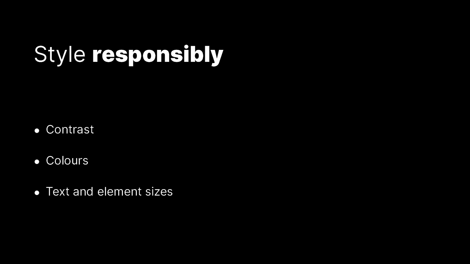
Style responsibly • Contrast • Colours • Text and element sizes

🛠 Adapt styling to user preferences
Adapt to animation preferences .element { animation: 3s infinite alternate slideIn; } @media (prefers-reduced-motion: reduce) { .element { } animation: none; }
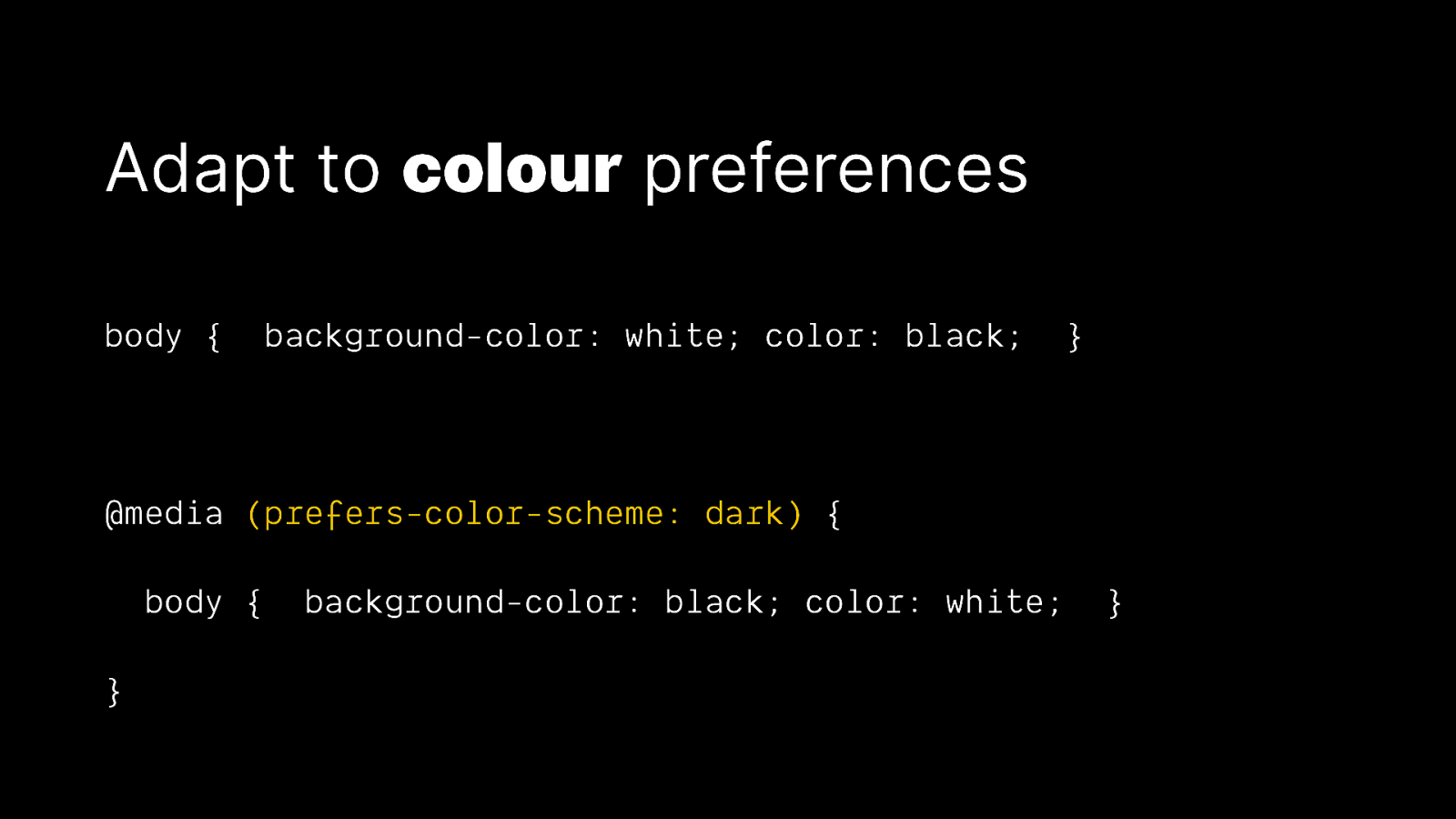
Adapt to colour preferences body { background-color: white; color: black; } @media (prefers-color-scheme: dark) { body { } background-color: black; color: white; }
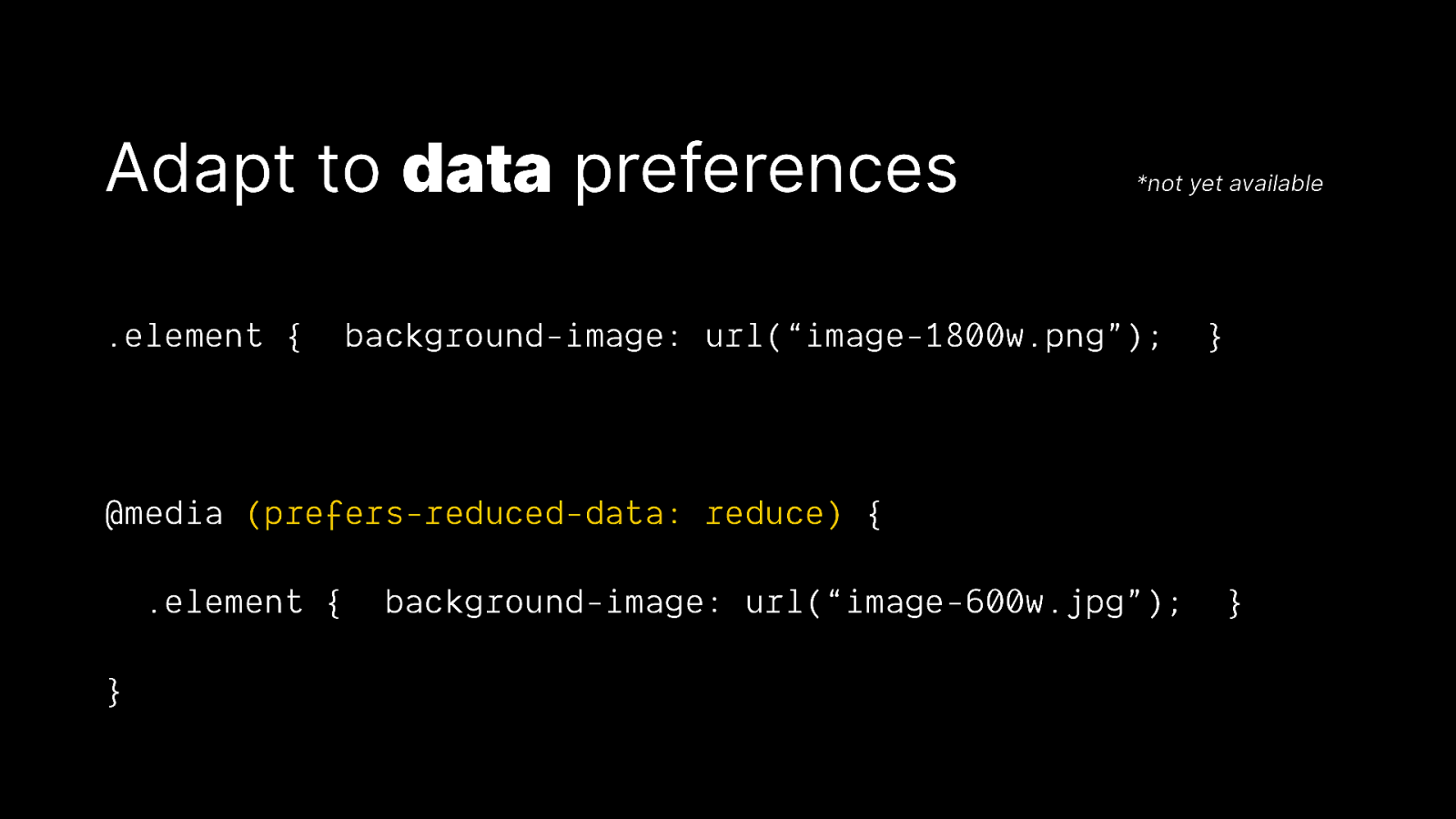
Adapt to data preferences .element { *not yet available background-image: url(“image-1800w.png”); } @media (prefers-reduced-data: reduce) { .element { } background-image: url(“image-600w.jpg”); }

Everyone is online, but not everyone is on the iPhone 100 ProMaxPlusXL
📈 Performant CSS matters
Be careful of expensive animations button { top: 0; transition: top 1s; 😭 } button:hover { top: 10px; }
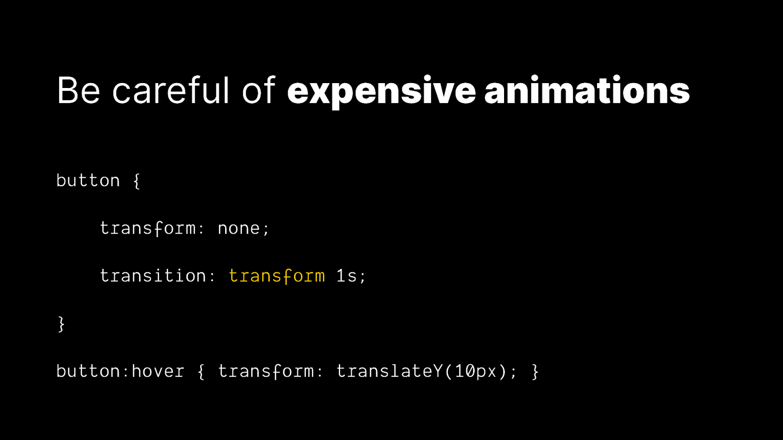
Be careful of expensive animations button { transform: none; transition: transform 1s; } button:hover { transform: translateY(10px); }
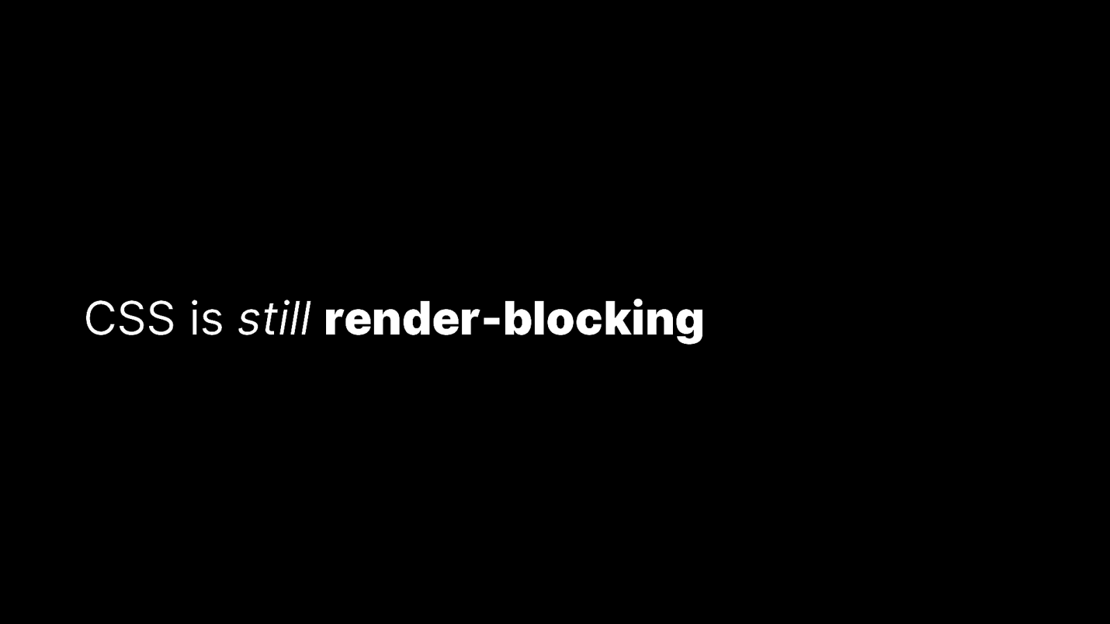
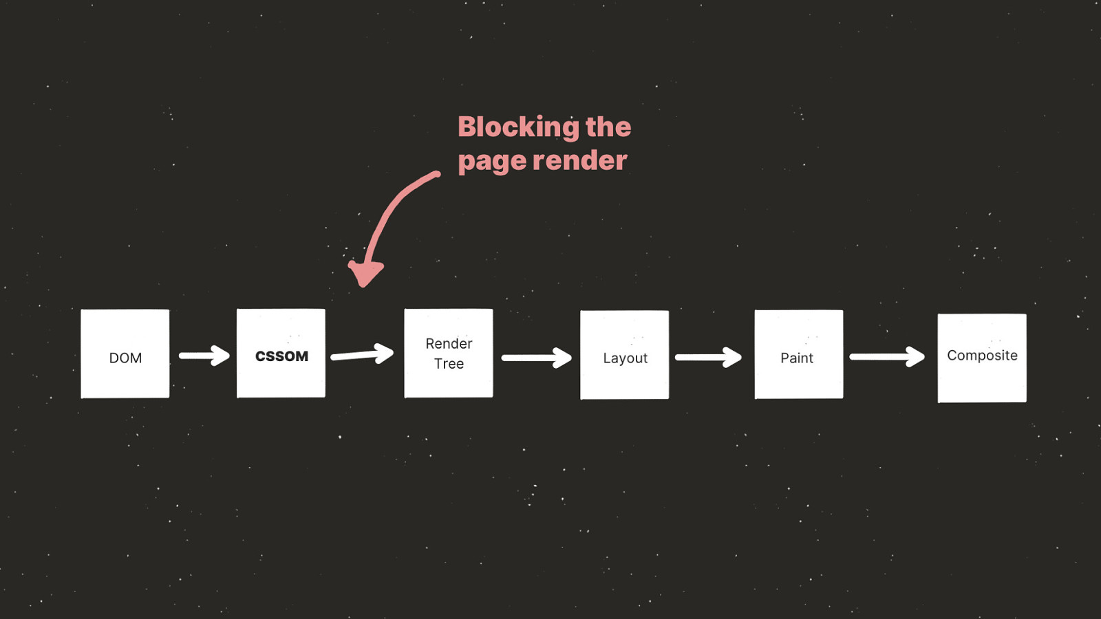
CSS is still render-blocking
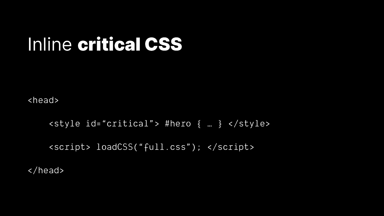
Inline critical CSS <head> <style id=“critical”> #hero { … } </style> <script> loadCSS(“full.css”); </script> </head>
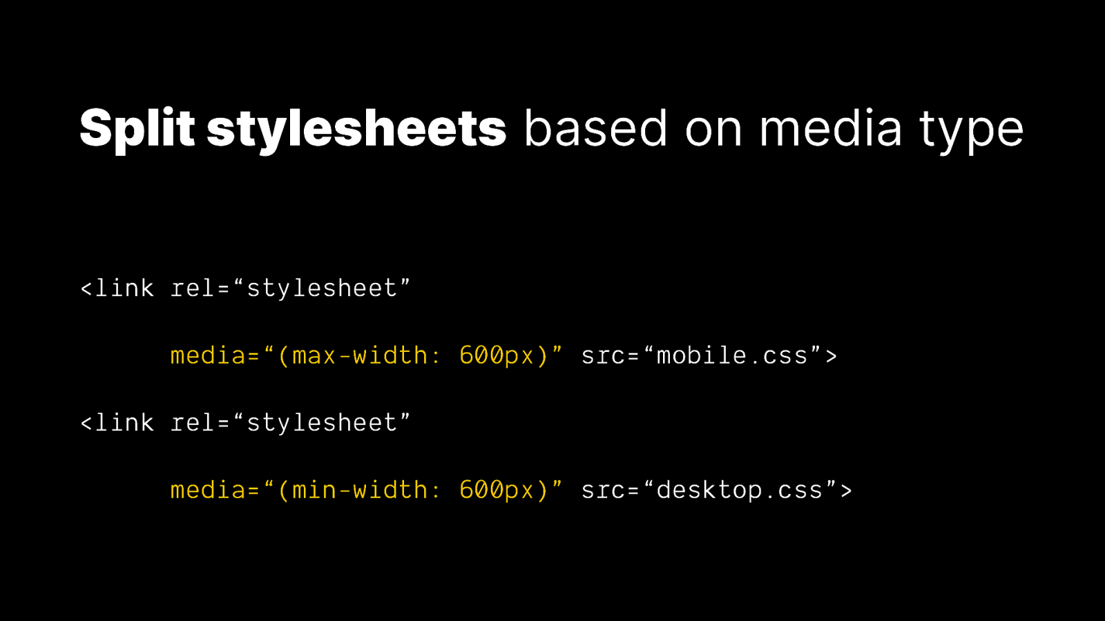
Split stylesheets based on media type <link rel=“stylesheet” media=“(max-width: 600px)” src=“mobile.css”> <link rel=“stylesheet” media=“(min-width: 600px)” src=“desktop.css”>
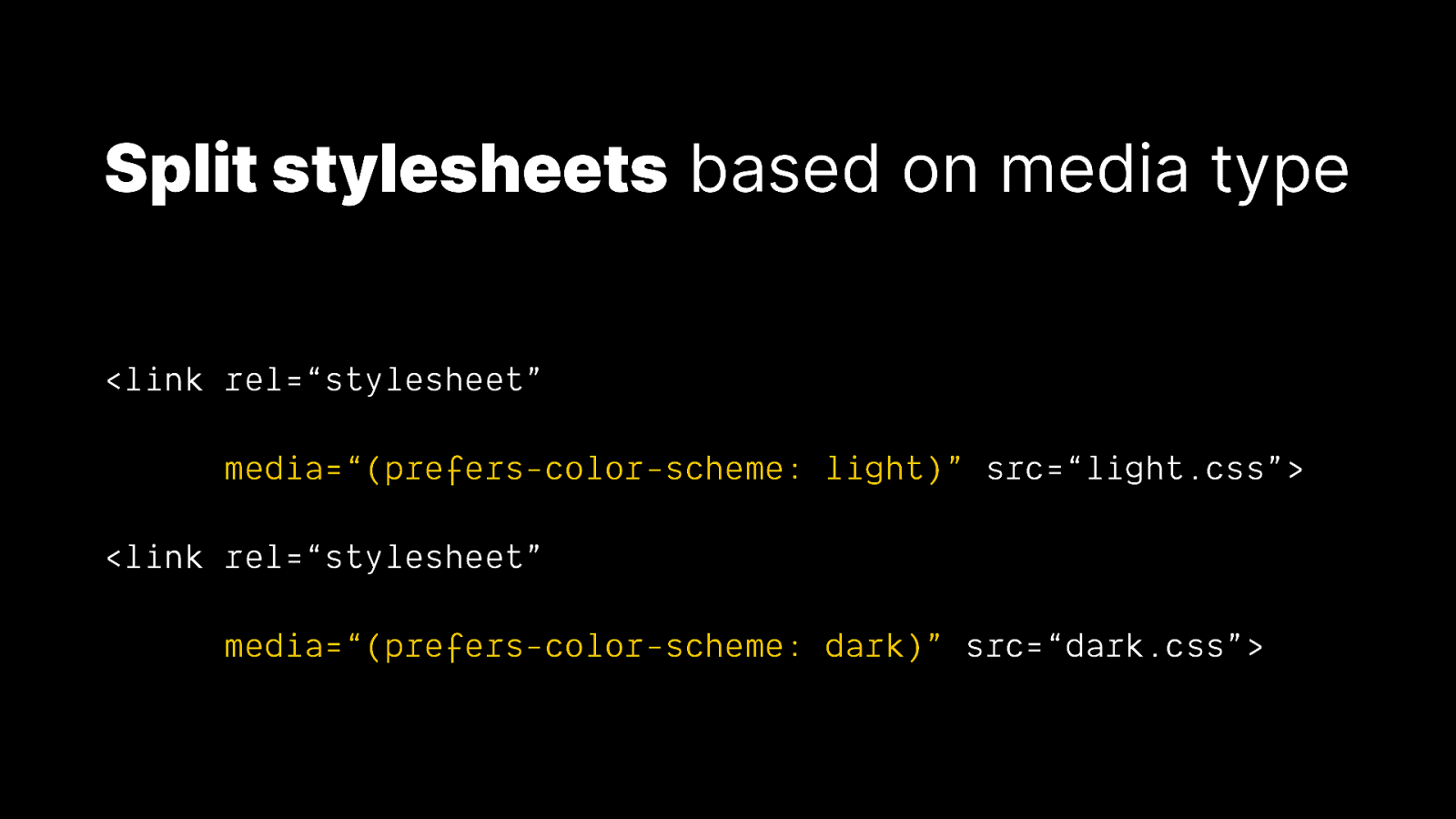
Split stylesheets based on media type <link rel=“stylesheet” media=“(prefers-color-scheme: light)” src=“light.css”> <link rel=“stylesheet” media=“(prefers-color-scheme: dark)” src=“dark.css”>
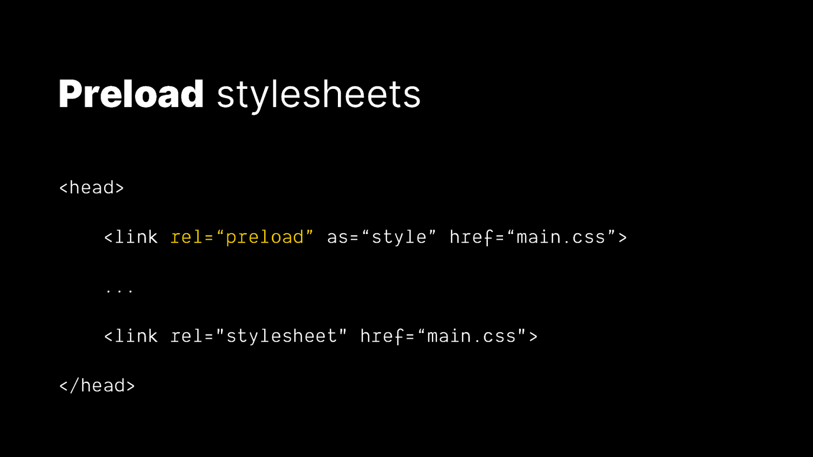
Preload stylesheets <head> <link rel=“preload” as=“style” href=“main.css”> … <link rel=”stylesheet” href=“main.css”> </head>
HTTP/2 Push <FilesMatch “.html$”> Header set Link “</main.css>; rel=preload; as=style” <FilesMatch>
Writing CSS in 2119 2019
✅ Progressively enhance the experience with new features ✅ Use logical properties that are adaptable to different languages ✅ Don’t break the accessibility of HTML ✅ Adapt styling to user preferences ✅ Beware of expensive CSS animations ✅ Serve smaller, modular stylesheets wherever possible ✅ Pre-emptively load stylesheets
Thank you! 🌍 Where to find me 📚 Further reading & sources • ireaderinokun.com • CSS Logical Properties (Working Draft) • bitsofco.de • Proposal: prefers-reduced-data • @ireaderinokun • loadCSS() • Preload (Candidate Recommendation)

It’s 100 years in the future, how has writing stylesheets changed? This talk will cover topics such as progressive enhancement, accessibility, internationalisation, and performance as it relates to writing CSS in 100 years (and, of course, today).
 for free. You
can too.
for free. You
can too.